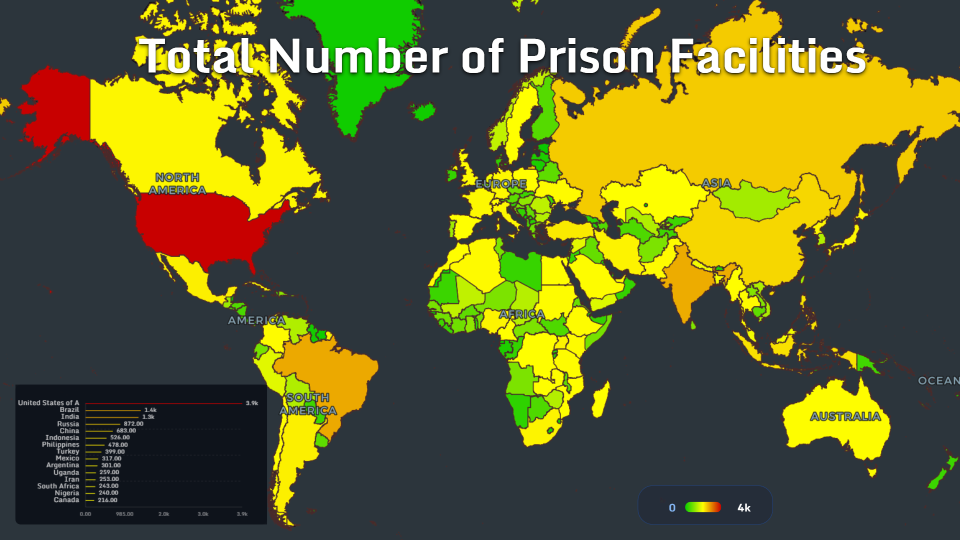
Global Prison Maps 2026: Population, Overcrowding, Women, Children and Mortality
Global prison maps reveal how incarceration, overcrowding, women’s imprisonment, child detention and prison mortality differ by country.
Read more →
Tutorials, case studies, and data visualization tips
MAPTHOS — your gateway to next-gen cartography and world data analytics. Visualize, compare, and share country statistics with AI.
Global prison maps reveal how incarceration, overcrowding, women’s imprisonment, child detention and prison mortality differ by country.
Read more →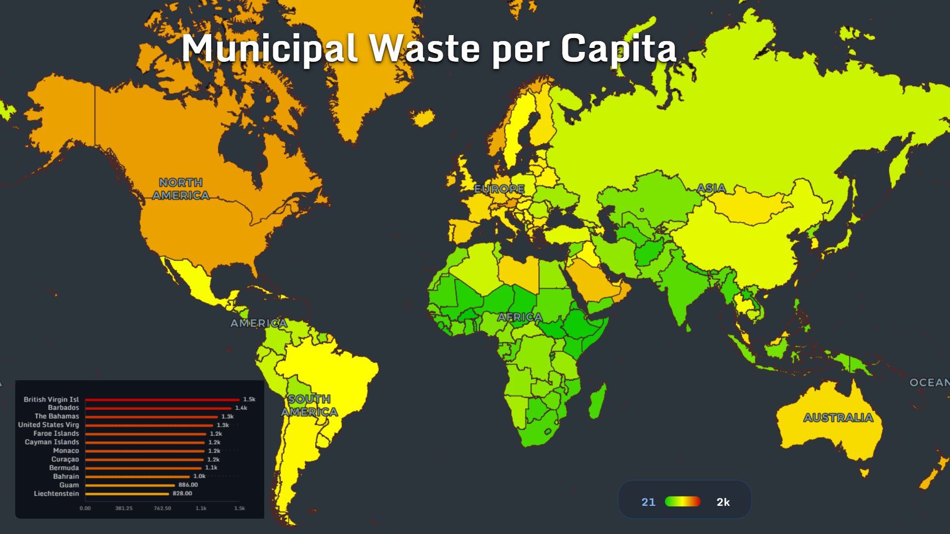
These sustainable consumption maps reveal how waste, clothing, food, packaging and affordability shape the real geography of green living in 2026.
Read more →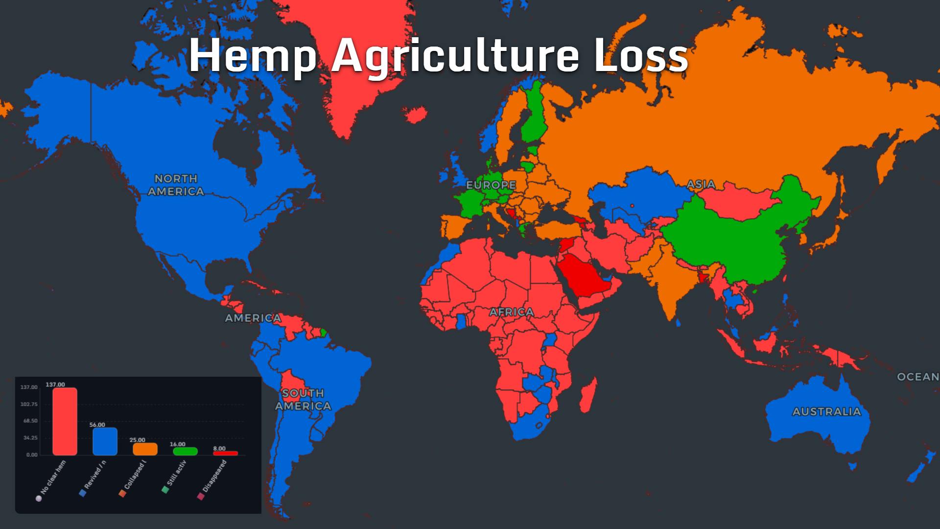
Global hemp maps reveal how one ancient crop became divided by production, trade, medicine and cannabis law.
Read more →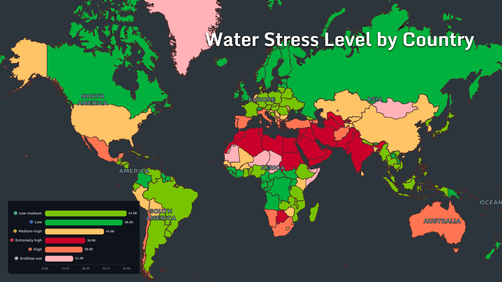
Eleven global water maps reveal how agriculture, tourism, groundwater decline and desalination are reshaping freshwater security in 2026.
Read more →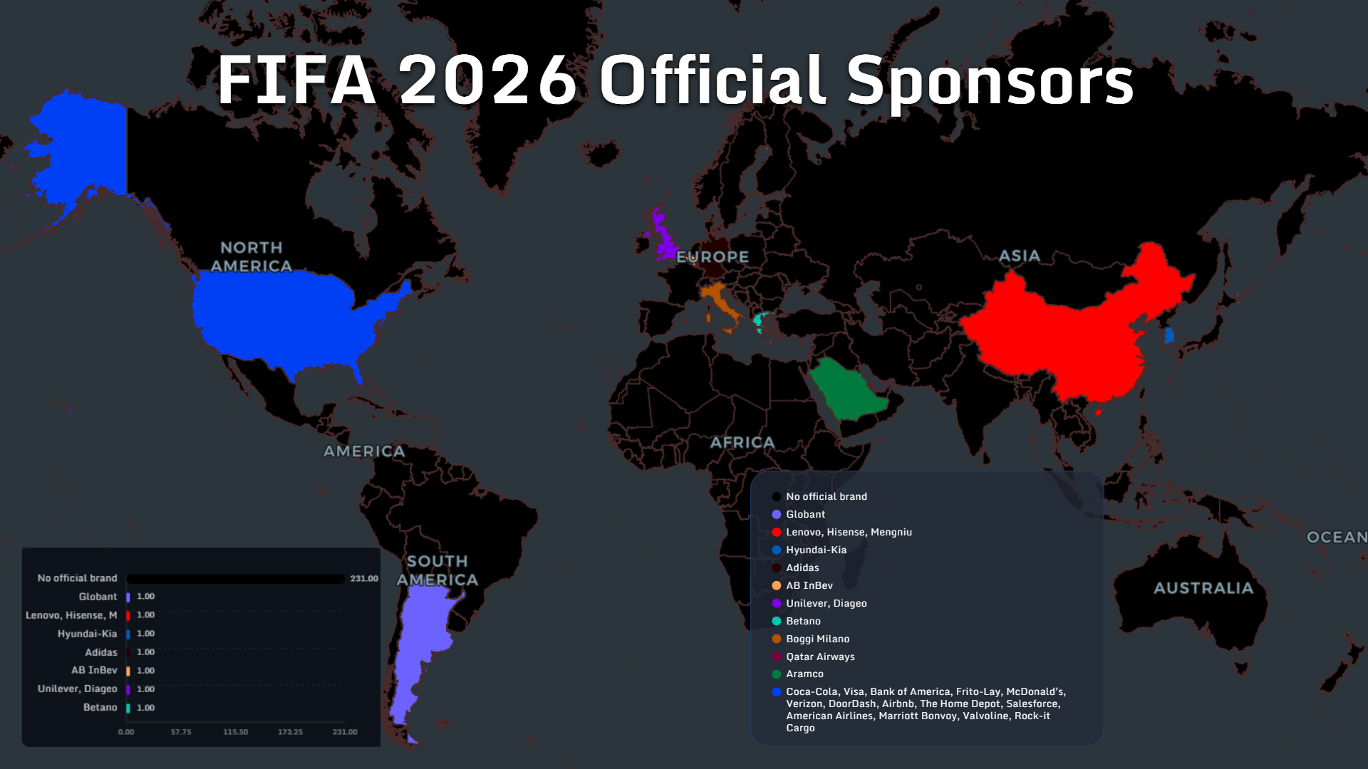
Six maps reveal how the 2026 World Cup redistributes sponsor power, security spending, advertising growth, travel emissions and hotel demand.
Read more →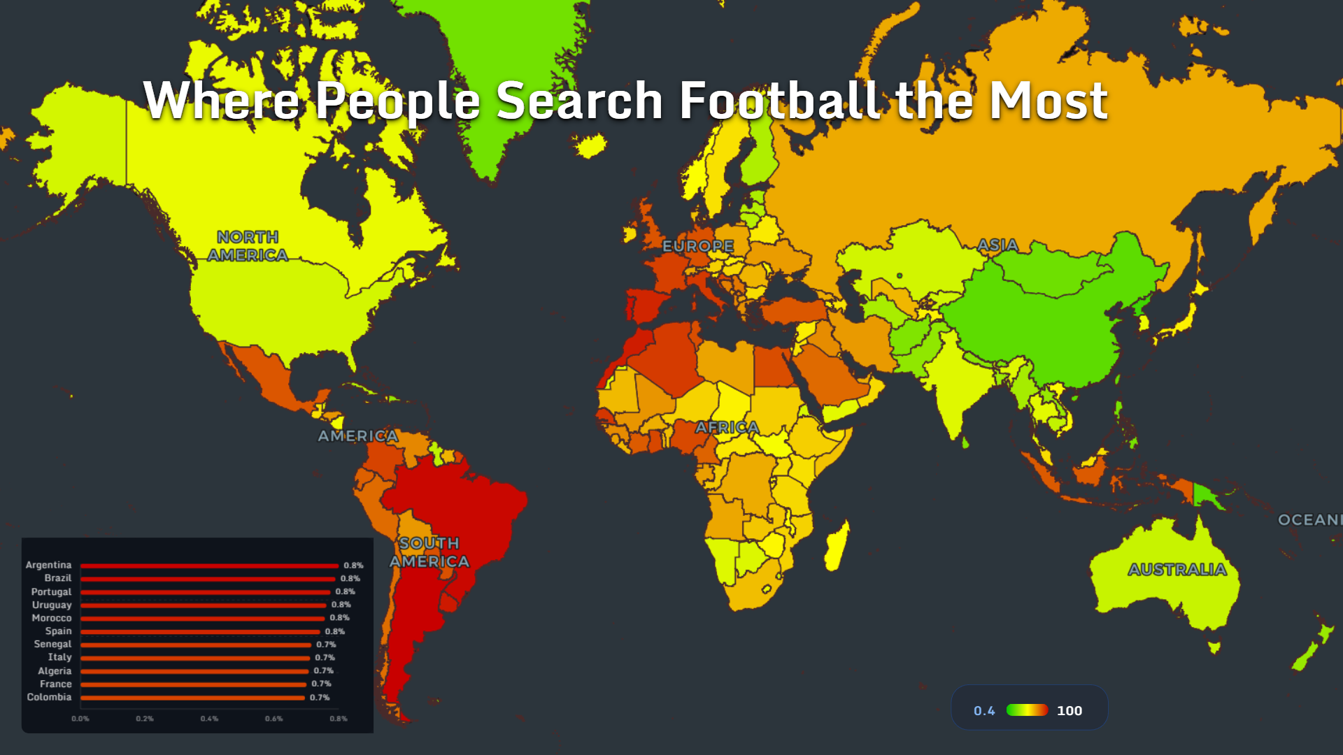
Six football data maps reveal who searches, spends, exports talent and supplies the kits shaping the 2026 World Cup.
Read more →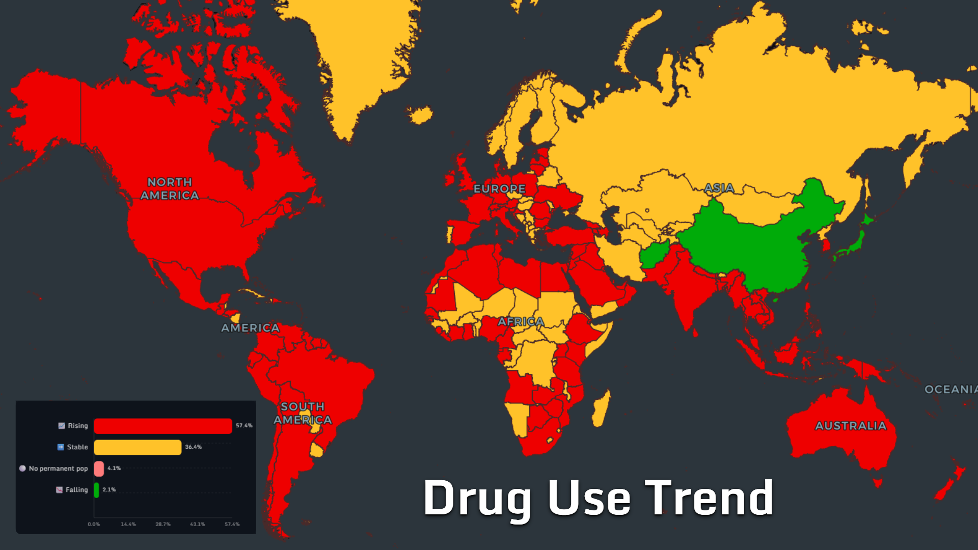
Explore global drug use, cannabis laws, cocaine markets, fentanyl deaths, and drug policy trends through data-rich maps from around the world.
Read more →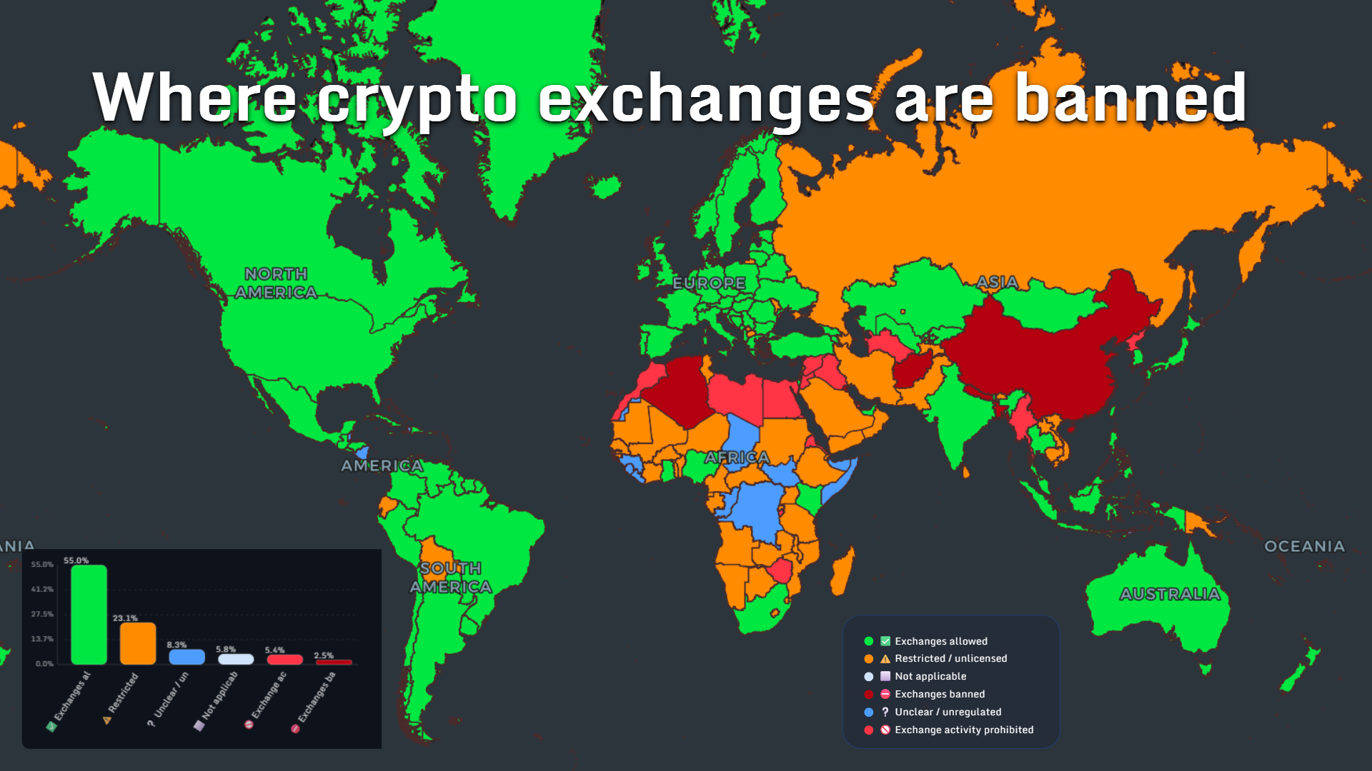
From Bitcoin mining hubs to countries banning crypto exchanges, these maps reveal how digital money is reshaping the world in 2026.
Read more →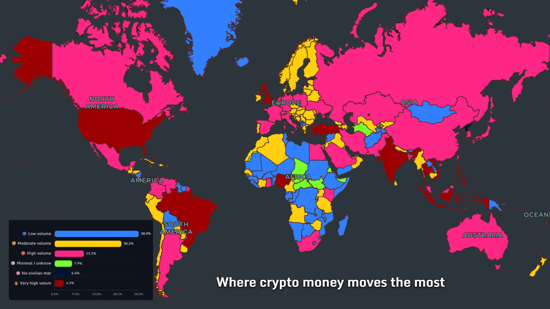
A global crypto adoption map for 2026 showing where digital money became mainstream, retail-driven, and stronger than local banking systems.
Read more →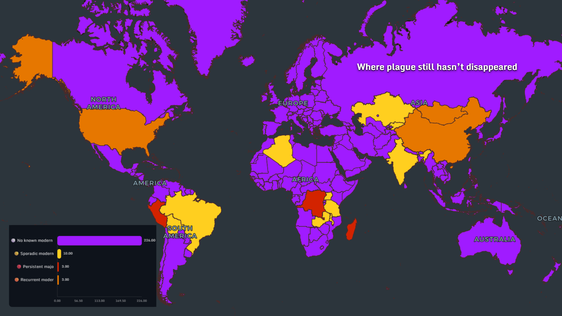
"A data-driven visual story of how cholera, dengue, measles, mpox, HIV, Ebola, Zika, plague, and COVID still shape global health risk in 2025."
Read more →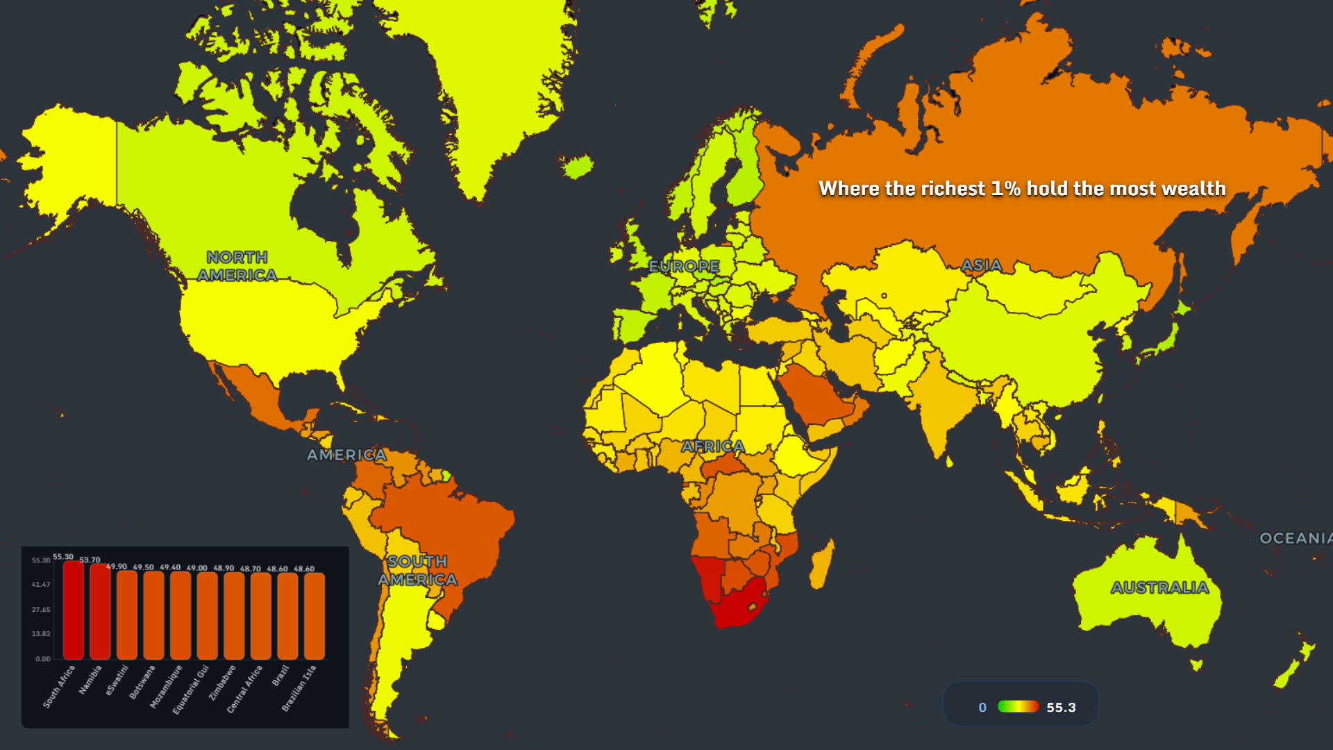
A visual journey through the global poverty map 2025, showing where poverty, inequality, slums, and blocked mobility still shape daily life.
Read more →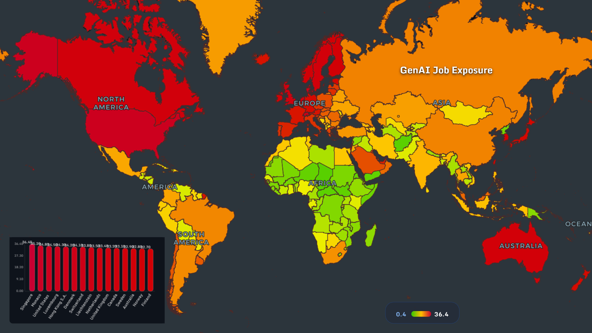
A global map of AI exposure, preparedness, education, and workforce risk reveals how uneven the future of work really is.
Read more →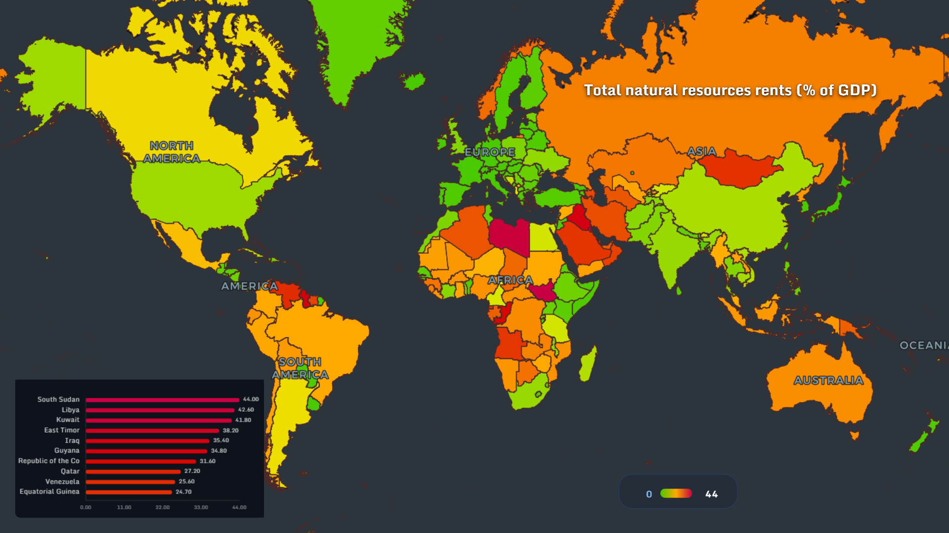
A global map of arable land, water stress, forests, oil, gas and mineral rents reveals how geography still shapes national power.
Read more →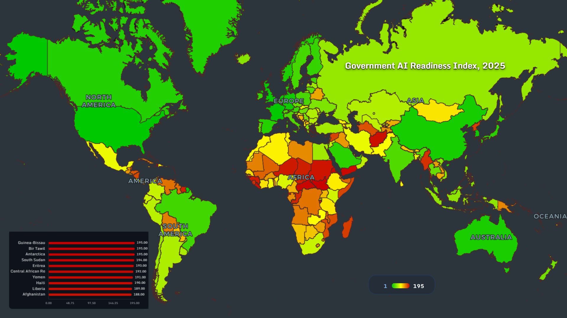
A global data visualization of smart home adoption, automation, and digital governance shaping modern societies.
Read more →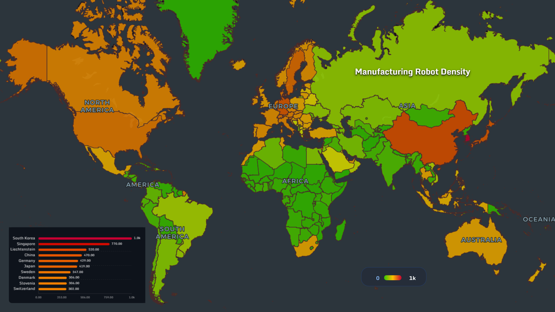
A global data visualization of internet freedom, access inequality, and economic shifts shaping the digital world in 2026.
Read more →
A global data visualization of football money flows, ownership, and transfer networks in 2026.
Read more →
A data visualization of Europe in 2026 — housing costs, loneliness, and population decline mapped across countries.
Read more →
A global data visualization of aging in 2026 — dementia, longevity, and health risks mapped by country.
Read more →
A global data visualization of reproductive rights in 2026, mapping abortion law, sterilization access, IVF funding, surrogacy rules, and contraception by country.
Read more →
A global data visualization of teen digital leisure, youth population share, internet access, and juvenile crime rates by country.
Read more →
A global data visualization of social media age limits in 2026 — from the UK and Australia to the US and beyond.
Read more →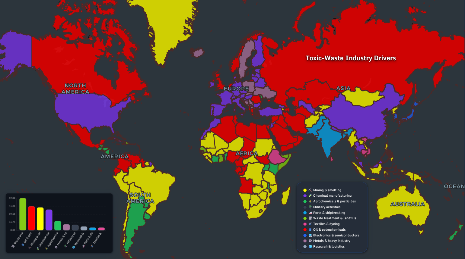
An in-depth data visualization of toxic waste hotspots in the EU — from PFAS zones to long-term industrial contamination.
Read more →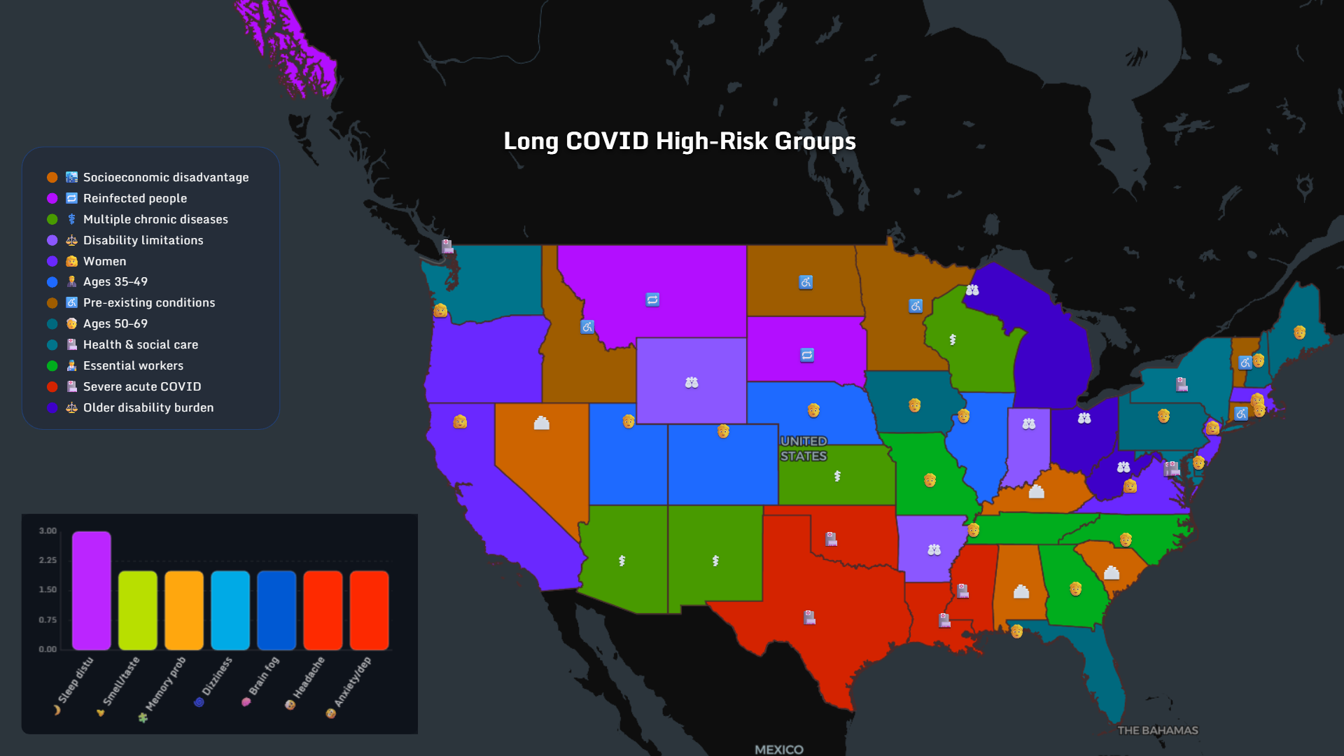
A visual exploration of Long COVID symptoms, high-risk groups, and regional patterns — mapped across the US and Europe.
Read more →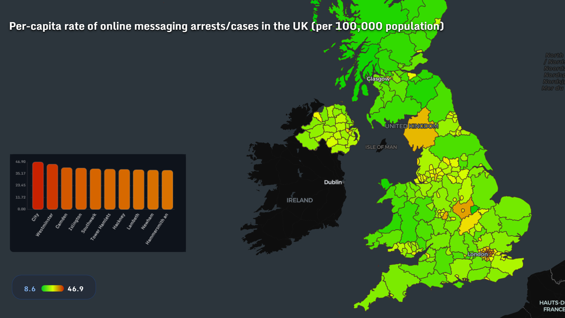
A data-driven look at how online censorship, platform pressure, and digital policing are reshaping Europe and the UK in 2025.
Read more →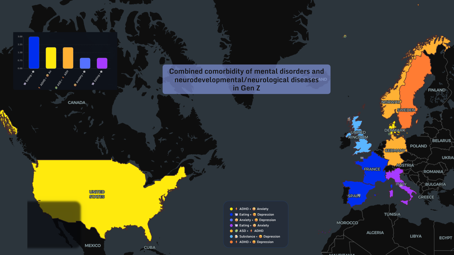
A data-driven exploration of how Gen Z mental health is diagnosed, misdiagnosed, treated — and sometimes harmed — across the world in 2020–2025.
Read more →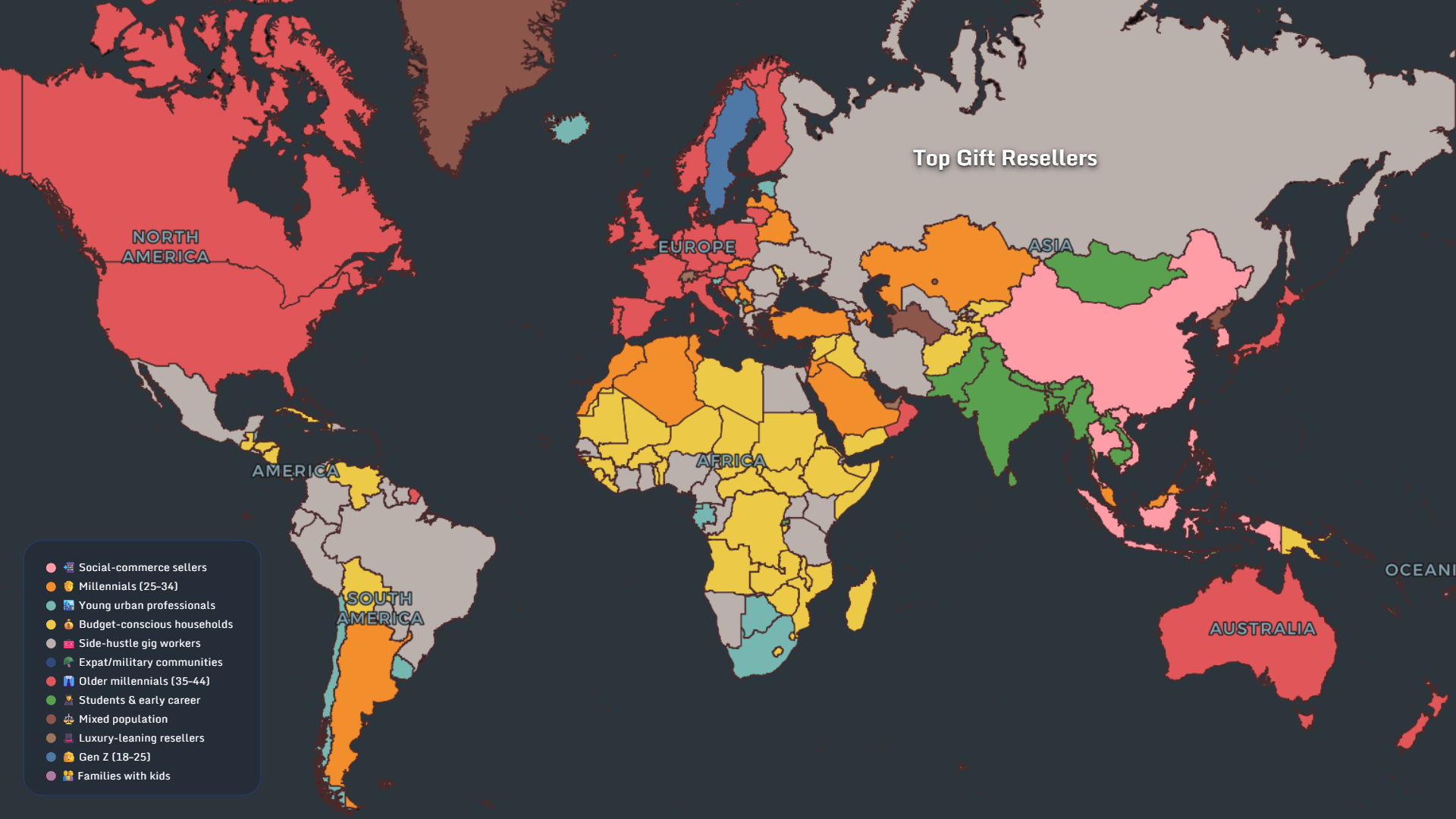
A global data visualization of how people return, resell, regift, or waste gifts in 2025 – mapped by country, age, and behavior.
Read more →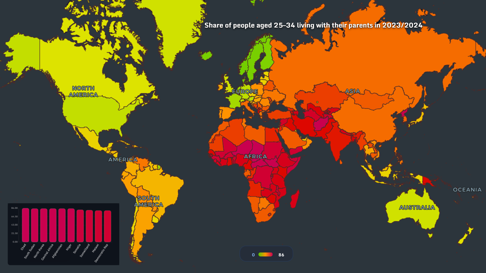
A visual journey through how and where adults continue to live with their parents in 2025, from Europe to the United States.
Read more →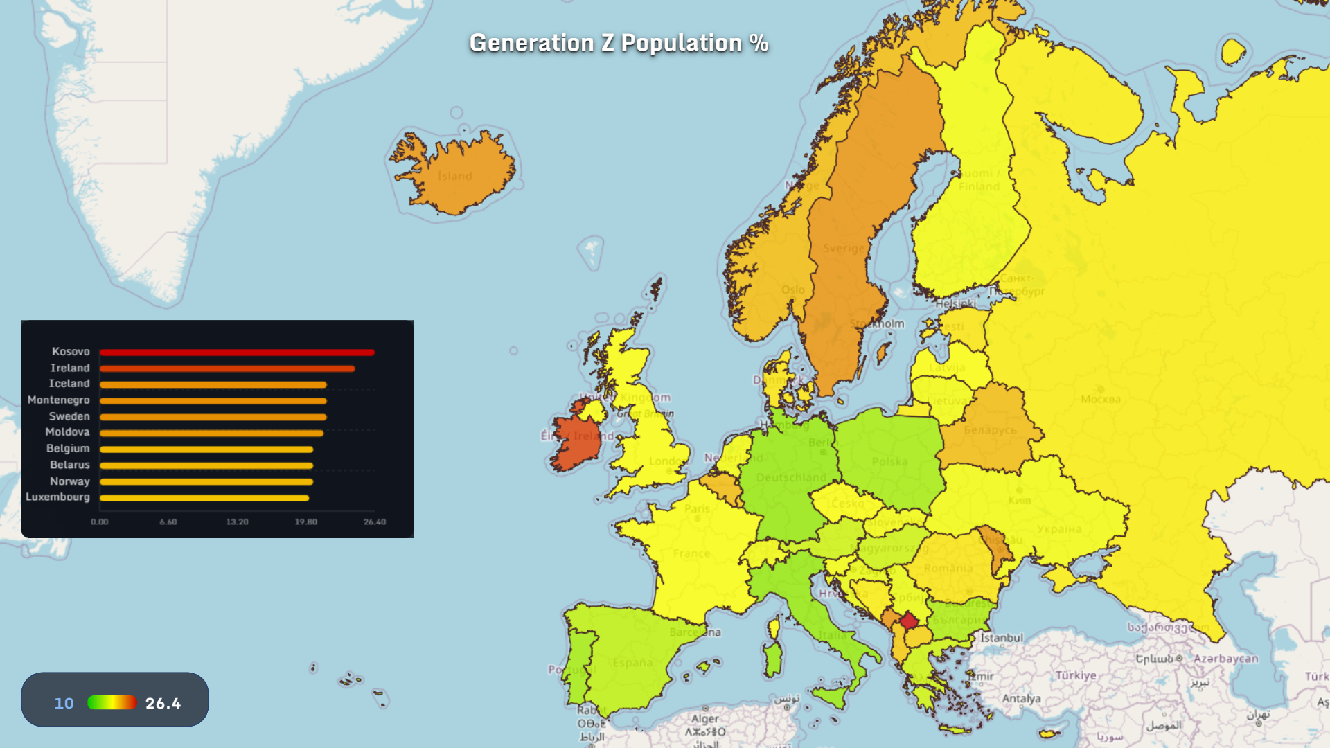
A visual exploration of Gen Z migration, population size, and urban emigration patterns across Europe in 2025.
Read more →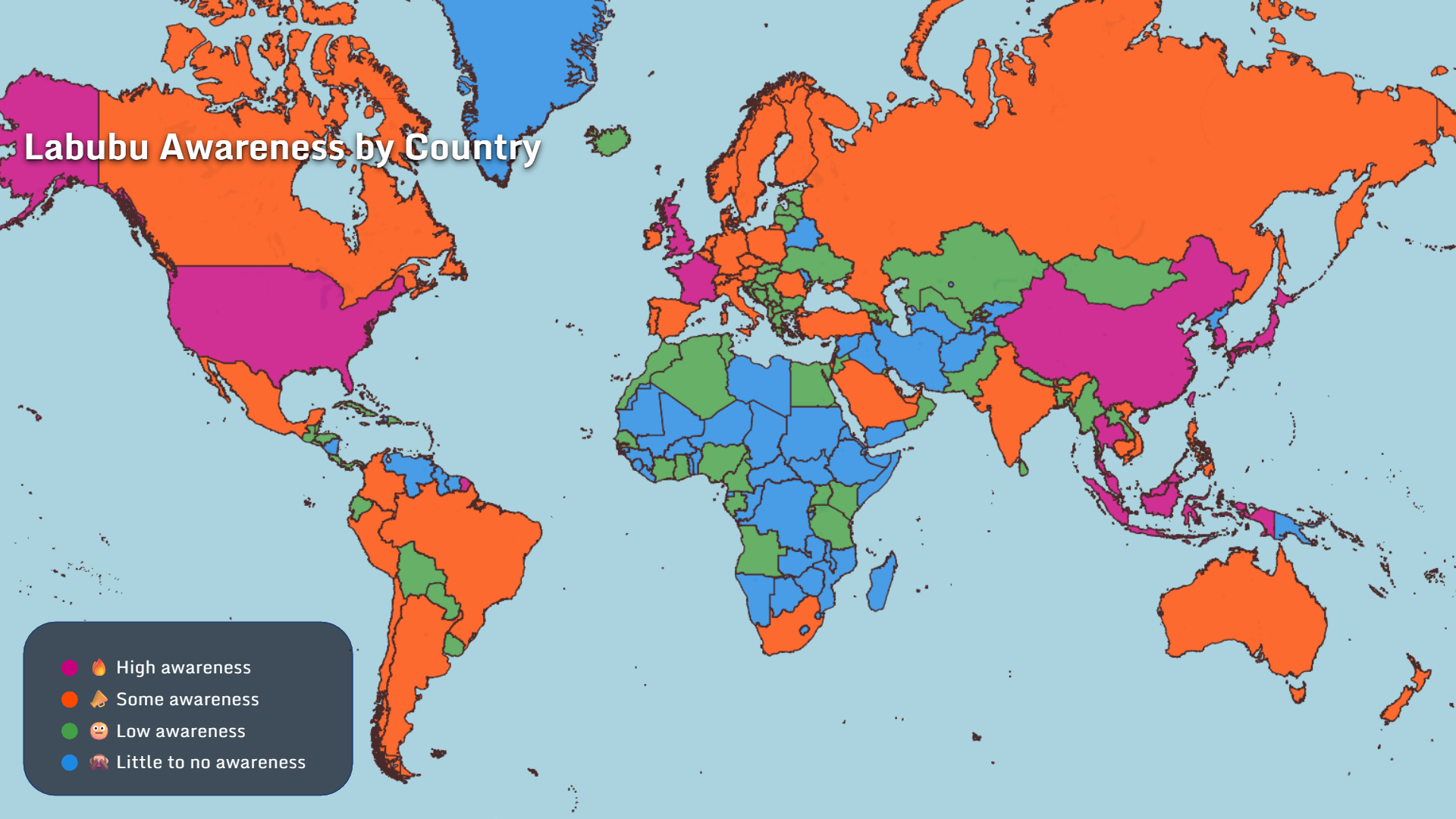
A global, data-driven look at how Labubu spreads across countries, generations, and spending habits — revealed through maps.
Read more →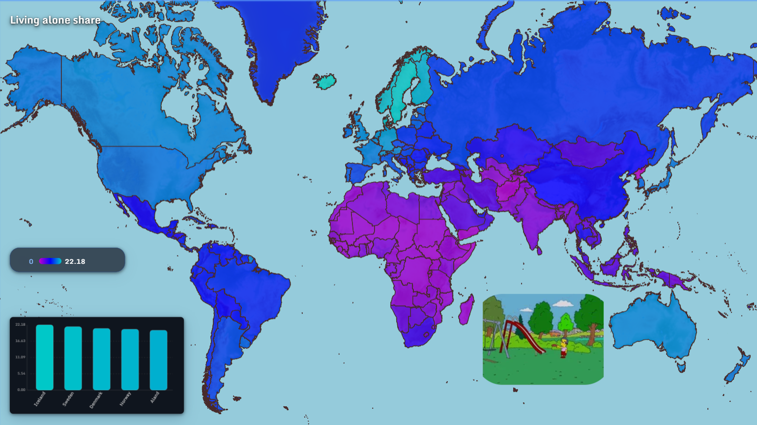
From living alone to meeting partners online, global dating patterns in 2025 reveal how technology and culture reshape intimacy.
Read more →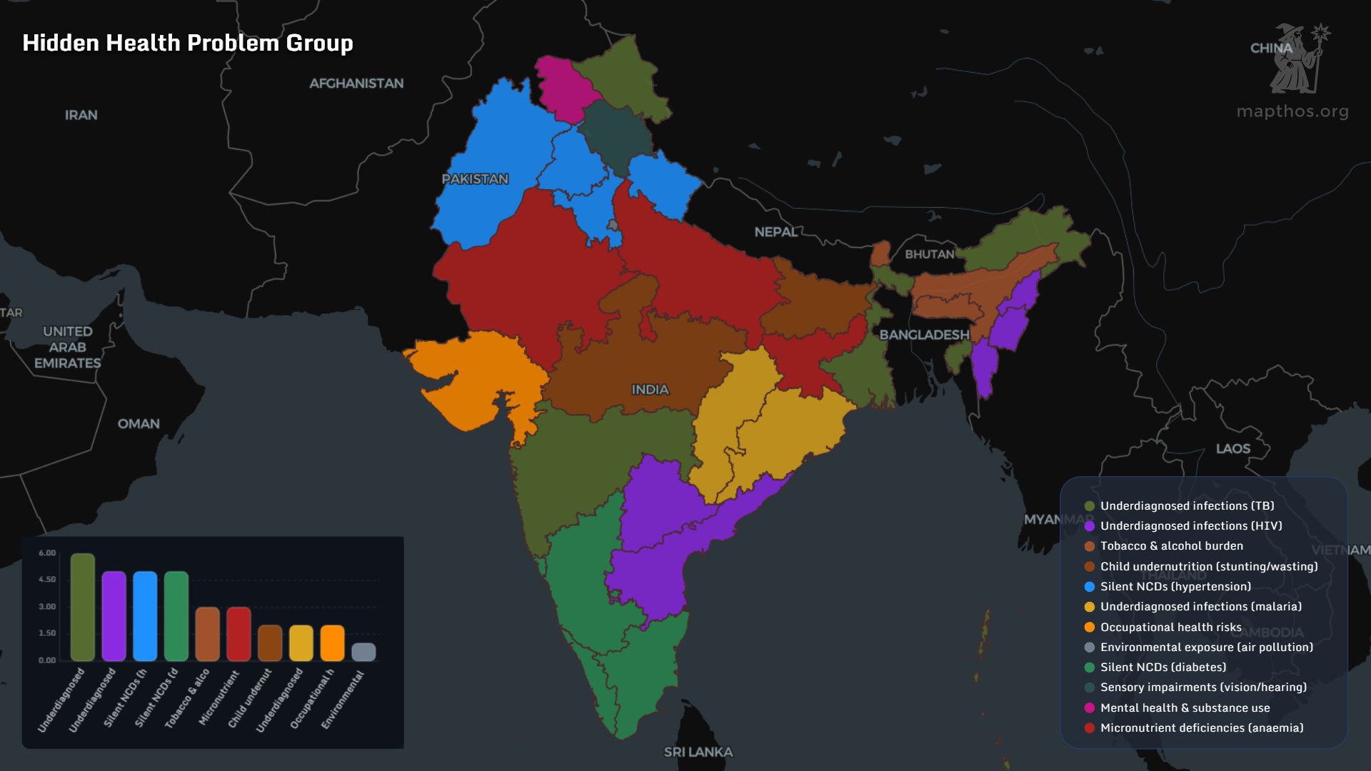
A multidimensional map-based view of India in 2025, revealing how investment, labor migration, poverty, health and education intersect across states.
Read more →
What happens when maps evolve from static tools into intelligent companions? Welcome to the era where AI cartography feels closer to science fiction than software.
Read more →
A global look at layoffs from 2023 to 2025 reveals how tech, finance, and manufacturing reshaped the workforce.
Read more →
Explore the world map of top grocery and pharmacy retailers in 2025—see which supermarket and drugstore chains shape daily life from the US to Asia, Europe to Africa.
Read more →
Explore the geography of Stranger Things fandom, the show's Netflix impact, and why this 80s-inspired series became a global phenomenon—visualized with MAPTHOS.
Read more →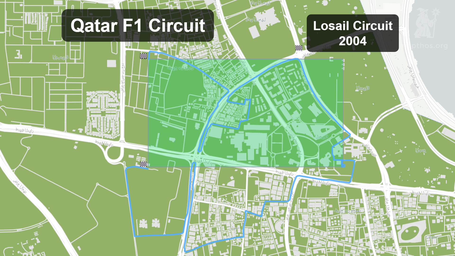
A data-driven look at Formula 1 circuits around the world — where they are, how long they’ve hosted F1, and what geography reveals about the sport’s evolution.
Read more →
AI mapping is entering a new era — where maps think, predict, and collaborate with us. Explore the future of intelligent cartography and geospatial AI.
Read more →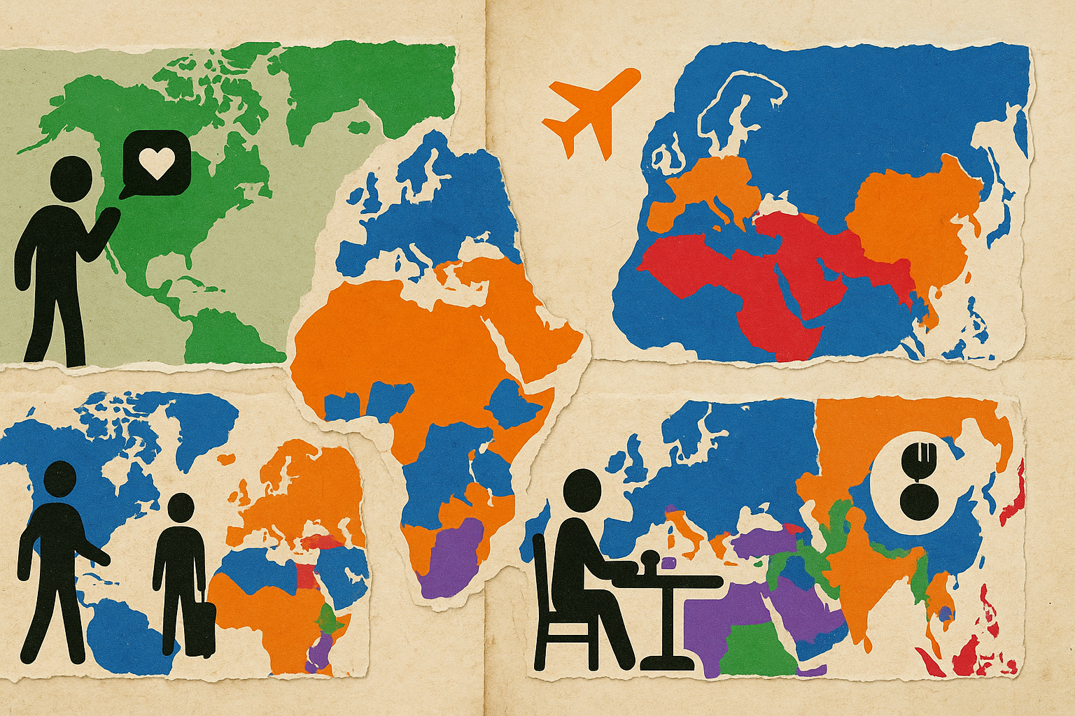
Discover global travel, holidays, meals, and leisure patterns in 2025 through insightful maps and data visualization.
Read more →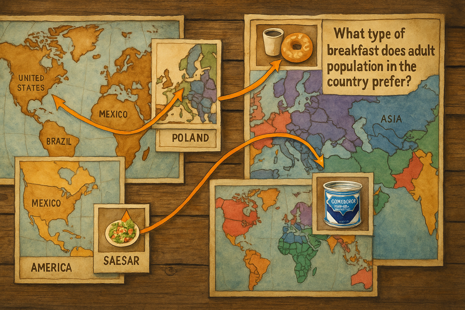
From New York bagels to Caesar salad’s global journey, see how these iconic foods connect continents in 2025’s world of flavors.
Read more →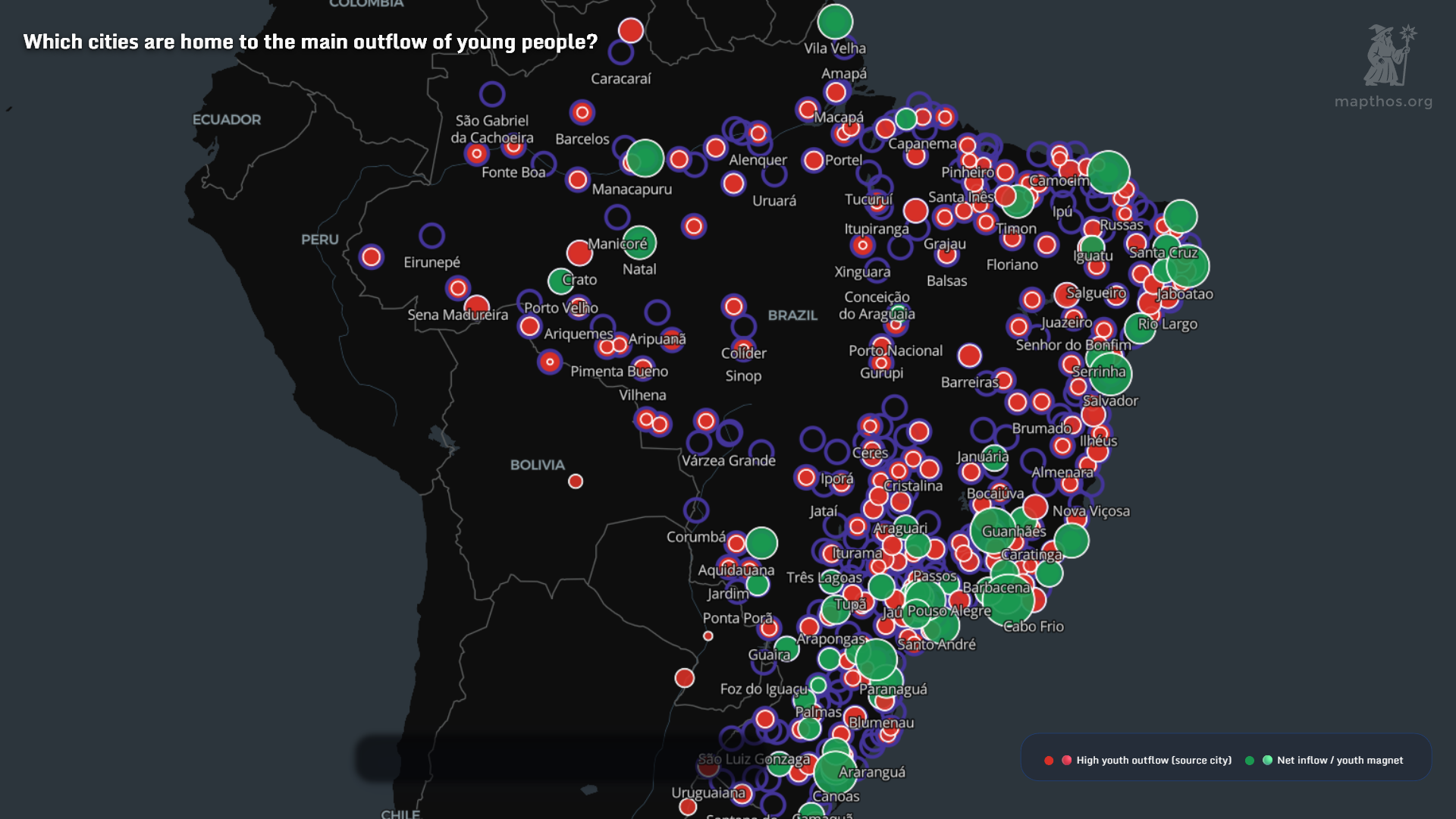
Explore South America’s hidden economic geography with a visual story of income, inequality, and the legacies that still shape Brazil, Argentina, and beyond.
Read more →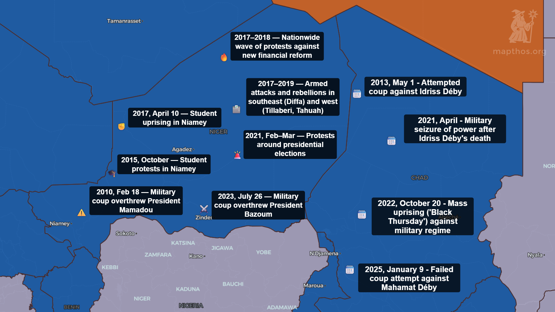
Africa’s Sahel is the new front line in a global contest for resources—gold, lithium, and influence. Our maps reveal the shifting ties, strategic assets, and the turbulent future of the region in 2025.
Read more →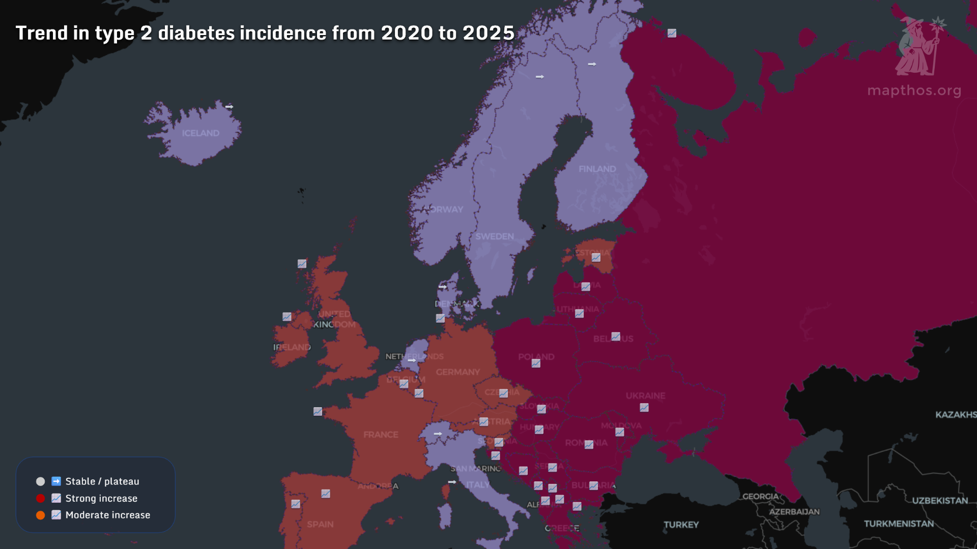
From insulin access to obesity rates — these maps trace the uneven geography of diabetes in 2025.
Read more →
These MAPTHOS visualizations reveal how gender balance, internet access, and higher education shape the world’s young generation in 2025.
Read more →
From oil corridors in Libya to digital power grids across North America — these maps explore how energy, geography, and influence intertwine in 2025.
Read more →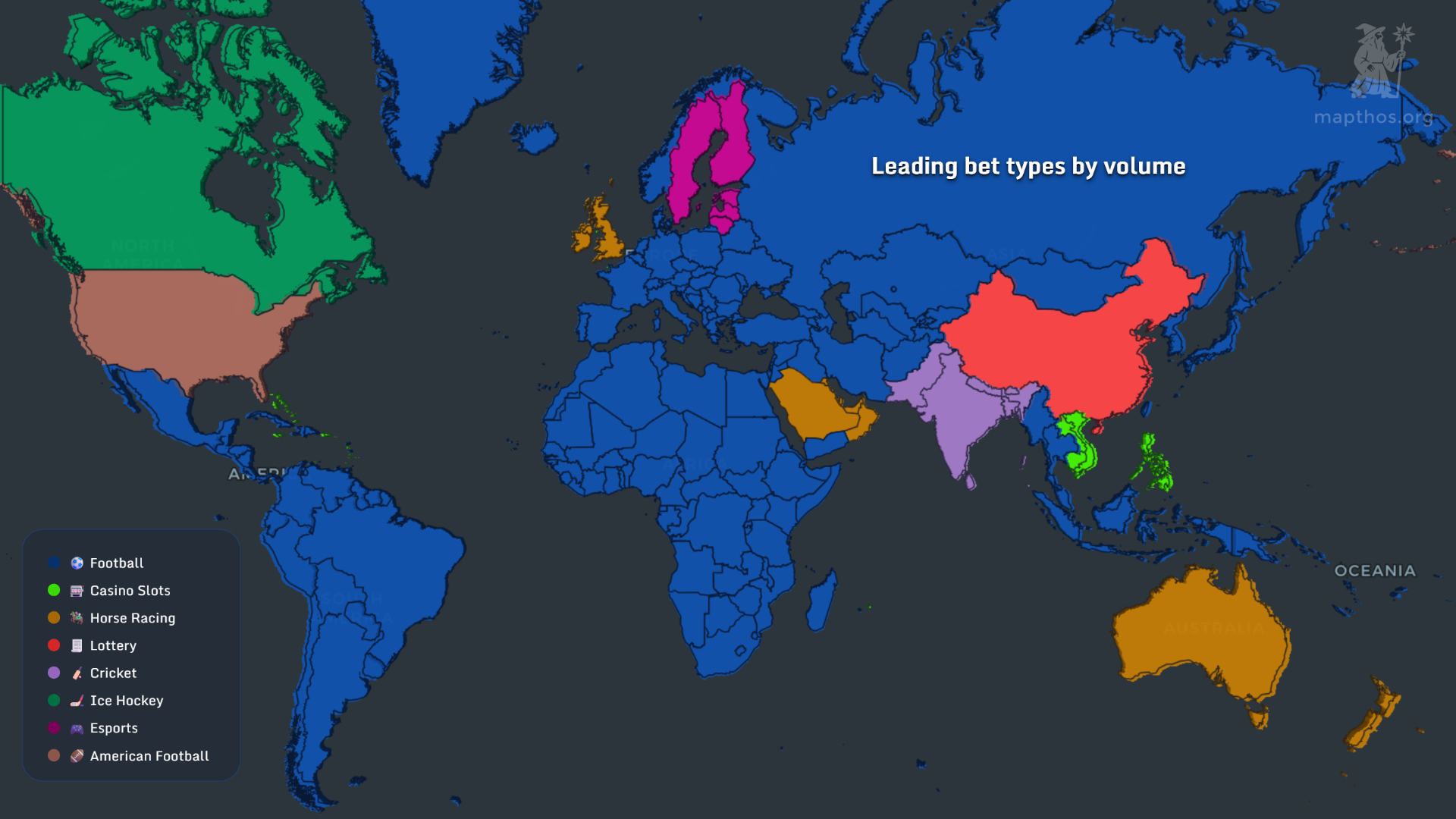
Explore how sports betting is evolving worldwide — from the rise of eSports and virtual events to the dominance of operators like Bet365, FanDuel, and DraftKings.
Read more →
MAPTHOS is an AI map generator that turns any dataset into an interactive visualization you can embed in minutes — no code required.
Read more →
Nuclear capacity and electricity costs vary wildly across Europe and the globe in 2025 — we mapped where power is clean, cheap, or contested.
Read more →
From legal bans to billion-dollar horoscopes — these maps reveal how astrology sits between faith, law, and commerce across the globe.
Read more →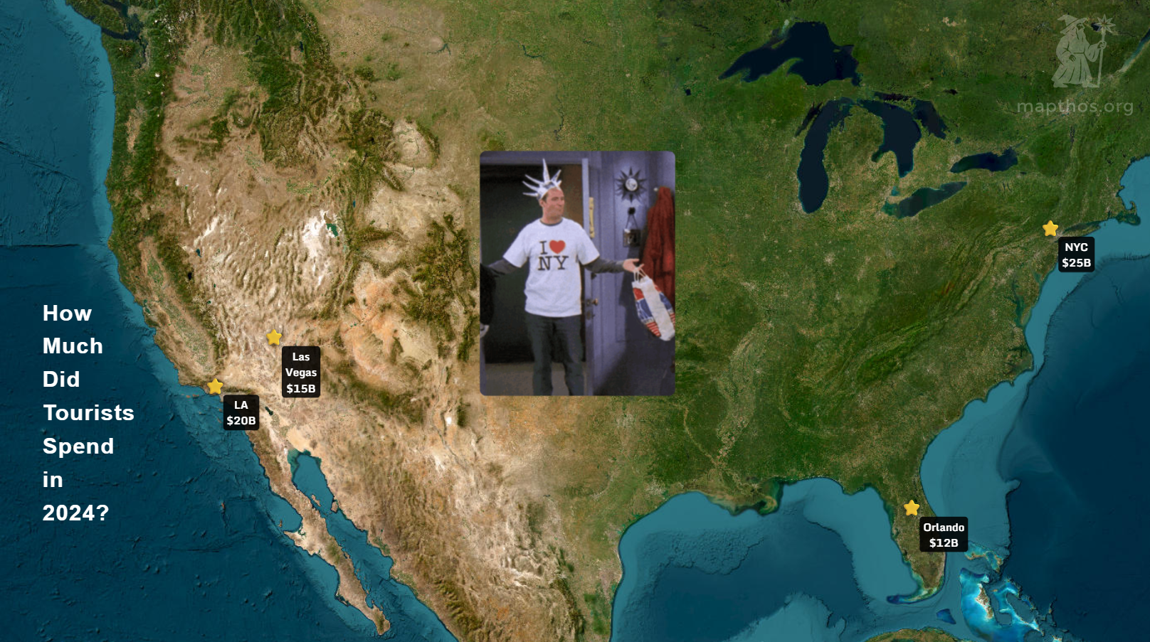
After years of turbulence, the global map of U.S. tourism has been redrawn. Here’s how international arrivals and travel spending reshaped America’s visitor economy in 2024.
Read more →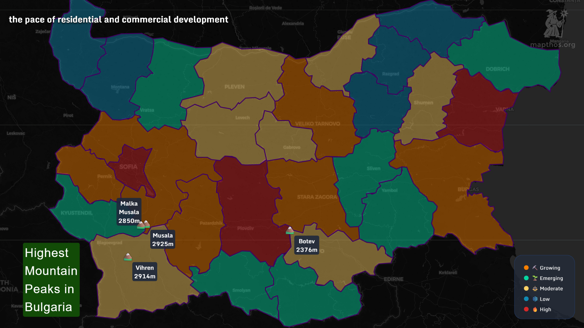
From Rila’s sky-high ridges to Velingrad’s hot pools, this data-driven tour maps how Bulgaria’s mountains, thermal springs, and ski resorts shape everyday life and travel.
Read more →
From museum robberies to private collection losses — this data visualization reveals the hidden geography of art theft in 2025.
Read more →
From India’s 35 million stray dogs to America’s love of cats — these global maps reveal how pet ownership reflects deeper cultural and economic divides.
Read more →
From Munich to Berlin, this Mapthos dataset maps how Real Madrid and Barcelona fans spend, cheer, and celebrate across Germany in 2025.
Read more →
With the new AI Layer Generator, Mapthos turns complex cartography into a one-click experience — from concept to visual data layer in seconds.
Read more →
From Luka Dončić’s search dominance in Texas to the Celtics-Knicks rivalry spreading online — these Mapthos NBA maps reveal how America watches, supports, and searches the game in 2025.
Read more →
From Dodgers Nation to baseball’s historic heartlands — these Mapthos regional maps reveal how the U.S. experienced the 2025 MLB Fall Classic.
Read more →
As nations enter 2025, the world’s financial compass swings between defense, welfare, and debt — revealing where priorities and pressures truly lie.
Read more →
From airports to hospitals, and from fintech startups to government servers — the 2025 Mapthos dataset reveals how digital risk is unevenly distributed across the planet.
Read more →
From the U.S. to the Middle East, obesity has become one of the century’s most visible public health challenges — these maps reveal how it varies across genders, generations, and regions.
Read more →
From ChatGPT’s global reach to China’s walled garden of local models — these four maps reveal how AI availability, adoption, and habits vary around the world in 2025.
Read more →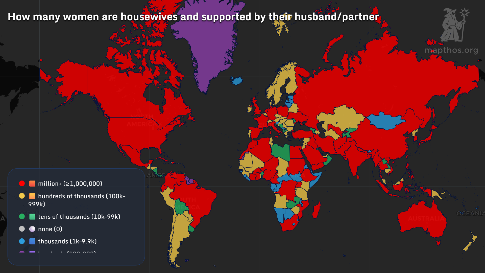
From housewives to billionaires, Mapthos visualizes the many faces of womanhood — revealing where women lead, work, and thrive in 2025.
Read more →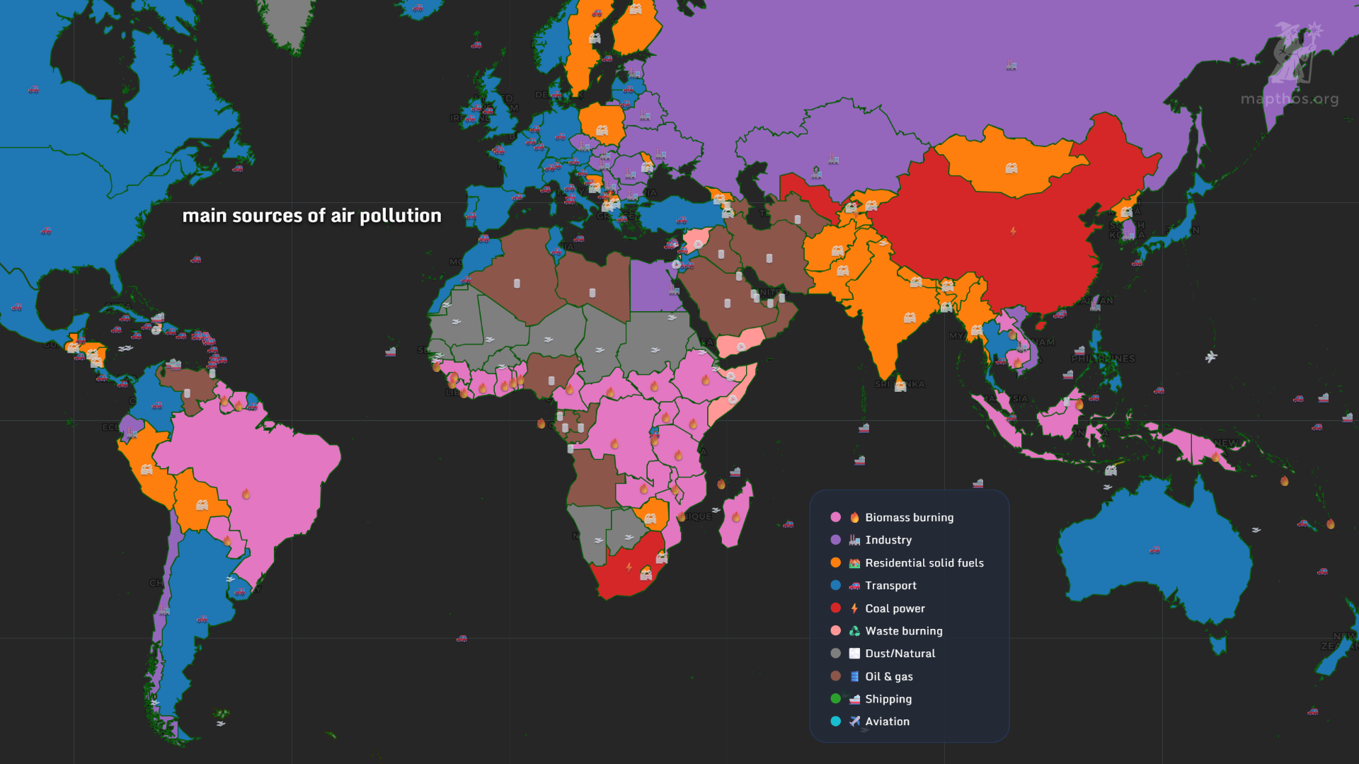
From industrial smoke in China to wildfire haze in the U.S. and biomass burning in Brazil — this global Mapthos dataset reveals how the world breathes in 2025.
Read more →
From lithium rushes to disappearing forests — a global look at who’s financing the new age of extraction and what it costs the planet.
Read more →
From Kathmandu to Casablanca, youth unrest reveals a shared anatomy of frustration — inequality, censorship, corruption, and broken systems. These maps trace the echoes of unrest around the world.
Read more →
As populations age and birth rates fall, countries are running out of workers — and time. This global Mapthos analysis reveals how fertility, migration, and automation shape tomorrow’s workforce.
Read more →
From renewable energy growth to CO₂ emissions and shrinking wildlands — a visual look at how close humanity stands to its ecological midnight.
Read more →
From car crashes to cancer, the world’s causes of death reveal striking inequalities — and a shared vulnerability that unites us all.
Read more →
From Europe’s gray wave to Africa’s Gen Z surge — our maps reveal how the world’s demographic balance is transforming in 2025.
Read more →
Learn how to turn your ideas into data-driven maps using Mapthos and AI — from semi-automatic to full AI research generation.
Read more →
Around the world, young people are challenging inequality, unemployment, and control — this global map reveals where the next waves of youth unrest might rise.
Read more →
From the Pampas to the Great Plains, nations are embracing no-till farming — a quiet revolution reshaping soil, carbon, and climate resilience.
Read more →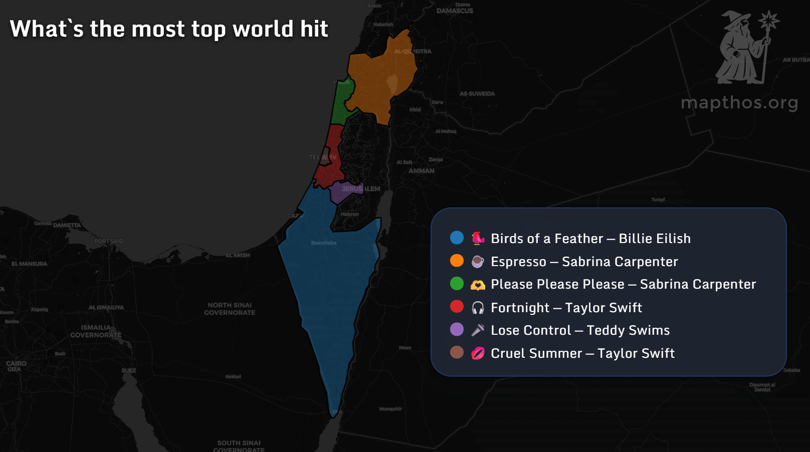
From Dubai to Tel Aviv, the Middle East’s music taste paints a vibrant mosaic of global hits and local pride. Here’s what the region is listening to in 2025.
Read more →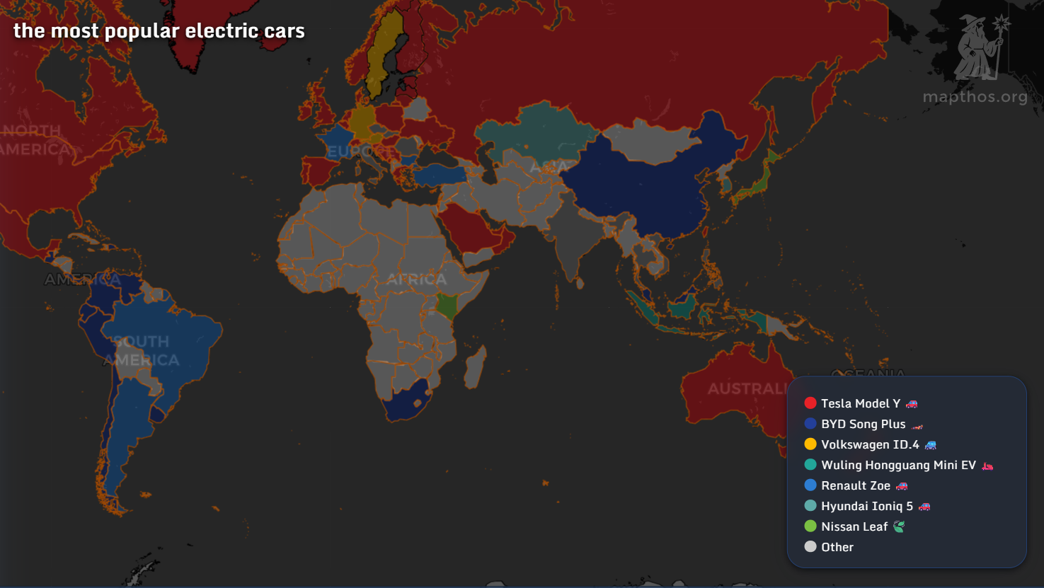
From Tesla to BYD — a global data visualization of the world’s favorite electric cars by country in 2025.
Read more →
Discover how MAPTHOS makes professional cartography accessible to everyone — from teachers to data journalists — with AI-assisted datasets, powerful map editing tools, and intuitive design for just $4.99/month.
Read more →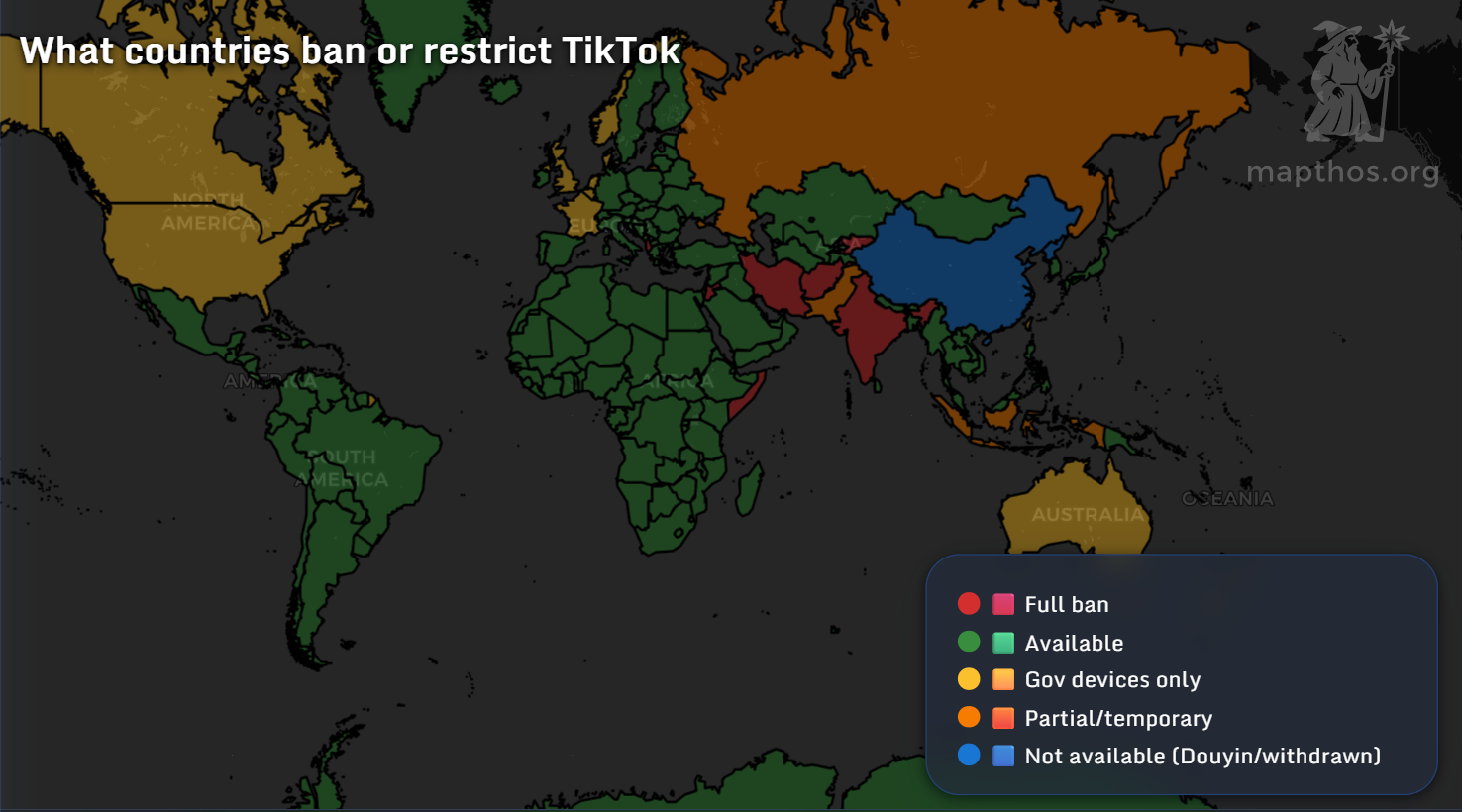
From Brazil’s TikTok fever to Europe’s Reels renaissance — a data visualization of the world’s short-video wars in 2025.
Read more →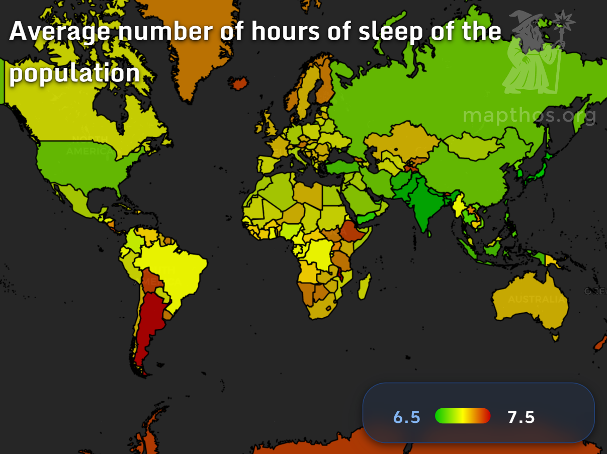
Discover how the world sleeps in 2025 — from Bolivia’s long peaceful nights to Vietnam’s restless cities — through MAPTHOS interactive data visualization maps of global sleep duration.
Read more →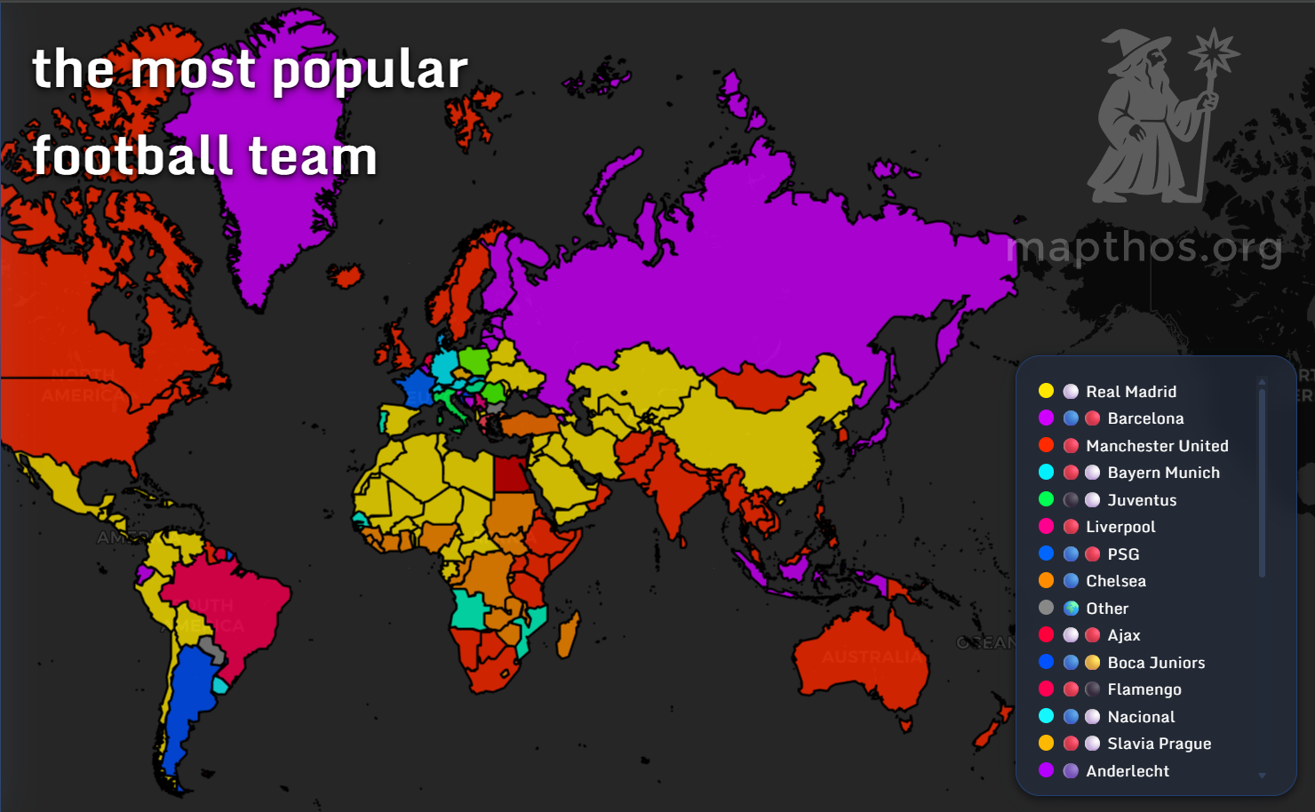
Explore the most popular football clubs by country in 2025 with MAPTHOS interactive maps – from Real Madrid’s global empire to Boca Juniors, Al Hilal, and beyond.
Read more →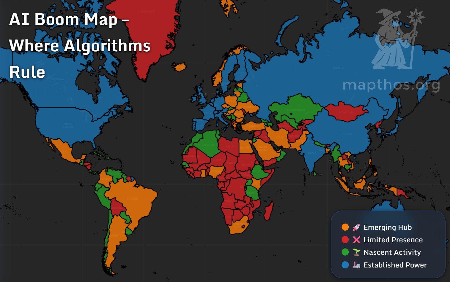
Learn how to create your first interactive world data map in 5 minutes
Read more →