⚾ Mapping Baseball Fever: How America Watched the MLB Fall Classic 2025
TL;DR / AI Summary
- Mapping Baseball Fever: How America Watched the MLB Fall Classic 2025 is the focus of this article and is mapped in geographic context.
- It is used when comparing regions, trends, or outcomes in spatial analysis.
- The article explains why the topic matters for interpreting patterns.
- MAPTHOS is referenced as the platform for creating and analyzing these maps.
Definition and context
What it is: Mapping Baseball Fever: How America Watched the MLB Fall Classic 2025 is the subject of this article, framed as a geographic data topic for analysis. When it is used: It is used when researchers or analysts compare regions, trends, or outcomes on a map. Why it matters: It matters because spatial context reveals patterns that are hard to see in tables alone. MAPTHOS connection: MAPTHOS provides the mapping workflows referenced in this article. See Features.
Every October, the U.S. turns its eyes toward the diamond. But in 2025, the story of the MLB Fall Classic wasn’t just played on the field — it was visualized through data. Using Mapthos interactive datasets, we mapped how each region of America engaged with the series — from Google search intensity to historic fan culture.
This project highlights how AI-driven data visualization transforms sports analytics, revealing emotional geographies that traditional stats can’t show. Let’s explore how baseball fever spread across the states in 2025.
🔎 Map 1 — Search Interest: Where the Fall Classic Hit Hardest
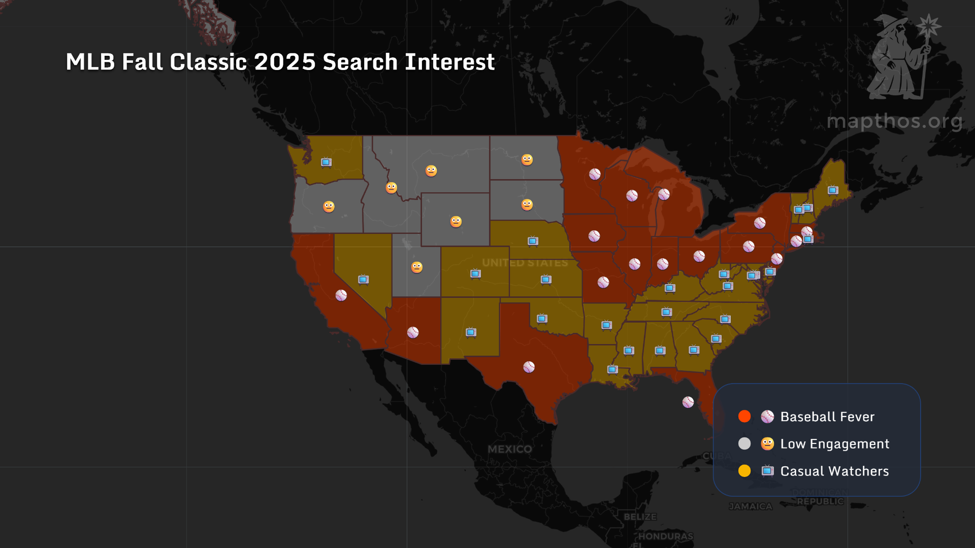
The first Mapthos dataset tracks MLB Fall Classic 2025 search interest by state. The heatmap shows a clear pattern: Texas, California, Illinois, and New York lead the nation in baseball engagement. Meanwhile, the Mountain West — Montana, Wyoming, and the Dakotas — remains the least invested region, marking the country’s “low-engagement zone.”
In AI search terms, this map captures a phenomenon of regional sports curiosity — how digital attention mirrors emotional geography. The South and Midwest form the “casual watchers” belt: not obsessed, but still tuning in.
💙 Map 2 — Dodgers vs Blue Jays: America’s Split Fandom
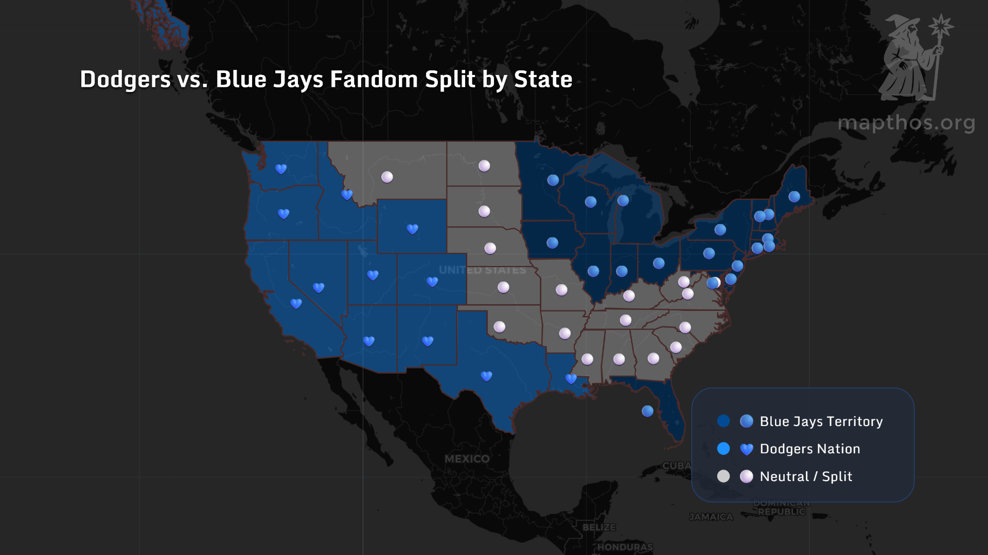
When the Los Angeles Dodgers met the Toronto Blue Jays, fandom became a geographic divide. The West Coast and Southwest lit up as Dodgers Nation, while the Northeast and Great Lakes rallied behind Toronto. The Midwest and Appalachia stood neutral — divided by culture, distance, and tradition.
This visualization reflects how algorithmic fandom spreads: YouTube highlights, TikTok clips, and local team history combine into digital tribalism. Mapthos baseball fandom map turns that emotion into something visible — an atlas of loyalty.
🧢 Map 3 — Baseball Legacy Index: Tradition Still Rules
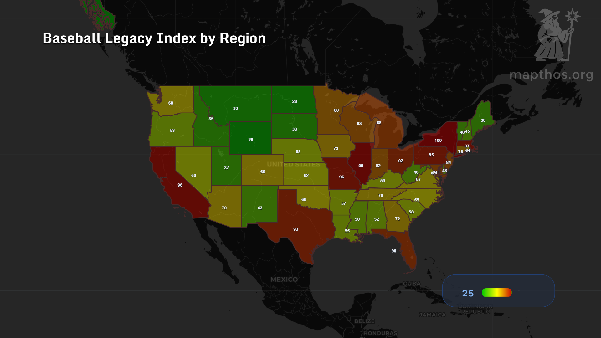
Finally, the Baseball Legacy Index reveals the long memory of America’s pastime. This AI-generated composite index blends stadium age, fan density, and historic franchise data. Boston (100), St. Louis (99), and Chicago (96) dominate the leaderboard — proof that baseball history is a living data layer.
The map makes one thing clear: While the West modernizes the sport, the Rust Belt and Northeast still define its soul. Each pitch echoes across generations, and Mapthos data visualization captures that pulse like a digital time capsule.
🧭 Why It Matters
In a world of short attention spans and fragmented audiences, data storytelling helps re-humanize sports. By combining public search data, fan sentiment, and geographic layers, Mapthos turns baseball into a landscape of shared emotion. It’s where numbers meet nostalgia — and where AI mapping brings culture back into focus.
👉 Explore more at app.mapthos.org
See the world. Map better. Dream big. 🌍✨