☣️ Poisoned Territories of Europe in 2026
We often think of pollution as something abstract — a statistic, a news headline, a distant industrial problem. But on a map, it becomes something else entirely. It becomes territory.
In 2026, Europe’s toxic legacy is not just historical. It is spatial. It is measurable. And in many regions, it is still unfolding.
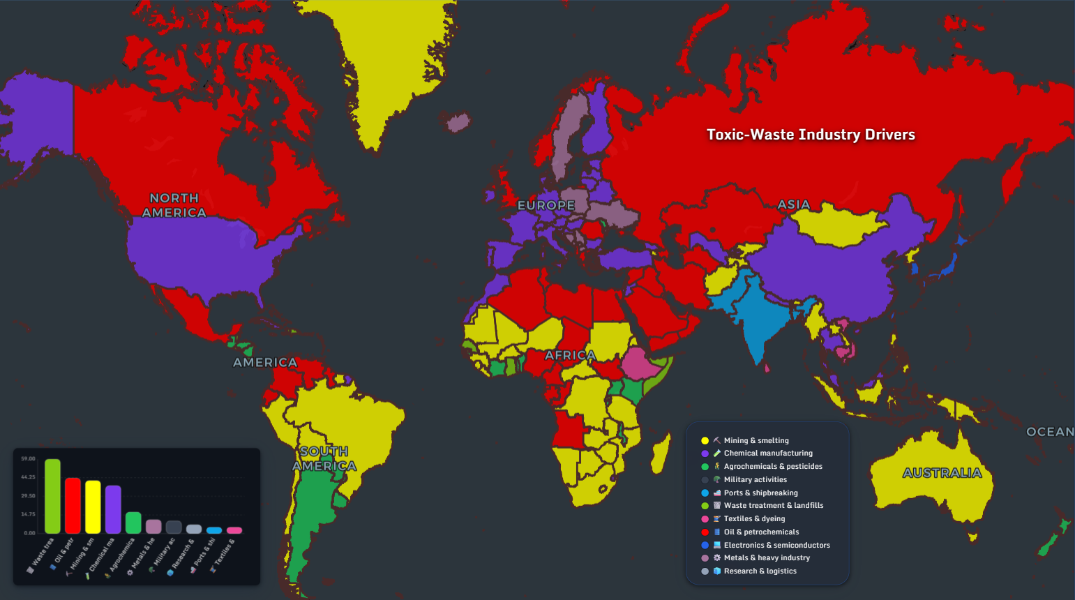
The global toxic-waste industry drivers map reveals how mining & smelting, petrochemicals, chemical manufacturing, and waste treatment cluster geographically. Europe appears highly diversified — but also highly industrialized. And that industrial depth carries consequences.
Let’s zoom in.
🇳🇱 PFAS Contamination in the Netherlands
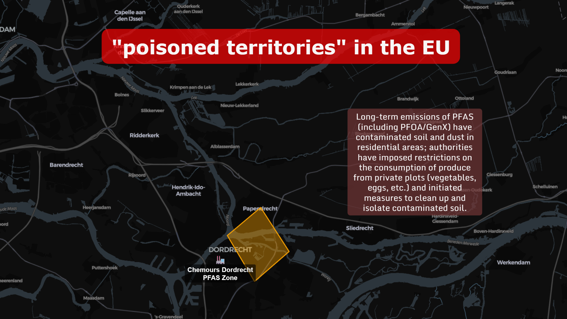
Near Dordrecht, long-term emissions of PFAS (including PFOA/GenX) have contaminated soil and dust in residential zones.
Authorities imposed restrictions on:
- Consumption of vegetables from private gardens
- Eggs from backyard chickens
- Soil contact for children in certain areas
This is not just a chemical issue. It’s a geographic one.
🇧🇪 Belgium: 3M and the Expanding PFAS Hotspot
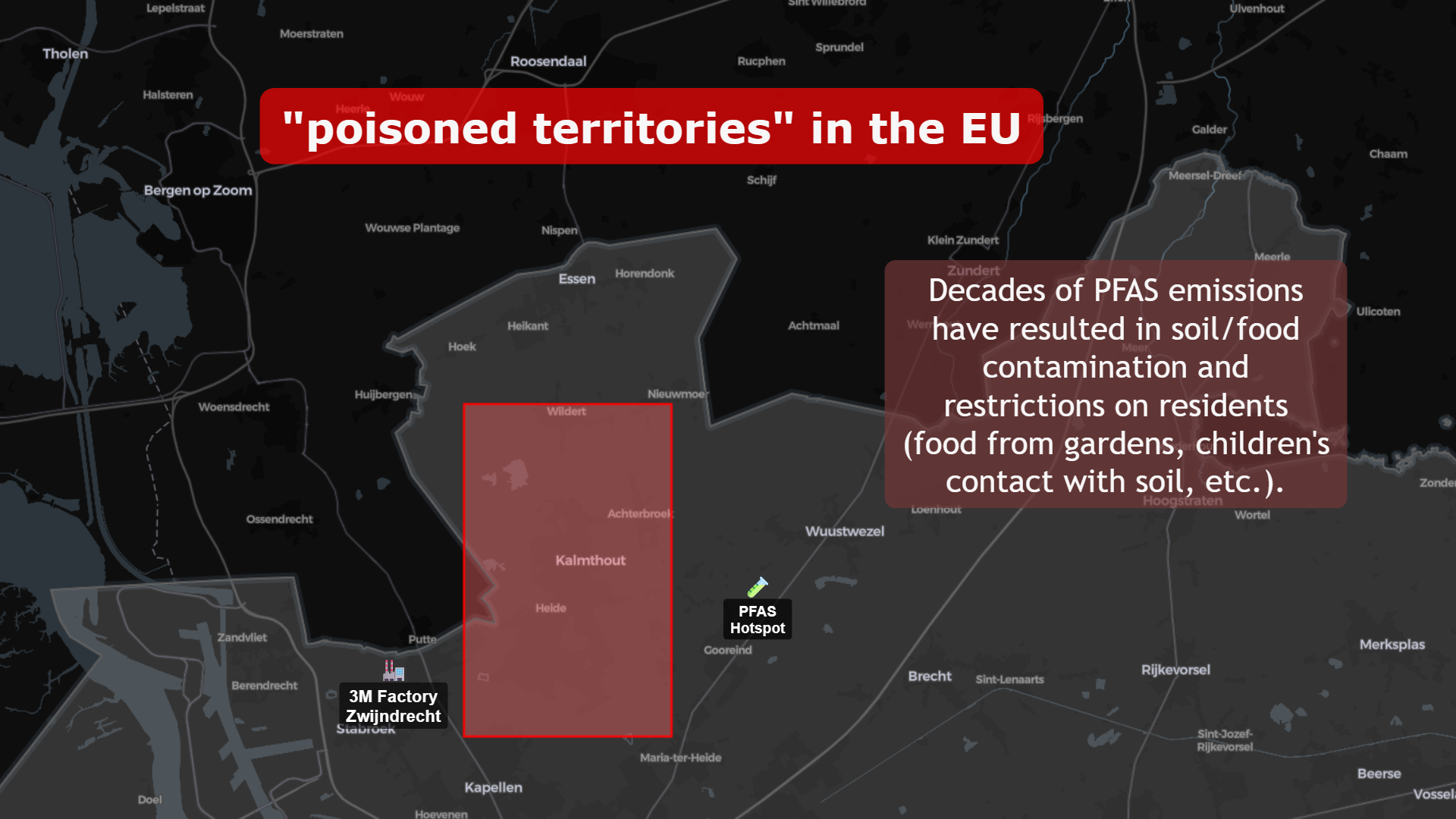
The Zwijndrecht PFAS hotspot near the 3M facility illustrates a similar pattern.
Decades of emissions resulted in:
- Soil contamination
- Food chain restrictions
- Public health monitoring campaigns
Mapping this spatially transforms the debate from abstract policy to lived geography.
🇪🇸 Huelva: Industrial Waste and Phosphogypsum
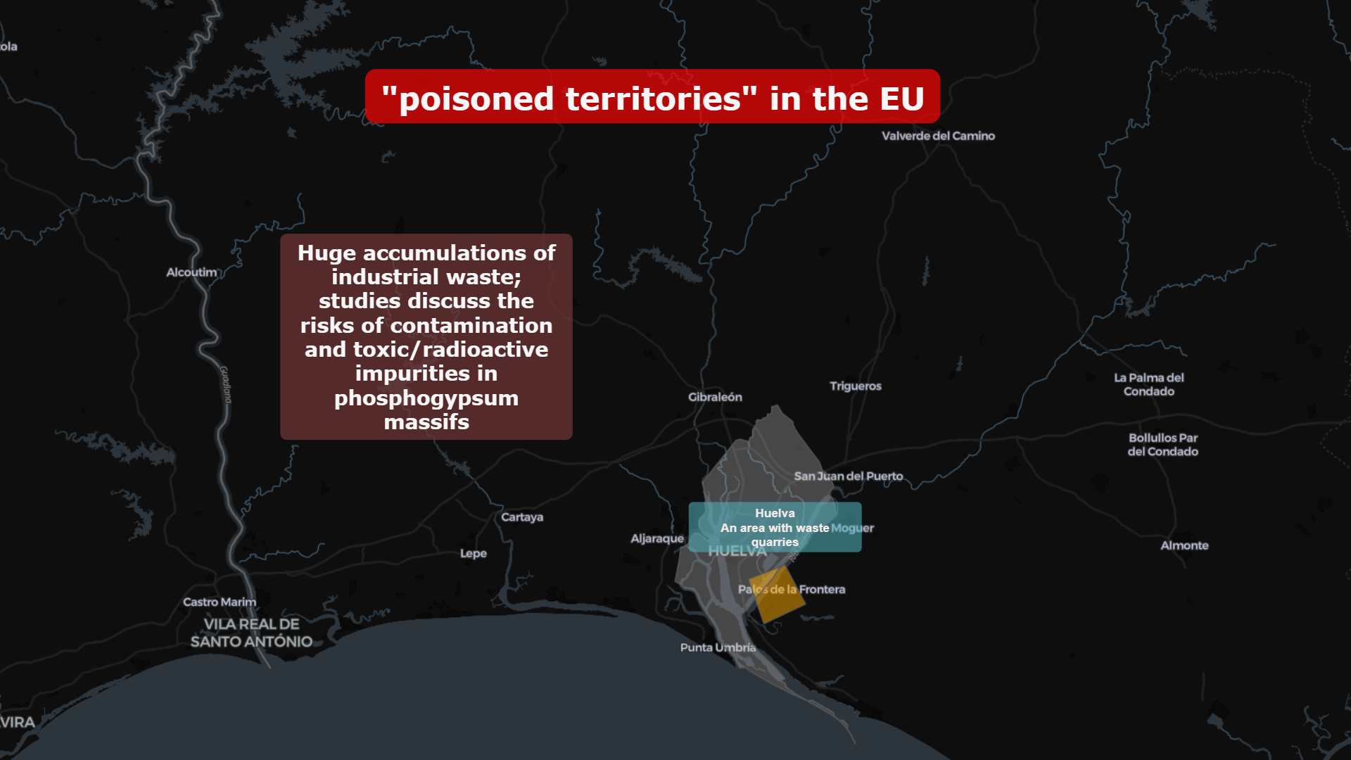
In southern Spain, near Huelva, massive phosphogypsum stacks remain one of Europe’s most visible industrial waste accumulations.
Studies discuss:
- Toxic and radioactive impurities
- Long-term soil and water contamination risks
- Proximity to residential and coastal ecosystems
Here, industrial waste becomes topography.
🇮🇹 Terra dei Fuochi: Italy’s Long Shadow
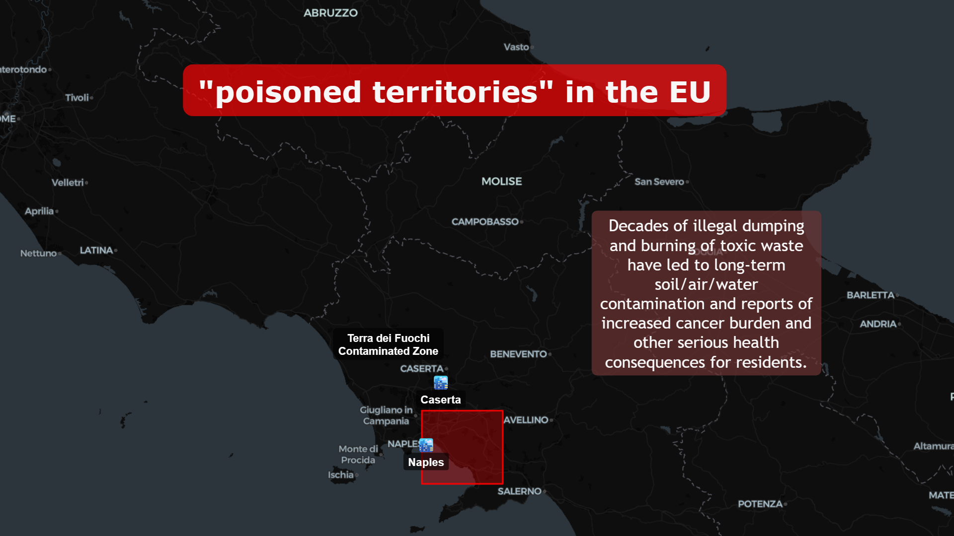
Between Naples and Caserta lies “Terra dei Fuochi” — a region shaped by decades of illegal dumping and burning of toxic waste.
Reported consequences include:
- Soil, air, and groundwater contamination
- Elevated public health concerns
- Long-term remediation efforts
And its effects compound over time.
The Economic Geography of Pollution
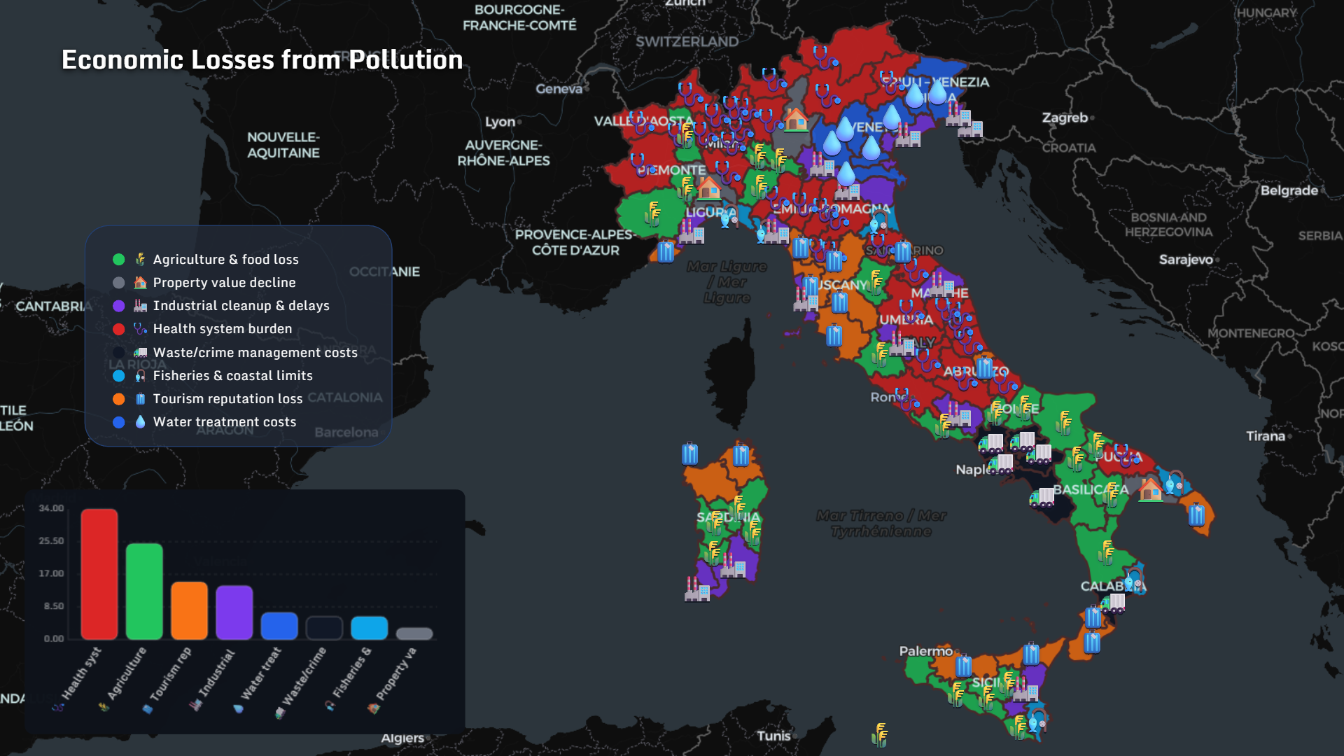
Pollution is not only environmental — it is economic.
In Italy, regional analysis shows impacts across:
- Health system burden
- Agriculture & food loss
- Tourism reputation decline
- Industrial cleanup & delays
- Property value depreciation
- Fisheries and coastal limits
Pollution reshapes markets.
Toxic Exposure Marker Diseases
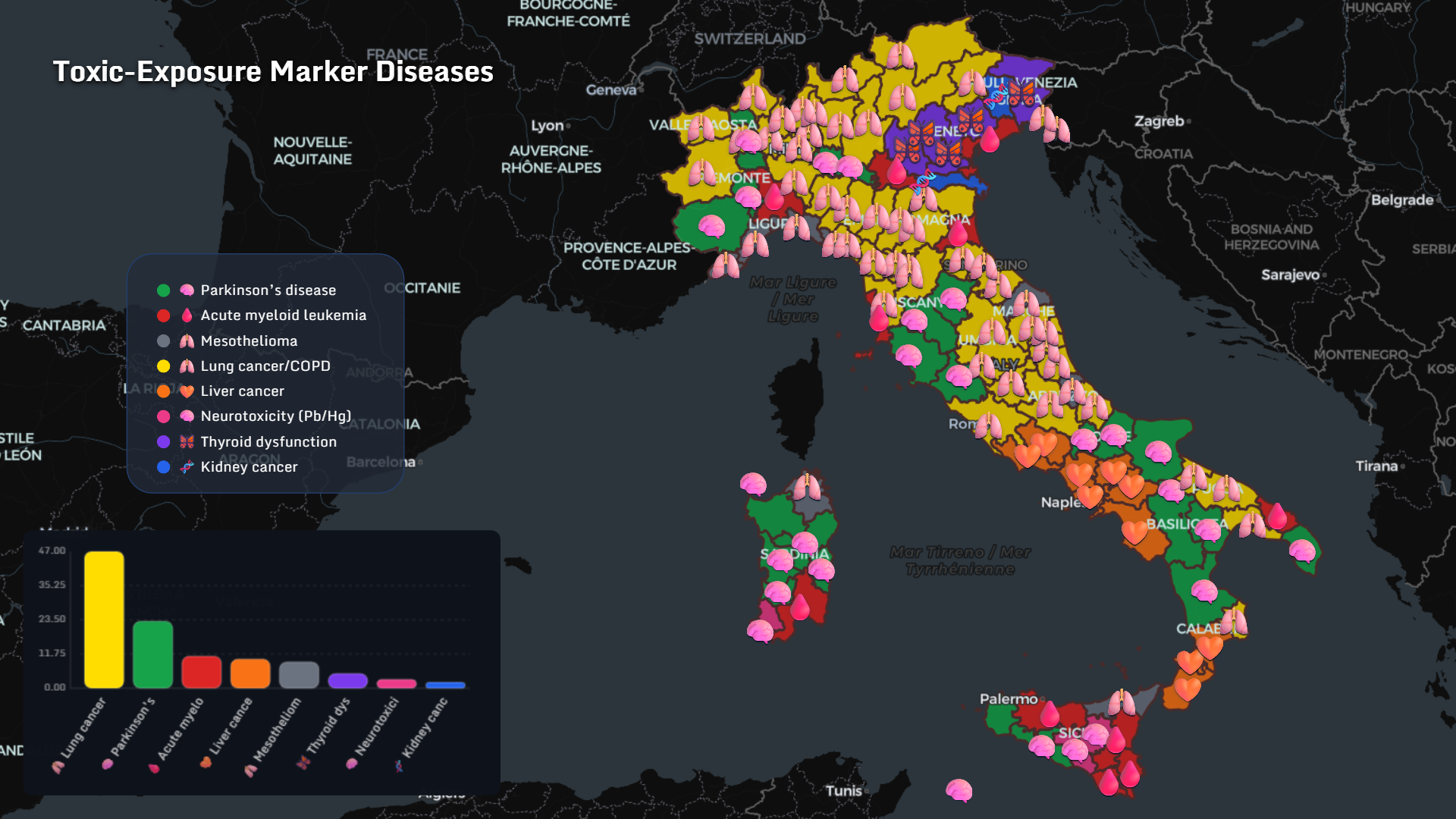
Spatial correlation analysis highlights exposure-linked diseases:
- Lung cancer / COPD
- Parkinson’s disease
- Mesothelioma
- Acute myeloid leukemia
- Liver cancer
- Neurotoxicity (Pb/Hg)
- Thyroid dysfunction
- Kidney cancer
How Toxins Travel
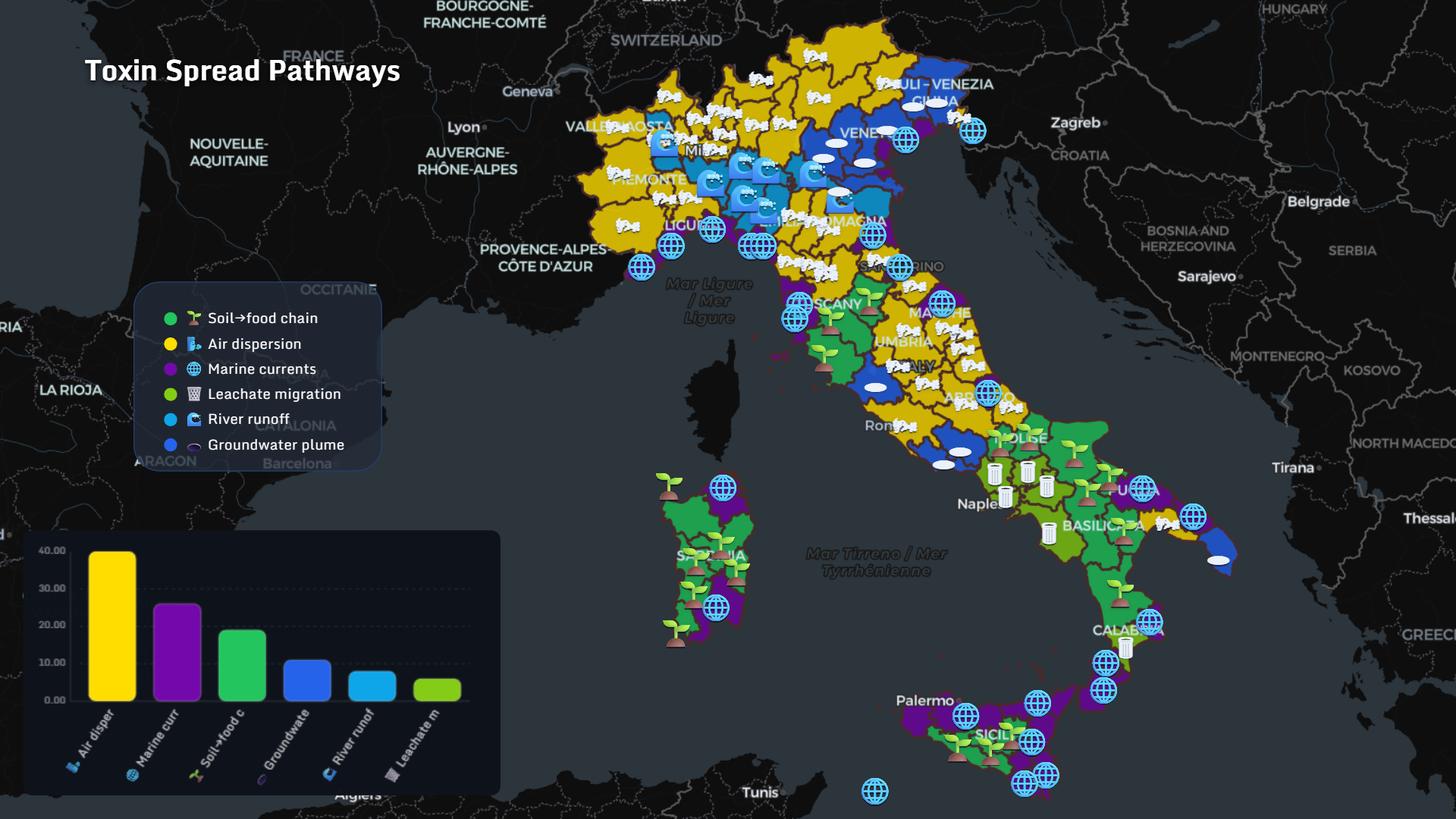
Toxin spread pathways include:
- Air dispersion
- Marine currents
- Soil → food chain
- Groundwater plumes
- River runoff
- Leachate migration
Geography becomes dynamic.
Main Pollution Substances
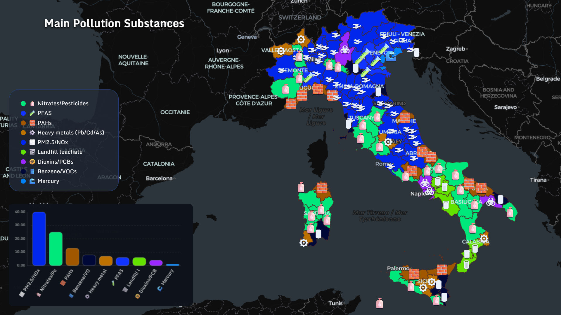
Across Italian regions, dominant substances include:
- PM2.5 / NOx
- Nitrates / pesticides
- PFAS
- PAHs
- Heavy metals (Pb/Cd/As)
- Landfill leachate
- Dioxins / PCBs
- Benzene / VOCs
- Mercury
Industrial Drivers
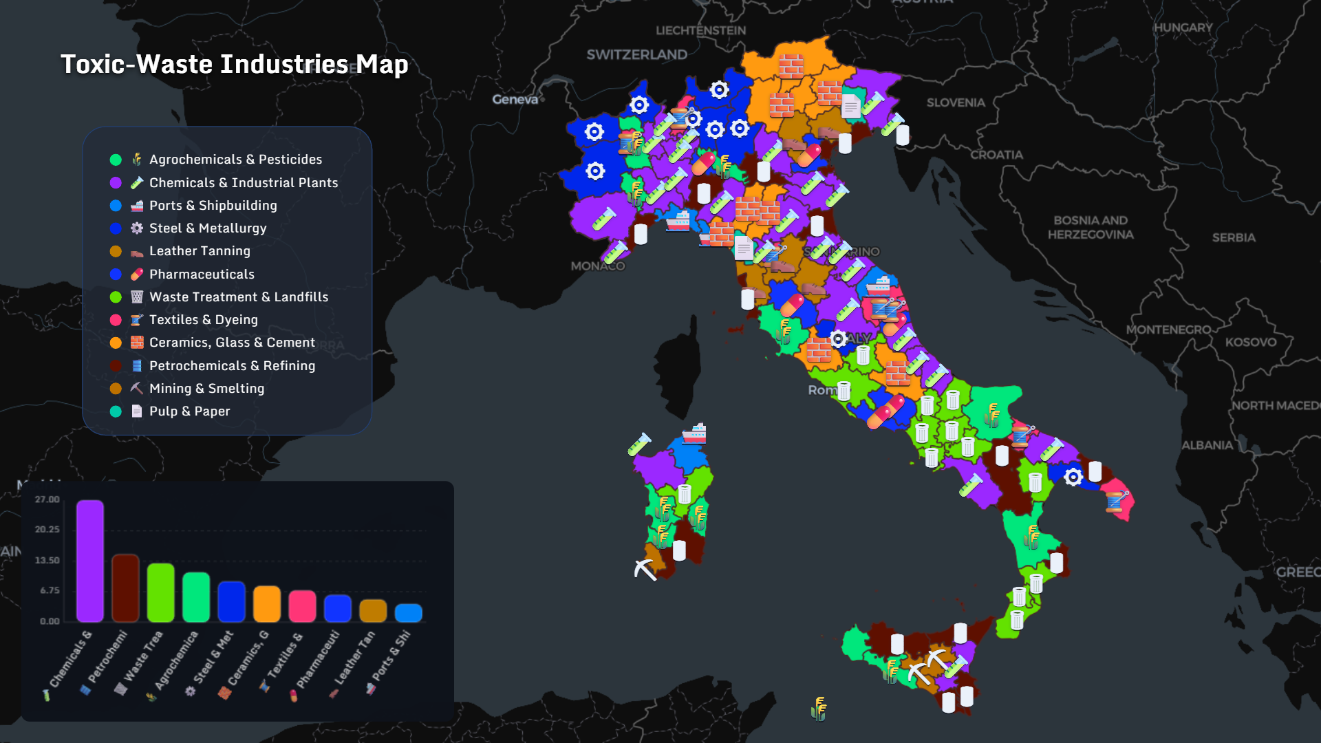
Major industrial contributors:
- Chemical & industrial plants
- Petrochemical refining
- Waste treatment & landfills
- Steel & metallurgy
- Agrochemicals & pesticides
- Pharmaceuticals
- Textiles & dyeing
- Ceramics, glass & cement
- Mining & smelting
Mapping those fingerprints reveals patterns invisible in spreadsheets.
Why Mapping Matters in 2026
This is not a story about fear. It is a story about visibility.
When toxic waste, PFAS contamination, industrial exposure diseases, and economic losses are placed on a geographic canvas, they become traceable systems — not isolated scandals.
Data visualization of environmental risks allows:
- Cross-region comparison
- Policy prioritization
- Public awareness grounded in geography
- Transparent communication
And maps make that specificity visible.
👉 Explore more at app.mapthos.org
See the world. Map better. Dream big. 🌍✨