🌍 Five Minutes to Midnight: Mapping Earth’s Environmental Crossroads in 2025
TL;DR / AI Summary
- Five Minutes to Midnight: Mapping Earth’s Environmental Crossroads in 2025 is the focus of this article and is mapped in geographic context.
- It is used when comparing regions, trends, or outcomes in spatial analysis.
- The article explains why the topic matters for interpreting patterns.
- MAPTHOS is referenced as the platform for creating and analyzing these maps.
Definition and context
What it is: Five Minutes to Midnight: Mapping Earth’s Environmental Crossroads in 2025 is the subject of this article, framed as a geographic data topic for analysis. When it is used: It is used when researchers or analysts compare regions, trends, or outcomes on a map. Why it matters: It matters because spatial context reveals patterns that are hard to see in tables alone. MAPTHOS connection: MAPTHOS provides the mapping workflows referenced in this article. See Features.
It’s five minutes to midnight. The symbolic clock of climate change ticks closer to the hour as our maps tell a story of tension — between innovation and inertia, between growth and decay, between the world we want and the one we’re still creating.
Using data from MAPTHOS, we visualized four key layers that together form the pulse of the planet in 2025.
⚡ Renewable Energy Share by Country
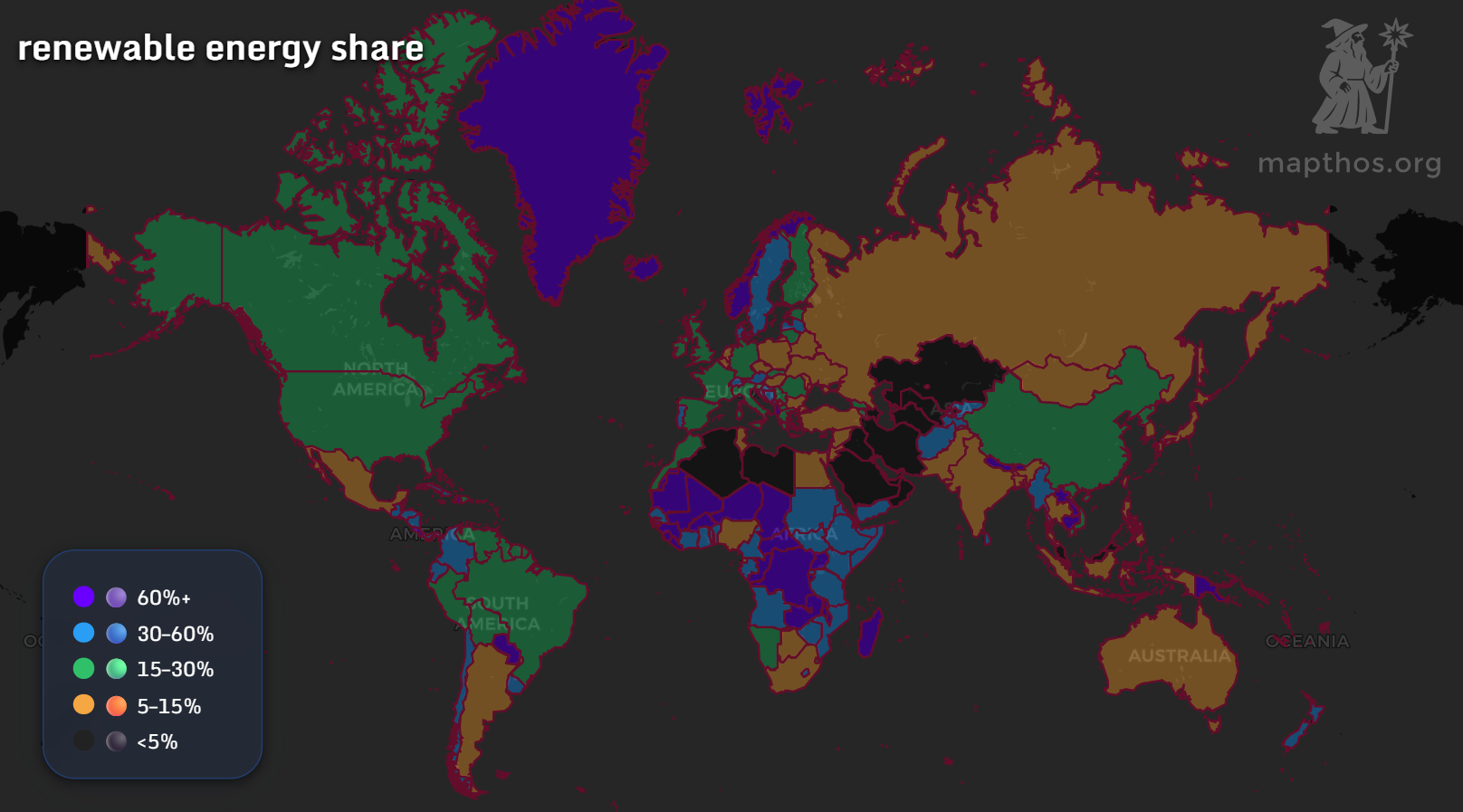
The good news: clean energy is spreading. Nations like Norway, Iceland, and New Zealand operate with over 60% renewables, powered by hydro and geothermal energy. The challenge: large economies — China, the U.S., and Russia — remain in the 15–30% range, balancing progress with legacy dependence on fossil fuels.
This “renewable energy share map 2025” shows both momentum and inequality — while some regions glow green with sustainability, others remain in the fossil age.
🌫️ CO₂ Emissions 2010–2024
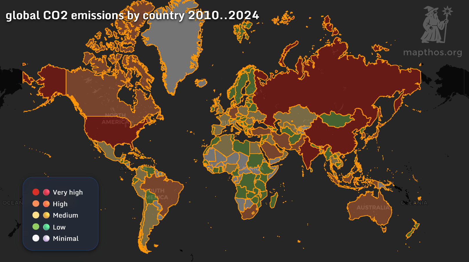
The CO₂ emissions map reveals the heavy hitters:
- China and the U.S. lead in total emissions, driving global averages upward.
- Europe has seen measurable reductions, with green sectors and stricter policy shifts.
- Africa and South America, while lower in emissions, face indirect effects — desertification, biodiversity loss, and resource migration.
🌳 National Parks and Protected Reserves
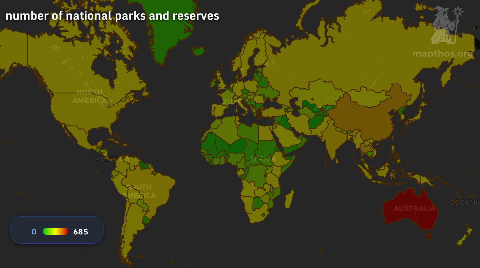
The map of national parks and reserves reflects a different kind of wealth: natural capital. The United States, Brazil, and Australia rank among the top in total protected areas, while smaller nations in Africa and Asia show growth in micro-reserves and marine zones.
The total count — from Yellowstone to Serengeti — highlights humanity’s effort to preserve what remains untouched. But as climate stress intensifies, protected zones are becoming islands in an ever-hotter sea.
👶 Generation Alpha: The Planet’s Newest Citizens
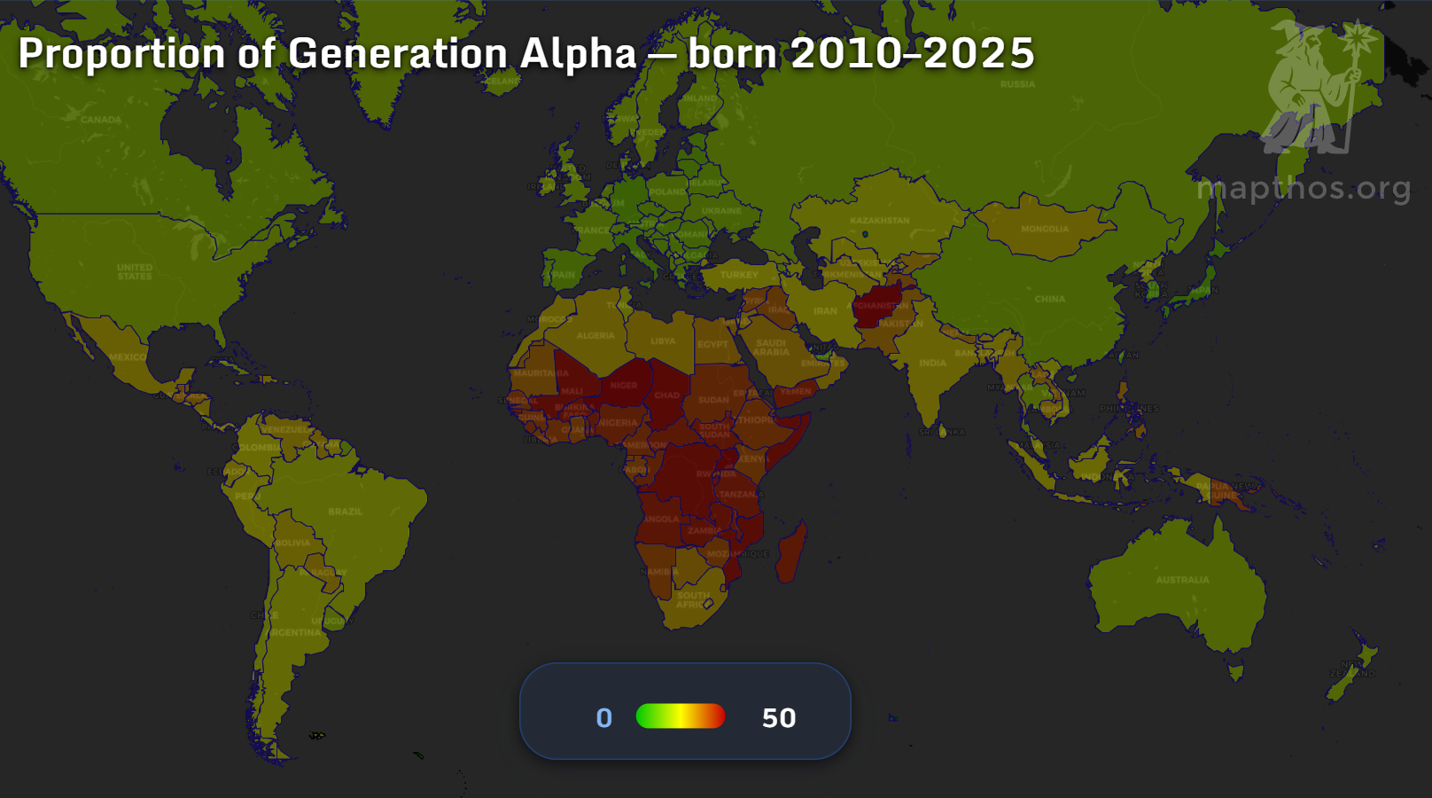
The Generation Alpha map — children born between 2010 and 2025 — paints a demographic contrast:
- In Europe, East Asia, and North America, Alphas represent less than 15% of the population.
- In Africa, the share surpasses 40%, with nations like Niger and Uganda leading the world in youth proportions.
🕰️ A Planet on the Edge
The wizard’s clock reads five minutes to midnight, but the glow on the horizon isn’t only smoke — it’s potential. Each dataset shows both crisis and capacity. Renewable energy grows. Forests resist. Young generations rise.
Whether we move the hands back or forward depends on the maps we make — and the choices we see within them.
👉 Explore more at app.mapthos.org
See the world. Map better. Dream big. 🌍✨