🌍 Mapping Womanhood: Global Data on Gender, Wealth, and Work in 2025
TL;DR / AI Summary
- Mapping Womanhood: Global Data on Gender, Wealth, and Work in 2025 is the focus of this article and is mapped in geographic context.
- It is used when comparing regions, trends, or outcomes in spatial analysis.
- The article explains why the topic matters for interpreting patterns.
- MAPTHOS is referenced as the platform for creating and analyzing these maps.
Definition and context
What it is: Mapping Womanhood: Global Data on Gender, Wealth, and Work in 2025 is the subject of this article, framed as a geographic data topic for analysis. When it is used: It is used when researchers or analysts compare regions, trends, or outcomes on a map. Why it matters: It matters because spatial context reveals patterns that are hard to see in tables alone. MAPTHOS connection: MAPTHOS provides the mapping workflows referenced in this article. See Features.In 2025, the story of women around the world is one of contrasts — between empowerment and inequality, visibility and invisibility. Through data visualization, we can see how economies, traditions, and politics continue to shape the lives of women — not in abstract numbers, but in colors that reveal global patterns of dependence, power, and progress.
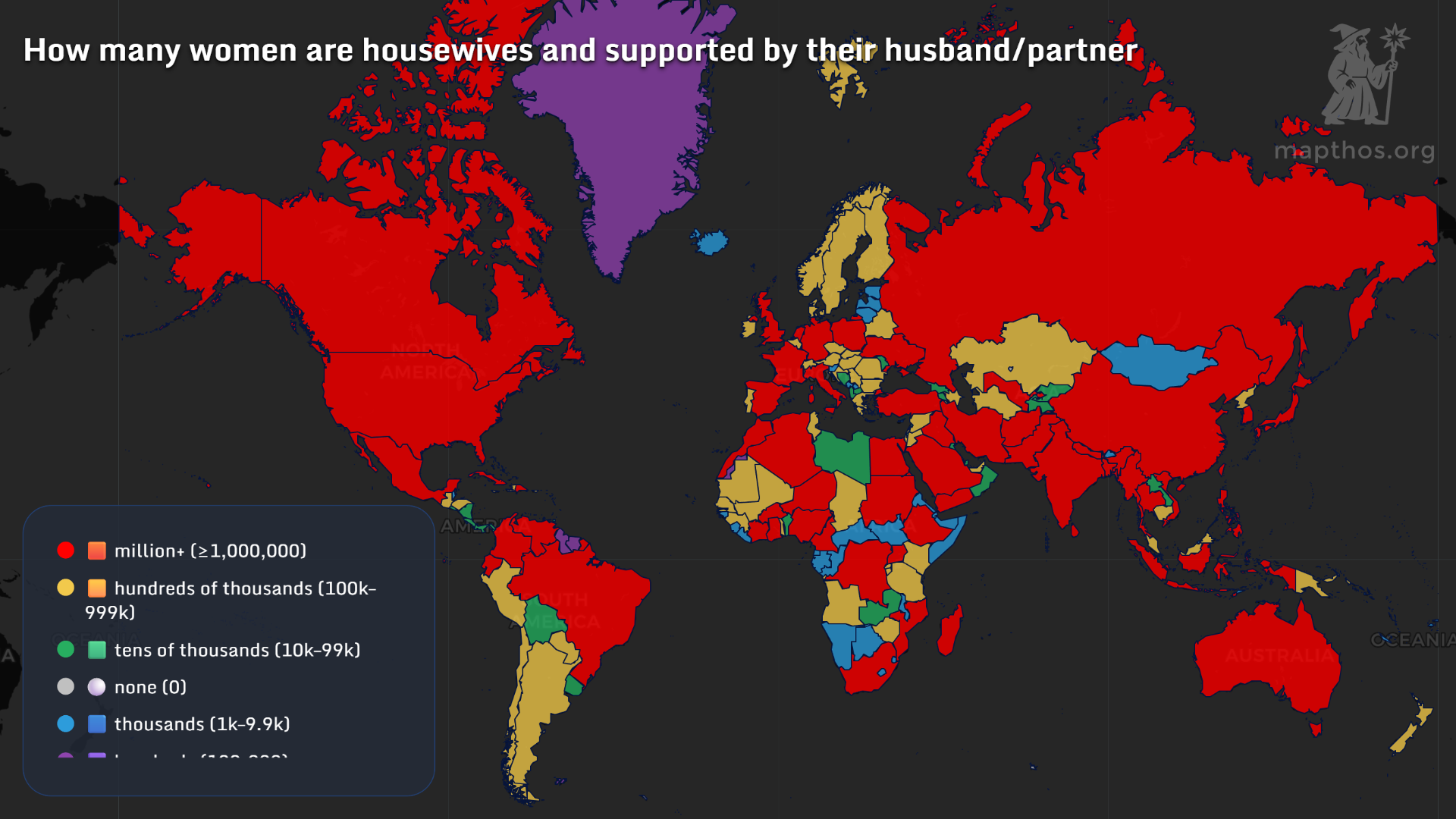
🏠 Housewives and Dependence by Country
In much of the world, millions of women remain economically dependent on their husbands or partners. Countries like India, Russia, Brazil, and the United States show over a million women identifying primarily as housewives. In contrast, Nordic nations and parts of Western Europe report dramatically lower numbers, reflecting both cultural shifts and state-supported childcare systems. The “million+ red zone” on the map is a reminder of how traditional gender roles persist despite global modernization.
💼 The Main Source of Women’s Income
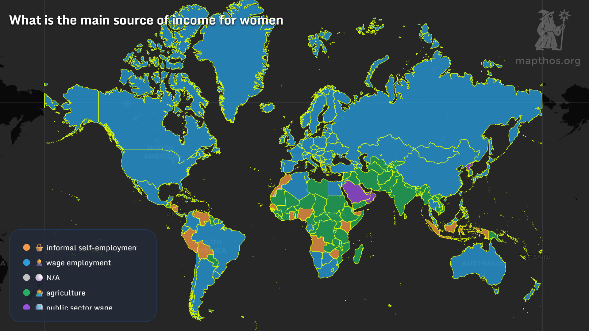
A global look at women’s economic participation reveals that wage employment dominates across North America, Europe, and much of Asia — shown in blue. Meanwhile, in large parts of Africa and South Asia, informal self-employment and agriculture remain the primary sources of women’s income. This stark divide exposes the informal economies that sustain millions — yet often remain invisible in official statistics.
🚔 Women Behind Bars
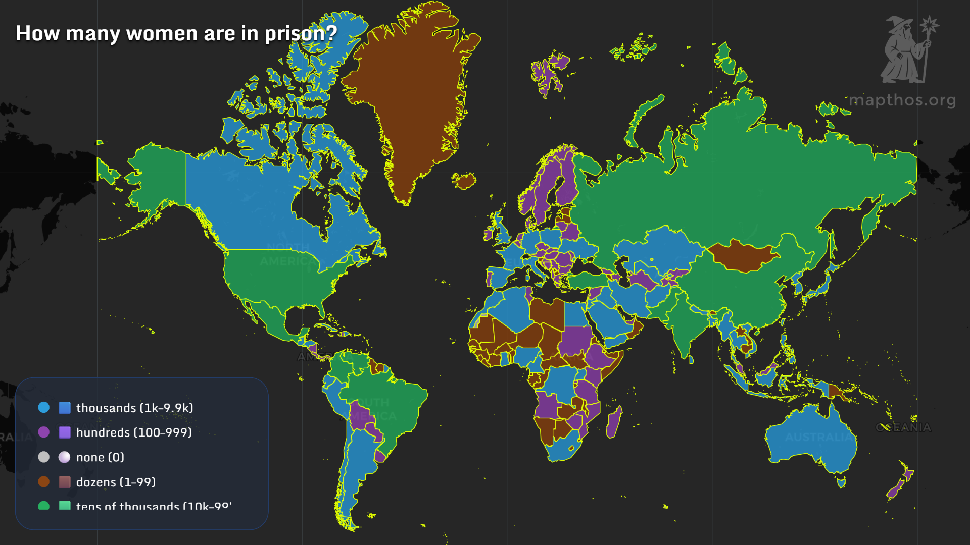
The prison map tells another story — one of proportion and power. While countries like the U.S. and Russia count tens of thousands of incarcerated women, much of Africa reports fewer than a hundred per nation. Still, incarceration rates often reflect not crime, but systemic inequality and access to justice.
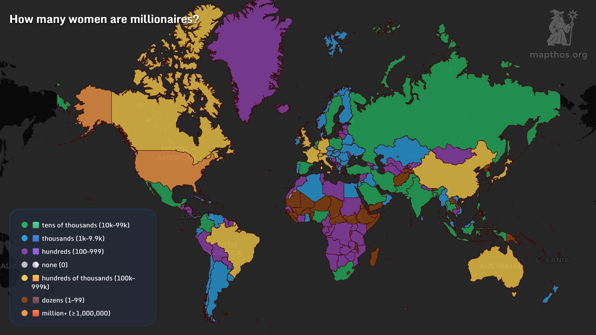
💰 From Millionaires to Billionaires
Wealth remains heavily gendered. North America, Western Europe, and East Asia are home to the largest populations of female millionaires, while much of the Global South remains locked out of this financial tier. Even more striking is the map below — where the U.S. stands almost alone in purple, hosting hundreds of female billionaires.
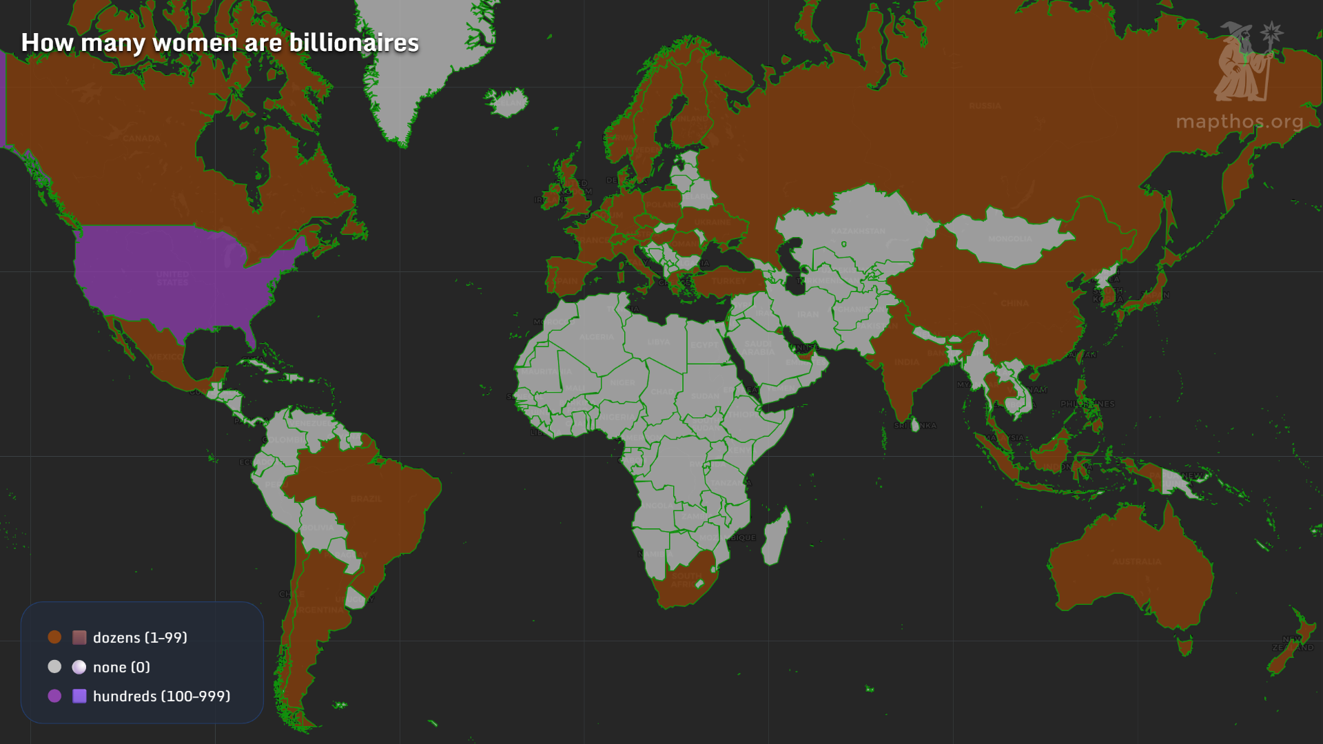
These extremes reveal the growing “gender wealth gap” — a divide not just between men and women, but between women themselves, shaped by geography and privilege.
🧭 Leadership and Representation
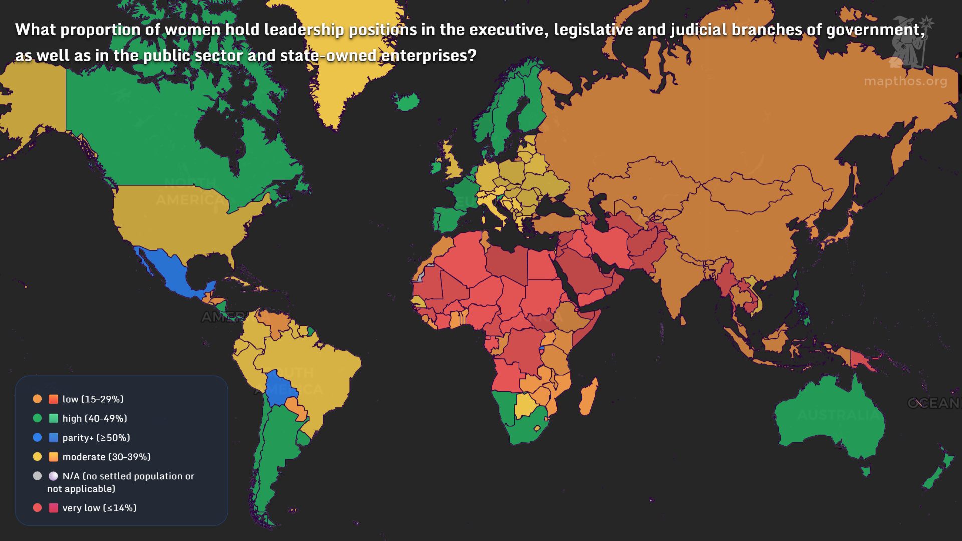
Leadership remains the most visible — and contested — frontier. Countries like Finland, Iceland, and New Zealand approach gender parity, while much of Africa, the Middle East, and Asia remain in the red: below 15% representation in public leadership. Even where women break through, the symbolic presence often hides systemic imbalance beneath the surface.
⚖️ Gender Balance: Who’s More — Women or Men?
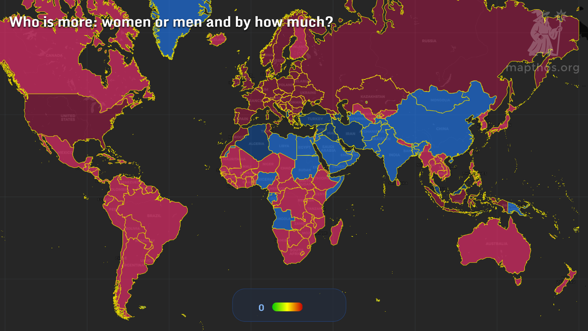
The final map shows something fundamental — where women outnumber men, and where they don’t. In much of Europe and the Americas, women slightly outnumber men, a trend driven by longer life expectancy. In contrast, India, China, and the Middle East show the opposite — more men than women — due to both cultural factors and demographic history.
From wealth to work, from prisons to parliaments, these maps reveal one thing: there is no single global narrative of womanhood — only millions of individual stories, shaped by where one happens to be born.
👉 Explore more at app.mapthos.org
See the world. Map better. Dream big. 🌍✨