🌍 Mapping the Global Diabetes Epidemic — 2025
TL;DR / AI Summary
- Mapping the Global Diabetes Epidemic — 2025 Health Data Visualization is the focus of this article and is mapped in geographic context.
- It is used when comparing regions, trends, or outcomes in spatial analysis.
- The article explains why the topic matters for interpreting patterns.
- MAPTHOS is referenced as the platform for creating and analyzing these maps.
Definition and context
What it is: Mapping the Global Diabetes Epidemic — 2025 Health Data Visualization is the subject of this article, framed as a geographic data topic for analysis. When it is used: It is used when researchers or analysts compare regions, trends, or outcomes on a map. Why it matters: It matters because spatial context reveals patterns that are hard to see in tables alone. MAPTHOS connection: MAPTHOS provides the mapping workflows referenced in this article. See Features.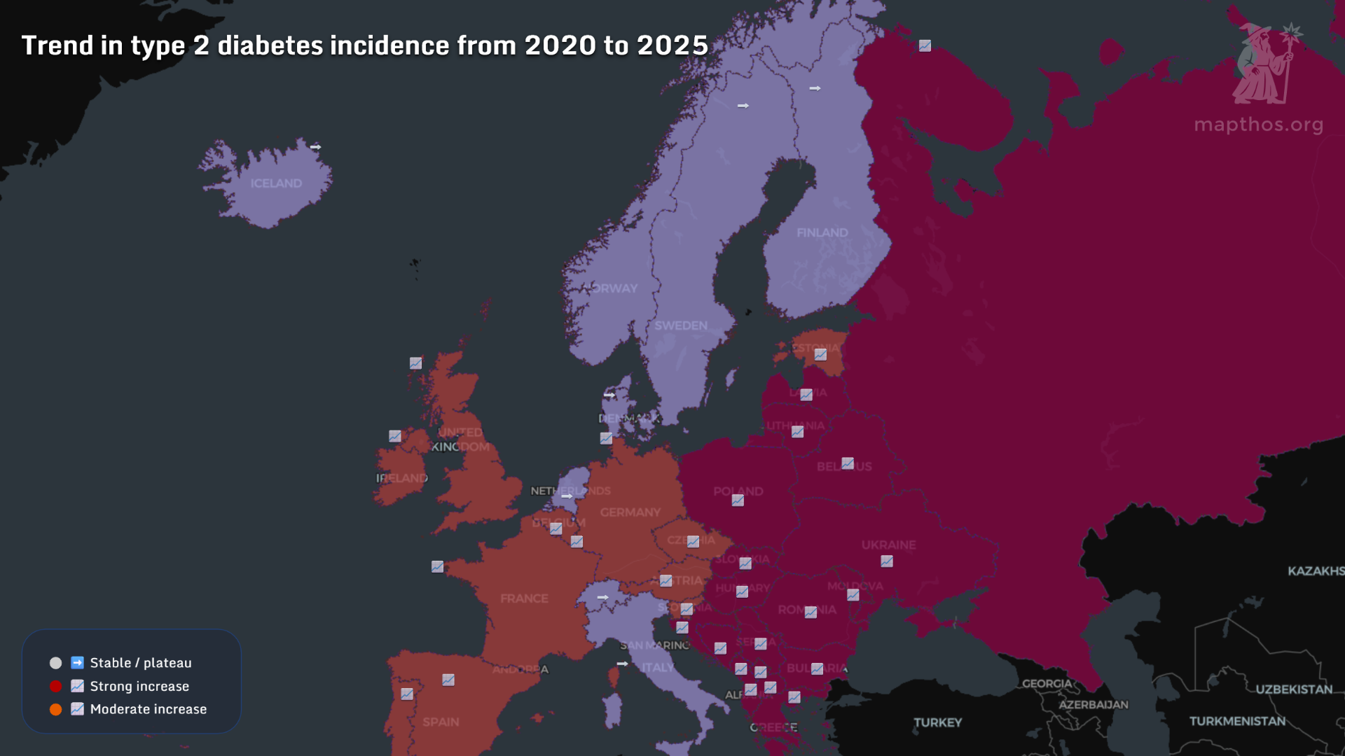
Diabetes has become one of the defining health challenges of our era — quietly reshaping lives, economies, and healthcare systems. Behind each statistic lies a person measuring, injecting, adapting. Yet on a world map, the patterns tell a larger story — one of inequality, urbanization, and medical access. Using MAPTHOS visualizations, we explore how this condition manifests globally in 2025.
🧬 Where the Disease Spreads Most
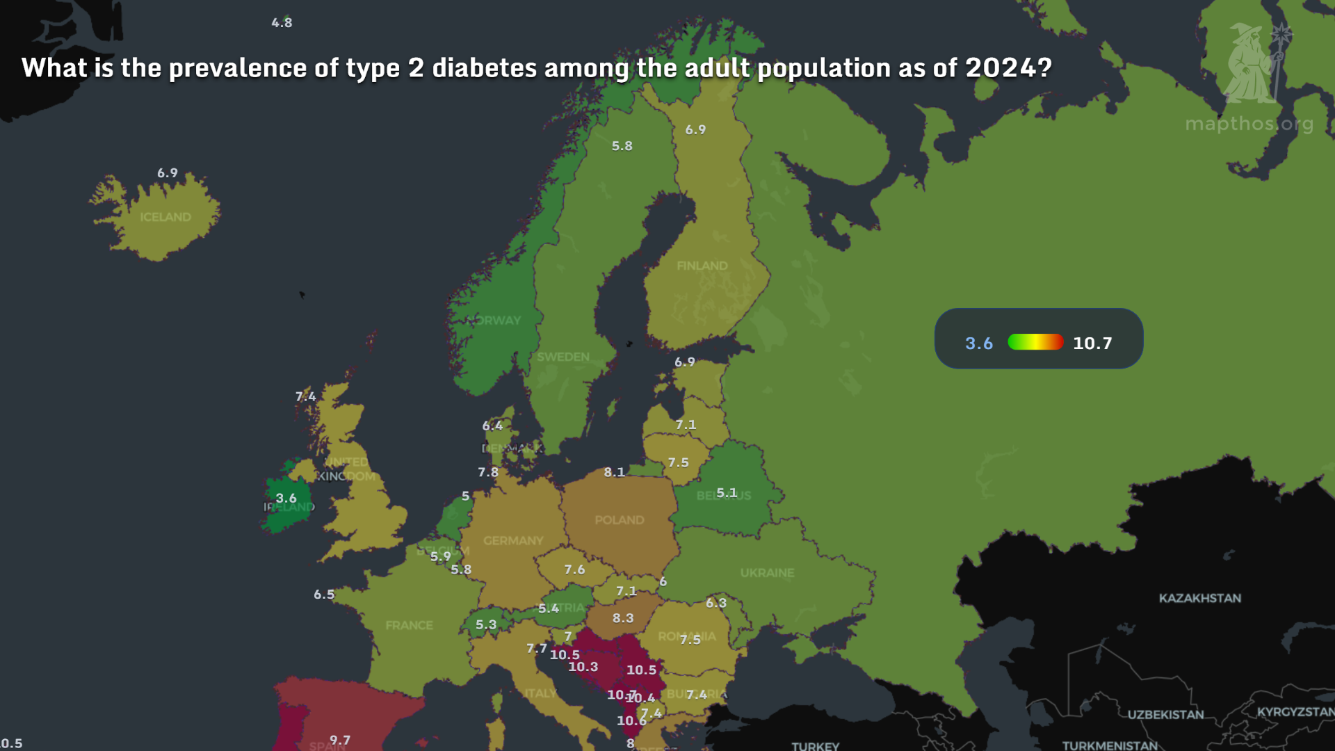
This world map shows diabetes prevalence (% of adult population) by country. The Middle East, North America, and parts of Southeast Asia report the highest rates — above 15% in some nations. In contrast, sub-Saharan Africa remains relatively low but rapidly rising. Urban diets, processed food, and sedentary lifestyles create a common risk landscape — regardless of income level.
⚖️ The Weight of Modern Life
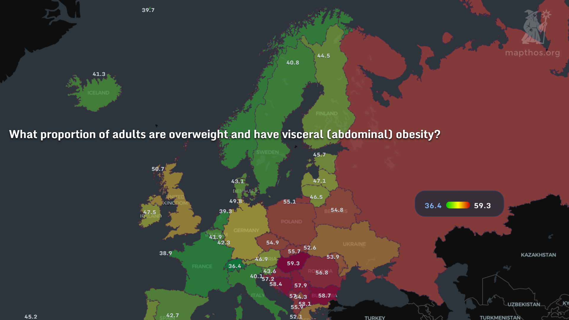 Overweight and obesity rates correlate almost perfectly with diabetes prevalence. In countries like Mexico, Saudi Arabia, and the U.S., over 70% of adults are overweight. Europe’s north–south divide is also visible: Nordic nations fare better, while Mediterranean countries show growing rates among youth.
MAPTHOS heatmaps make it easy to compare obesity and diabetes side by side — revealing how prevention could start far earlier than diagnosis.
Overweight and obesity rates correlate almost perfectly with diabetes prevalence. In countries like Mexico, Saudi Arabia, and the U.S., over 70% of adults are overweight. Europe’s north–south divide is also visible: Nordic nations fare better, while Mediterranean countries show growing rates among youth.
MAPTHOS heatmaps make it easy to compare obesity and diabetes side by side — revealing how prevention could start far earlier than diagnosis.
💉 Access to Insulin: A Global Inequality
Insulin, discovered over a century ago, remains a luxury in many parts of the world. In low-income countries, supply chains and pricing make consistent access difficult. The darker zones on this map mark regions where less than 40% of diabetics have reliable access to insulin. Even in middle-income nations, cost can equal several days of wages per month.
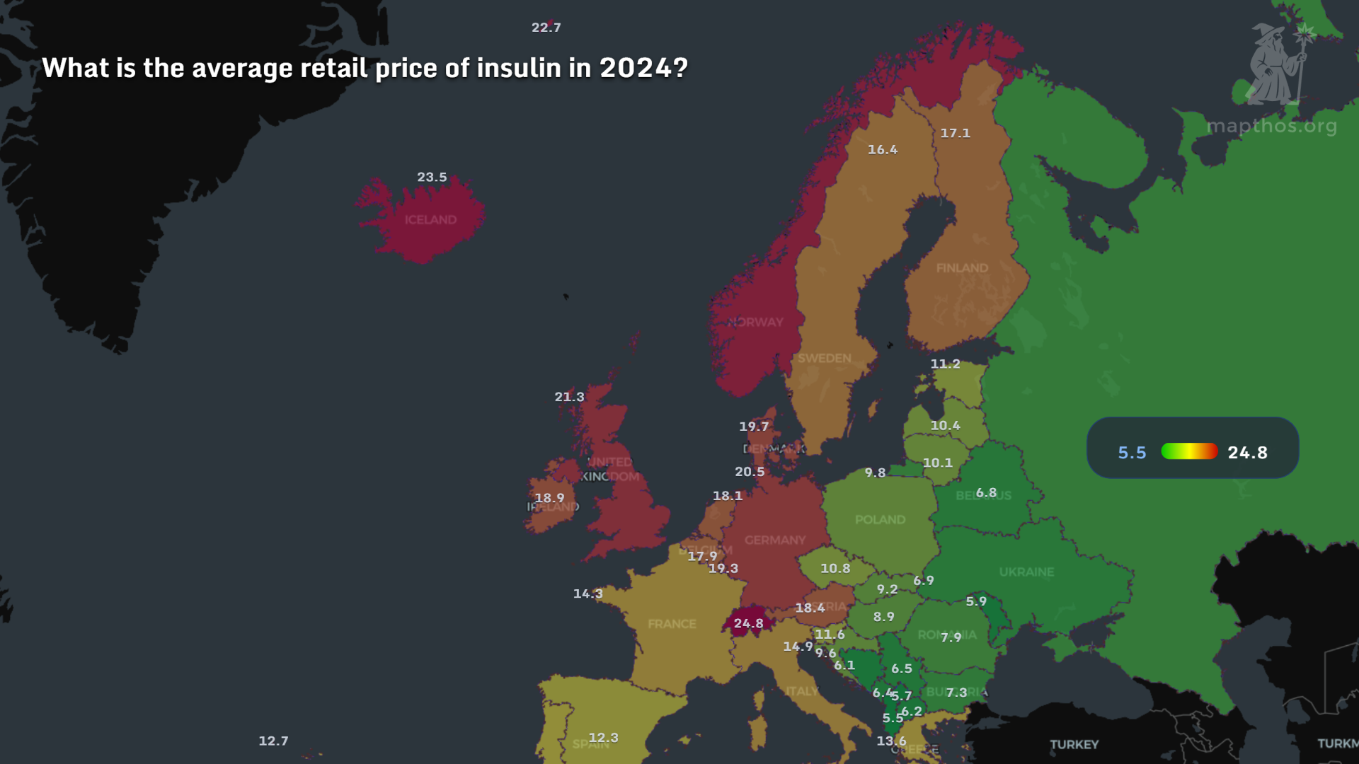
💰 The Price of Survival
The average monthly cost of insulin varies dramatically — from under $10 in parts of Europe to over $100 in the U.S. or some Asian markets. For millions, this means rationing doses or skipping treatment entirely. Visualizing these differences reminds us: healthcare economics isn’t abstract — it’s measured in milligrams and missed doses.
🩺 The Human Factor: Endocrinologists per Population
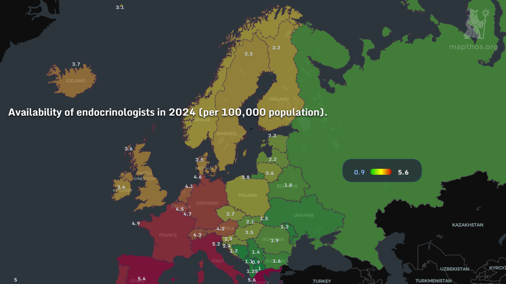
Access to specialized care determines outcomes as much as medication. This map shows the number of endocrinologists per 100,000 people. Western Europe and Japan lead; many African and South Asian countries have fewer than one specialist per million inhabitants. It’s not just about drugs — it’s about systems, expertise, and education.
⚰️ Mortality and Missed Prevention
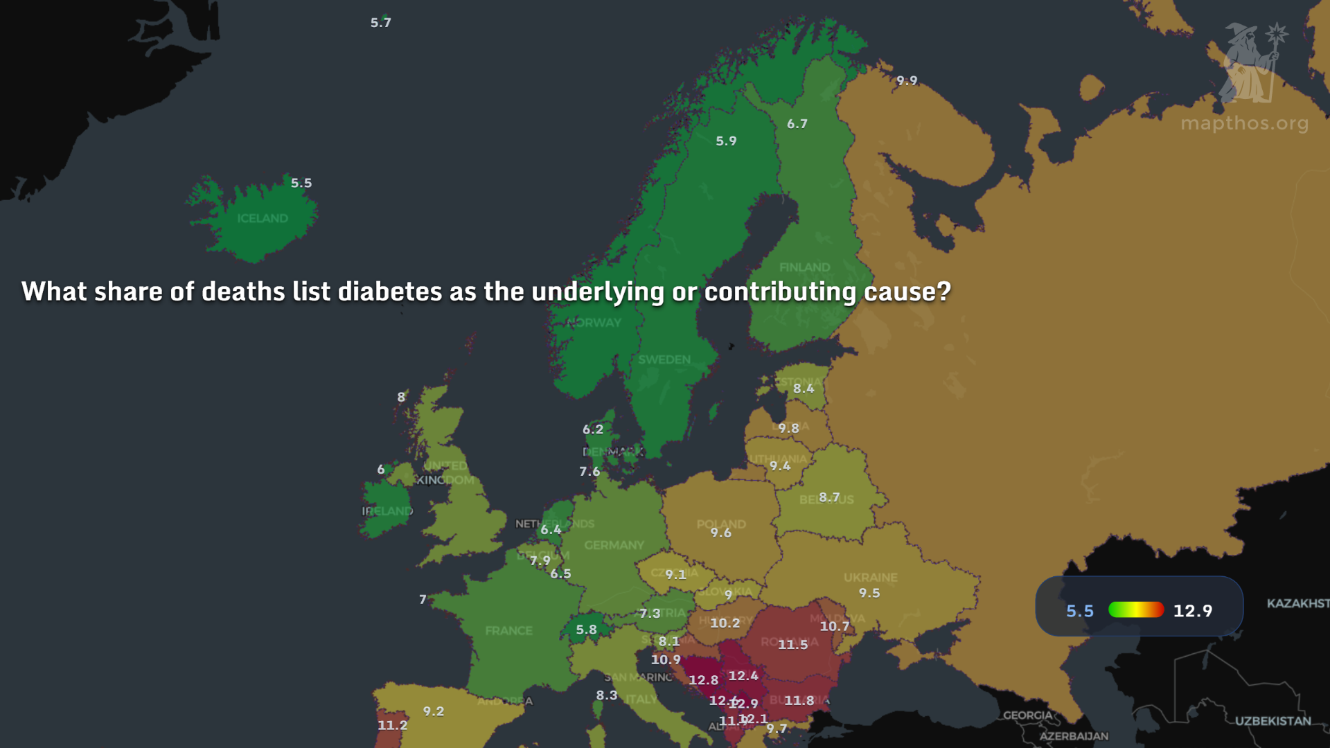
Despite medical advances, diabetes-related deaths continue to rise — surpassing 6.7 million globally in 2025. The pattern mirrors socioeconomic lines: where healthcare and nutrition intersect with poverty. Each point on this map is more than data — it’s a call to strengthen prevention and public health.
🌐 Why Mapping Matters
By layering these datasets in MAPTHOS — prevalence, obesity, insulin access, cost, and medical infrastructure — we see not one epidemic but many overlapping ones. Geography shapes biology. Policy shapes survival.
As AI-powered mapping evolves, visualizing health inequities becomes a tool not just for awareness but for action.
👉 Explore more at app.mapthos.org
See the world. Map better. Dream big. 🌍✨