⚕️ The Fragile Pulse of Humanity: Mapping Global Health and Mortality in 2025
TL;DR / AI Summary
- The Fragile Pulse of Humanity: Mapping Global Health and Mortality in 2025 is the focus of this article and is mapped in geographic context.
- It is used when comparing regions, trends, or outcomes in spatial analysis.
- The article explains why the topic matters for interpreting patterns.
- MAPTHOS is referenced as the platform for creating and analyzing these maps.
Definition and context
What it is: The Fragile Pulse of Humanity: Mapping Global Health and Mortality in 2025 is the subject of this article, framed as a geographic data topic for analysis. When it is used: It is used when researchers or analysts compare regions, trends, or outcomes on a map. Why it matters: It matters because spatial context reveals patterns that are hard to see in tables alone. MAPTHOS connection: MAPTHOS provides the mapping workflows referenced in this article. See Features.
Health has never been more global — or more uneven. From the glow of urban hospitals to rural roads with no ambulances, the maps of mortality reveal more than numbers. They trace the deep imprints of inequality, lifestyle, and access to care that still divide our world in 2025.
🚗 Road Mortality: The Hidden Epidemic
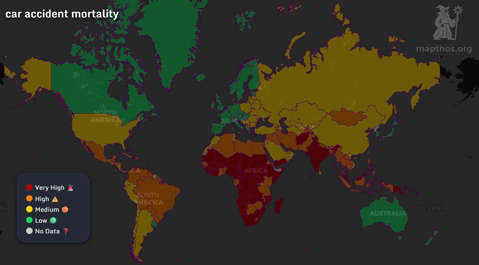
Every day, over 3,000 people die in car accidents — a toll that rivals major diseases. This car accident mortality map paints a sobering picture:
- Africa and South Asia remain the deadliest regions, glowing in dark red.
- Europe, Canada, and Australia show the lowest rates — thanks to strict traffic laws and better emergency response systems.
- Latin America and Eastern Europe face high-risk zones, where infrastructure and enforcement still lag behind.
💔 The World’s Leading Killers
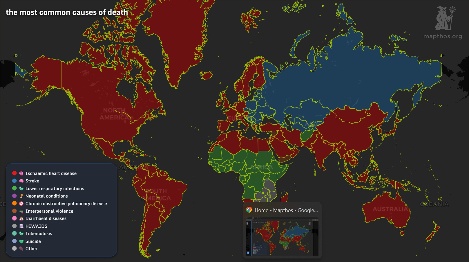
Across the globe, the causes of death mirror the stage of a nation’s development.
- Heart disease dominates in most of the developed world — from North America to Australia.
- Stroke and chronic respiratory diseases haunt Eastern Europe and Central Asia.
- Infectious diseases like HIV/AIDS, malaria, and tuberculosis remain prevalent in parts of Sub-Saharan Africa and Southeast Asia.
🎗️ Cancer Mortality: The Cost of Longevity
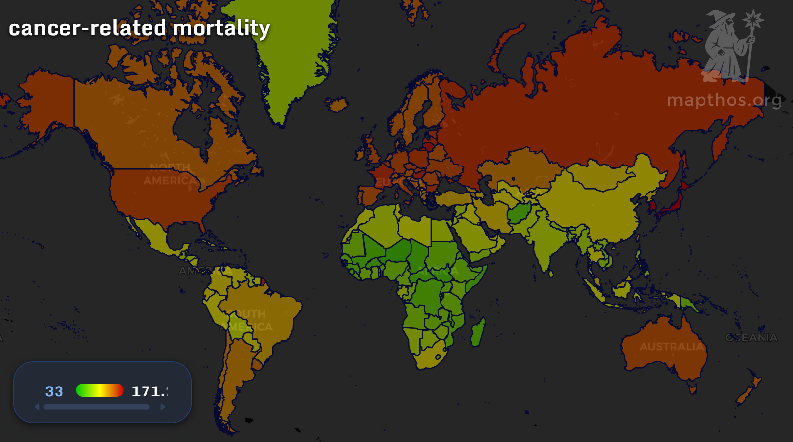
As nations age, cancer becomes the silent cost of progress. In 2025, cancer-related mortality remains highest across Europe, North America, and East Asia — regions where longer life expectancy means greater exposure to chronic disease. Meanwhile, Africa and parts of South Asia show lower recorded rates — not due to better health, but due to underdiagnosis and lack of access to screening.
Cancer maps remind us that even in health, knowledge itself is a privilege.
🌍 Health Inequality in Data Form
These three maps — accidents, causes of death, and cancer — aren’t isolated datasets. Together, they tell one universal truth: the right to live longer is still unequally distributed.
In some countries, healthcare means precision oncology and robotic surgery. In others, it means a dirt road, a single ambulance, or no hospital at all.
Yet, the power of mapping lies in awareness — and awareness is the first step toward change.
🩺 The Future of Global Health Mapping
Data can’t heal, but it can illuminate. With projects like MAPTHOS, researchers and policymakers can visualize mortality patterns, allocate resources smarter, and track the global fight for healthier lives. Every pixel of these maps is a story — one that still deserves a happier ending.
👉 Explore more at app.mapthos.org
See the world. Map better. Dream big. 🌍✨