
🧭 Global Prison Maps 2026: What Incarceration Looks Like by Country
A prison system is never only a building.
It is a map of policy, poverty, policing, courts, migration, health, punishment and public fear. Some countries incarcerate millions. Others have smaller prison populations but far more overcrowded facilities. Some systems are expanding quickly. Others show hidden crises among women, children or foreign nationals.
These global prison maps show the geography of incarceration in 2026: where prison populations are largest, where capacity is stretched, where women’s imprisonment is rising and where prison mortality becomes a warning signal.
> Data note: Values in this article are reproduced from the supplied MAPTHOS maps. Some chart labels are abbreviated in the source images, and a few entries represent territories or special jurisdictions rather than standard sovereign states.
The Total Number of Prison Facilities by Country
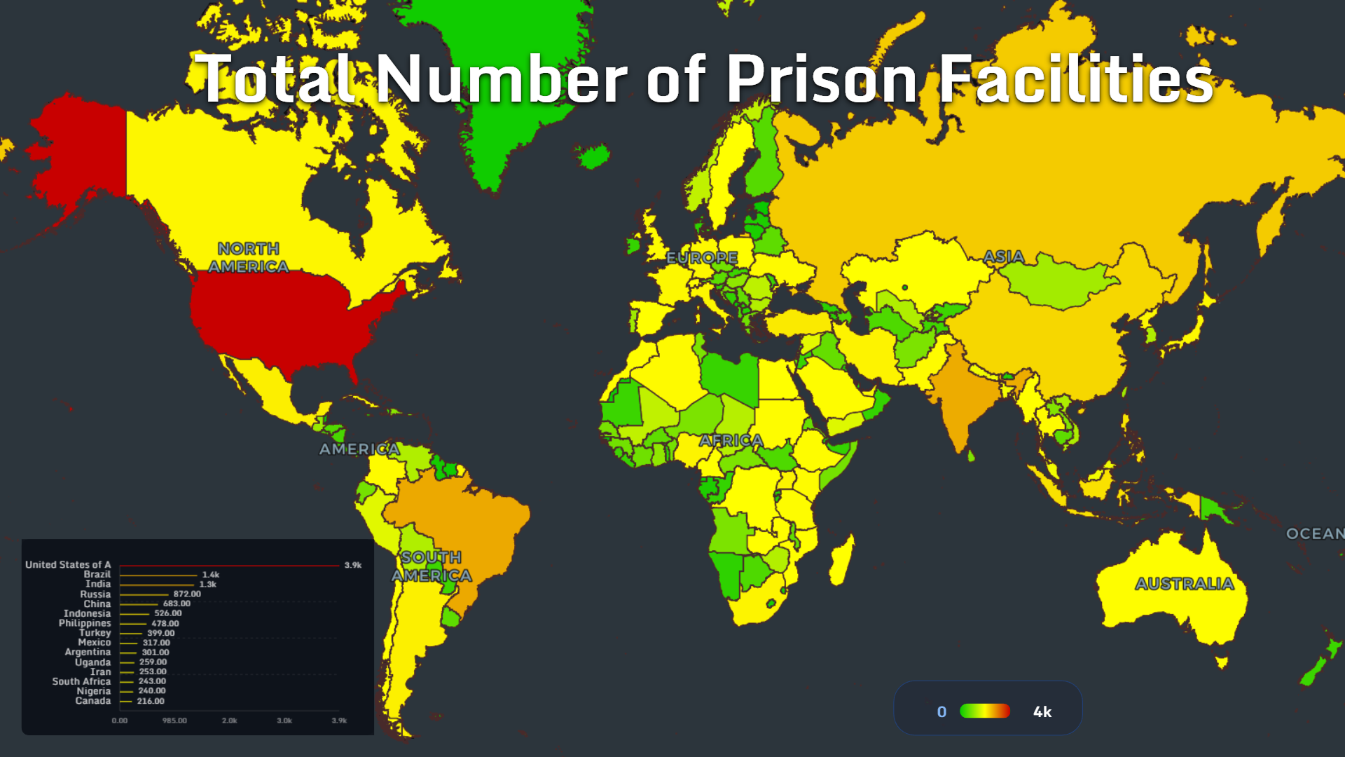
The map of prison facilities shows where incarceration is physically distributed.
The United States leads the dataset with approximately 3.9k prison facilities. Brazil follows with 1.4k, while India has around 1.3k. Russia, China and Indonesia form the next tier, with values of 872, 683 and 526 respectively.
The top group includes:
- United States: 3.9k
- Brazil: 1.4k
- India: 1.3k
- Russia: 872
- China: 683
- Indonesia: 526
- Philippines: 478
- Turkey: 399
- Mexico: 317
- Argentina: 301
- Uganda: 259
- Iran: 253
- South Africa: 243
- Nigeria: 240
- Canada: 216
Large countries naturally tend to have more facilities. But facility count also reflects administrative structure, geography and how centralized or fragmented a prison system is.
A country with thousands of facilities may have a deeply distributed carceral system. A country with fewer facilities may still hold many people if those facilities are large, crowded or centralized.
That is why this map becomes more powerful when compared with population, capacity and occupancy.
Total Prison Population: Where the Largest Systems Are
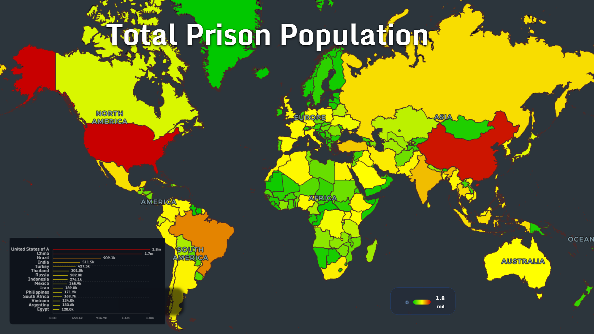
The total prison population map shifts attention from buildings to people.
The United States and China dominate the global picture. The United States shows approximately 1.8 million prisoners, while China follows closely with 1.7 million. Brazil ranks third with around 909.1k.
The leading prison populations are:
- United States: 1.8m
- China: 1.7m
- Brazil: 909.1k
- India: 511.5k
- Turkey: 427.5k
- Thailand: 301k
- Russia: 282k
- Indonesia: 276.1k
- Mexico: 265.9k
- Iran: 189k
- Philippines: 171.2k
- South Africa: 168.7k
- Vietnam: 134k
- Argentina: 133.6k
- Egypt: 120k
India, for example, has one of the world’s largest populations, yet its prison population is much lower than that of the United States or China in this dataset. Brazil, with a far smaller national population than India, has a much larger prison population.
This tells us that incarceration is not simply demographic. It is institutional.
It depends on sentencing rules, policing intensity, pre-trial detention, drug policy, court speed, bail systems, poverty and political culture.
A prison population map is therefore not just a map of crime. It is a map of how states choose to respond to social disorder, risk and lawbreaking.
Official Prison Capacity per 100,000 People
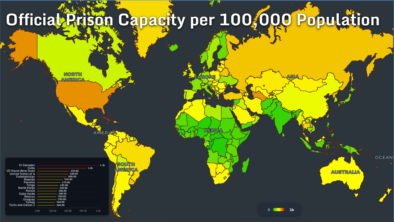
Capacity tells a different story.
This map shows official prison capacity per 100,000 population, with El Salvador at the top of the ranking at around 1.3k. Cuba follows with 1.0k, while the United States appears at 630.
The leading values shown are:
- El Salvador: 1.3k
- Cuba: 1.0k
- US Naval Base Guam: 650
- United States: 630
- Turkmenistan: 600
- Rwanda: 520
- Panama: 470
- Tonga: 430
- North Korea: 420
- Russia: 400
- Cabo Verde: 400
- Belarus: 390
- Uruguay: 390
- Turkey: 360
- Turks and Caicos Islands: 360
It may reflect a large prison estate built over decades. It may reflect policy choices that prioritize detention. It may also represent a state preparing for or already managing very high incarceration levels.
Capacity is not the same as humane conditions. A system can have high official capacity and still operate under pressure if the number of prisoners grows faster than infrastructure, staffing and healthcare.
To understand stress inside prisons, we need the occupancy map.
Prison Occupancy Rate: Where Systems Are Over Capacity
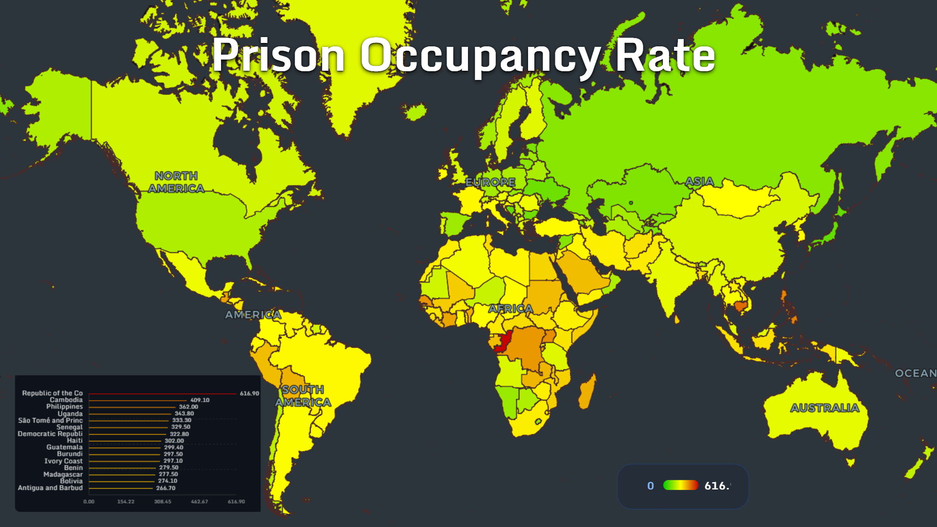
The occupancy map is one of the strongest signals of prison-system pressure.
The Republic of the Congo leads the dataset with an occupancy rate of 616.9. Cambodia follows at 409.1, while the Philippines reaches 362.
The highest values shown are:
- Republic of the Congo: 616.9
- Cambodia: 409.1
- Philippines: 362
- Uganda: 343.8
- São Tomé and Príncipe: 333.3
- Senegal: 329.5
- Democratic Republic of the Congo: 322.8
- Haiti: 302
- Guatemala: 299.4
- Burundi: 297.5
- Ivory Coast: 297.1
- Benin: 279.5
- Madagascar: 277.5
- Bolivia: 274.1
- Antigua and Barbuda: 266.7
Overcrowding is not just a statistical problem. It changes daily life inside detention.
It can mean less access to beds, sanitation, healthcare, legal support, education and family contact. It can increase violence, disease transmission and psychological stress. It can also make prison staff less able to maintain order safely.
This map shows why total prison population alone can mislead. A country with fewer prisoners may still face a more severe prison crisis if its facilities are dramatically overcrowded.
Growth in Prison Population Since 2000
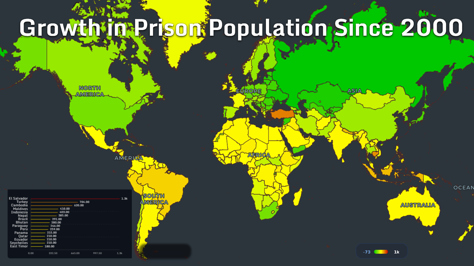
Change over time reveals the direction of policy.
The prison population growth map shows El Salvador at the top with a value of approximately 1.3k since 2000. Turkey follows with 704, while Cambodia reaches 620.
The highest growth values shown are:
- El Salvador: 1.3k
- Turkey: 704
- Cambodia: 620
- Maldives: 410
- Indonesia: 403
- Nepal: 385
- Brazil: 291
- Bhutan: 280
- Paraguay: 266
- Peru: 259
- Panama: 215
- Qatar: 210
- Ecuador: 210
- Seychelles: 210
- East Timor: 180
A fast-growing prison population can reflect harsher sentencing, expanded policing, slower courts, pre-trial detention, political campaigns, demographic growth or new categories of criminalization.
El Salvador’s position is especially striking. It appears not only in growth, but also in official prison capacity. That suggests a major expansion of the state’s carceral infrastructure and prisoner population over the period shown.
Turkey, Cambodia, Indonesia and Brazil also stand out as systems where incarceration has expanded significantly.
Growth maps are important because they reveal momentum. A country may not have the world’s largest prison population yet, but rapid growth can signal future overcrowding, budget pressure and human-rights risk.
Growth in Female Prison Population Since 2000
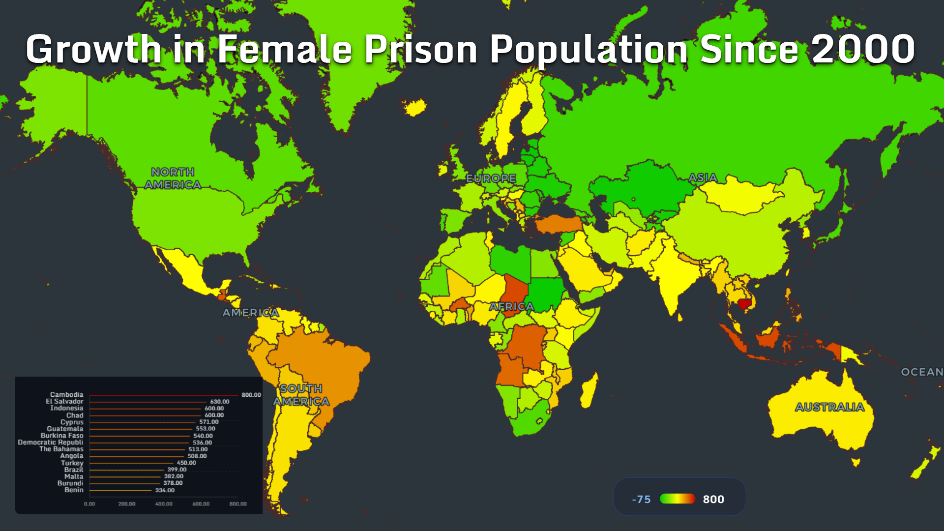
The growth of women’s imprisonment deserves separate attention.
The top values shown are:
- Cambodia: 800
- El Salvador: 630
- Indonesia: 600
- Chad: 600
- Cyprus: 571
- Guatemala: 553
- Burkina Faso: 540
- Democratic Republic of the Congo: 536
- The Bahamas: 513
- Angola: 508
- Turkey: 450
- Brazil: 399
- Malta: 382
- Burundi: 378
- Benin: 334
The geography here is different from the total prison population map.
Women remain a minority of prisoners almost everywhere, but the female prison population can grow rapidly from a smaller base. That makes percentage or index-style growth especially sensitive.
Still, the pattern matters.
Rising female imprisonment can be linked to drug enforcement, poverty, debt, migration, coercion, family responsibilities, violence and judicial systems that are not designed around the specific circumstances of women in conflict with the law.
The map makes visible a quieter transformation: prison systems are not only expanding. In some countries, they are becoming more female than before.
Female Share of Prisoners
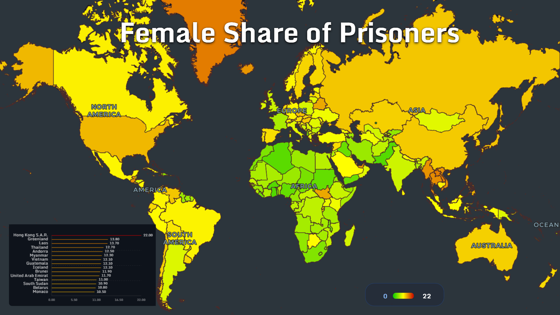
The female share map shows where women make up a larger portion of the prison population.
The highest values are:
- Hong Kong S.A.R.: 22
- Greenland: 13.8
- Laos: 13.7
- Thailand: 12.7
- Andorra: 12.5
- Myanmar: 12.3
- Vietnam: 12.1
- Guatemala: 12.1
- Iceland: 12.1
- Brunei: 11.9
- United Arab Emirates: 11.7
- Taiwan: 11.0
- South Sudan: 10.9
- Belarus: 10.8
- Monaco: 10.5
The female share of prisoners is not the same as the number of women in prison. A small jurisdiction can have a high female share with a relatively small total prisoner count.
But the measure is still important because it reveals the gender composition of punishment.
When read alongside the growth map, it raises two questions: where are women increasingly entering prison systems, and where do they already make up an unusually large share of the incarcerated population?
For policymakers, these maps point to the need for gender-specific data: sentencing patterns, offense categories, pre-trial detention, pregnancy, childcare, healthcare and reintegration after release.
Without that detail, women’s imprisonment remains statistically visible but socially underexplained.
Foreign Share of Prisoners
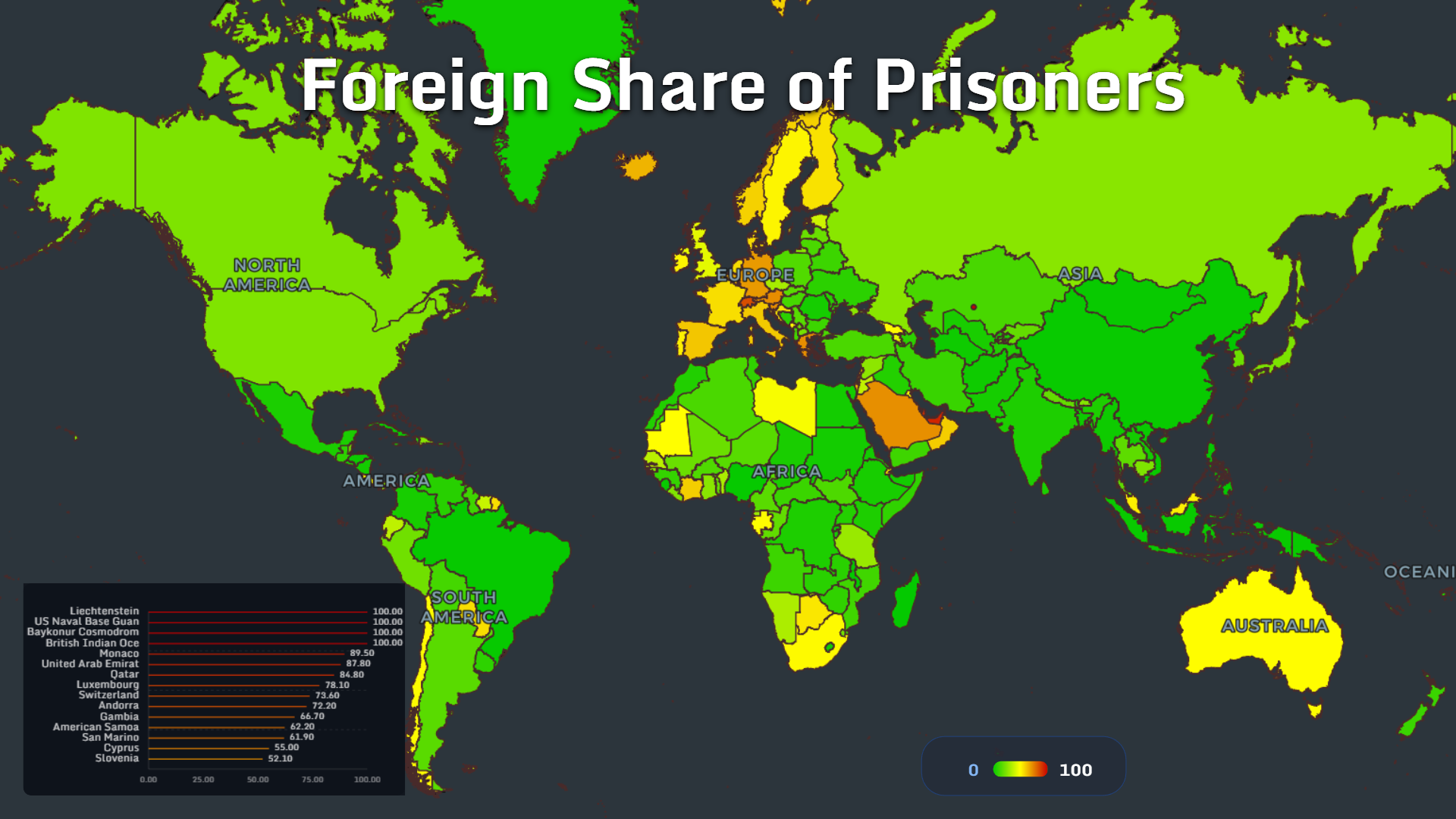
The foreign prisoner share map is strongly shaped by small territories, migration hubs and special jurisdictions.
The highest values shown include:
- Liechtenstein: 100
- US Naval Base Guam: 100
- Baykonur Cosmodrome: 100
- British Indian Ocean Territory: 100
- Monaco: 89.5
- United Arab Emirates: 87.8
- Qatar: 84.8
- Luxembourg: 78.1
- Switzerland: 73.6
- Andorra: 72.2
- Gambia: 66.7
- American Samoa: 62.2
- San Marino: 61.9
- Cyprus: 55
- Slovenia: 52.1
Very small prison populations can produce extreme percentages. Special jurisdictions may have unusual legal or demographic structures. Wealthy microstates and migrant-heavy economies can also show high foreign shares because their resident populations include many non-citizens.
Still, the pattern tells a larger story.
Prisons do not only reflect domestic criminal justice. They also intersect with migration, labor markets, borders and nationality.
In countries with large migrant workforces, the foreign share of prisoners can reveal how legal vulnerability, language barriers, labor status and access to defense shape outcomes.
In Europe and the Gulf, the map shows how closely prison systems can sit beside migration systems.
Children in Detention

Children in detention may be the most morally difficult map in the collection.
The highest numbers shown are:
- India: 79.1k
- United States: 25.8k
- China: 15.8k
- Pakistan: 13.5k
- Brazil: 9.3k
- Mexico: 8.0k
- Bangladesh: 7.7k
- Iran: 6.1k
- Nigeria: 4.8k
- Indonesia: 4.3k
- Russia: 3.7k
- Egypt: 3.6k
- Turkey: 2.8k
- Colombia: 2.7k
- Philippines: 2.6k
Because this is an absolute count, large-population countries naturally appear near the top. But the human meaning of the map remains clear: many states continue to use detention systems for minors at significant scale.
Children in detention require a different lens from adult imprisonment.
The relevant questions are not only legal. They are developmental: education, trauma, family contact, mental health, violence exposure and the long-term effects of institutionalization.
A child detention map is therefore a map of future consequences. The harm does not necessarily end when detention ends.
Prison Mortality Rate
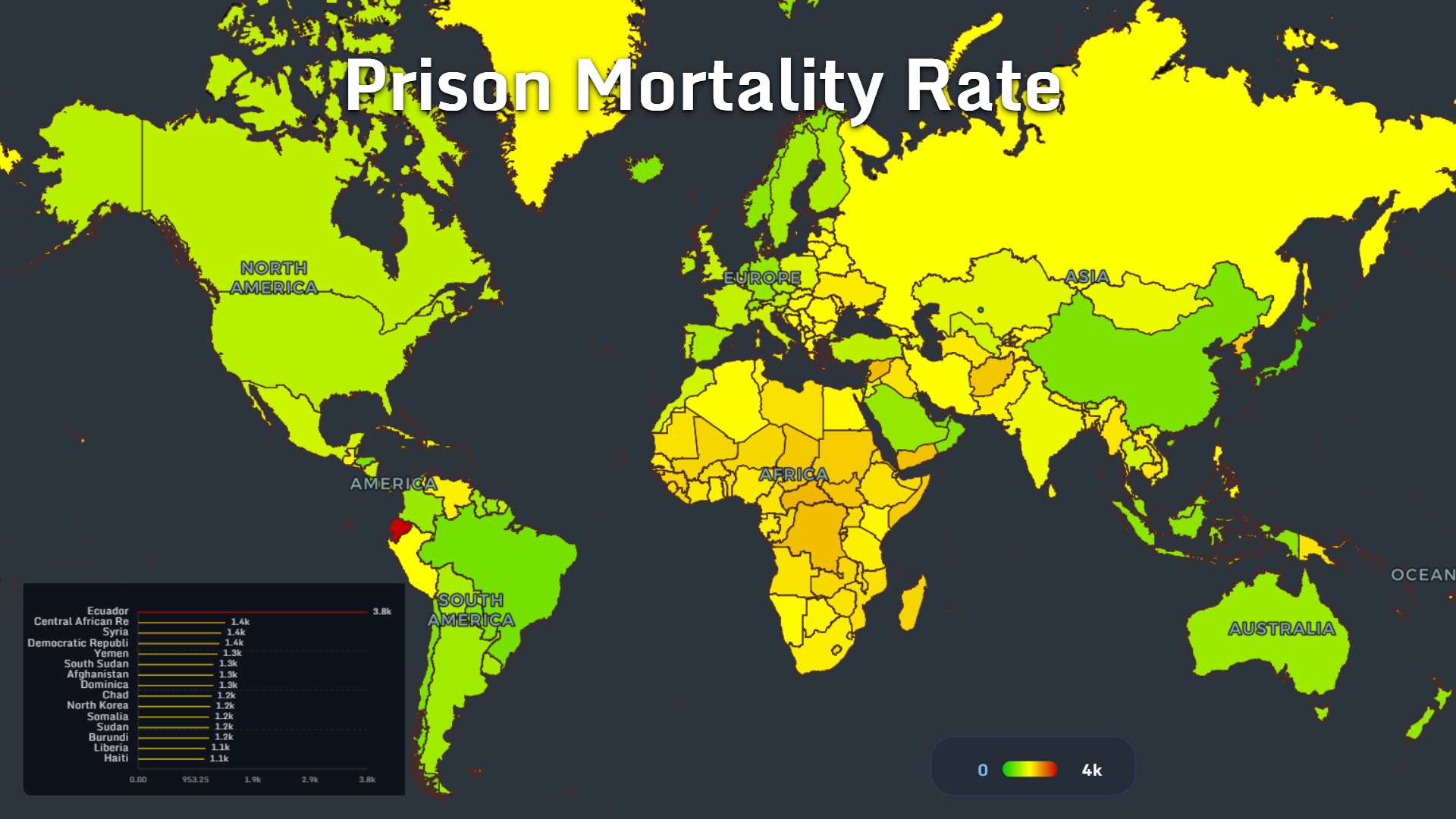
The prison mortality map moves from scale to survival.
Ecuador shows the highest value at approximately 3.8k, far above the next group. Central African Republic, Syria and Democratic Republic of the Congo each appear around 1.4k.
The leading values shown are:
- Ecuador: 3.8k
- Central African Republic: 1.4k
- Syria: 1.4k
- Democratic Republic of the Congo: 1.4k
- Yemen: 1.3k
- South Sudan: 1.3k
- Afghanistan: 1.3k
- Dominica: 1.3k
- Chad: 1.2k
- North Korea: 1.2k
- Somalia: 1.2k
- Sudan: 1.2k
- Burundi: 1.2k
- Liberia: 1.1k
- Haiti: 1.1k
Deaths in prison can be linked to violence, disease, lack of medical care, overcrowding, malnutrition, suicide, heat, neglect or state collapse. A high mortality rate is rarely just a health statistic. It is often a system-level signal.
Ecuador’s position is especially stark in this dataset. Its value sits far above the rest of the top group, suggesting an acute prison-safety problem in the mapped period.
When mortality is combined with overcrowding, the warning becomes stronger. A prison system can hold too many people, with too few resources, under too much stress — until the map begins to show death.
What These Prison Maps Reveal
These maps show that incarceration is not one global pattern.
It is many patterns layered together.
The United States and China dominate absolute prison population. Brazil, India, Turkey and Russia form the next major tier. El Salvador, Turkey and Cambodia show sharp prison population growth since 2000. Cambodia, El Salvador and Indonesia stand out in the growth of female imprisonment.
Overcrowding tells another story entirely. The Republic of the Congo, Cambodia, the Philippines and Uganda show extreme occupancy pressure. Foreign prisoner shares highlight microstates, migrant economies and special jurisdictions. Children in detention reveal the scale of juvenile confinement. Mortality exposes where prison conditions may become deadly.
The central lesson is simple: no single prison metric is enough.
A country can have many facilities but lower occupancy pressure. Another can have fewer prisoners but severe overcrowding. A third can have a small prison population but a high foreign share. A fourth may not dominate total incarceration, yet show alarming growth among women or children.
That is why prison data needs maps.
Maps make the hidden structure visible: who is confined, where capacity fails, where systems are growing and where the consequences become hardest to ignore.
MAPTHOS helps turn this kind of complex justice data into visual analysis that can be compared country by country, layer by layer.
👉 Explore more at app.mapthos.org
See the world. Map better. Dream big. 🌍✨