🌍 Global Poverty and Inequality Map 2025
Some maps show borders. Others show weather, roads, trade, or population. But maps about poverty and inequality show something quieter: the geography of chances.
In this global poverty map 2025, the world does not divide neatly into rich and poor. It fragments into many overlapping realities - where people live in extreme poverty, where family background shapes income, where young people struggle to find work, where GDP rises but poverty does not fall, and where the richest groups hold a very large share of wealth.
Each map below tells one part of the same story: poverty is not only about money. It is about housing, work, inheritance, institutions, social mobility, and the distance between growth on paper and life on the ground.
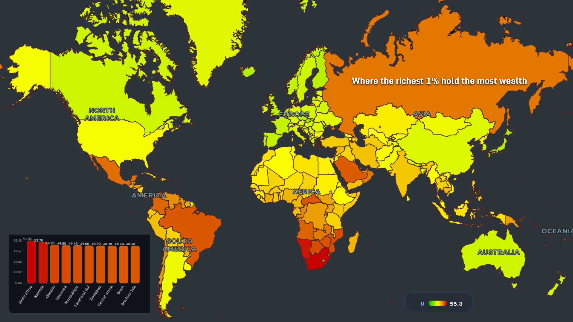
Where wealth concentrates at the very top
The header map shows where the richest 1% hold the most wealth. South Africa leads the ranking at 55.3, followed by Namibia at 53.7. Eswatini, Botswana, Mozambique, Equatorial Guinea, Zimbabwe, Central Africa, Brazil, and the Brazilian Islands also appear near the top.
This is one of the most direct inequality signals in the whole set. A country can have modern cities, active markets, and visible economic growth, yet still concentrate assets in the hands of a very small group.
For data visualization, this kind of wealth inequality by country is powerful because it turns an abstract idea - “the top 1%” - into a geographic pattern. Southern Africa stands out strongly, while parts of Latin America and selected resource-linked economies also show deep concentration.
Extreme poverty is still geographically clustered
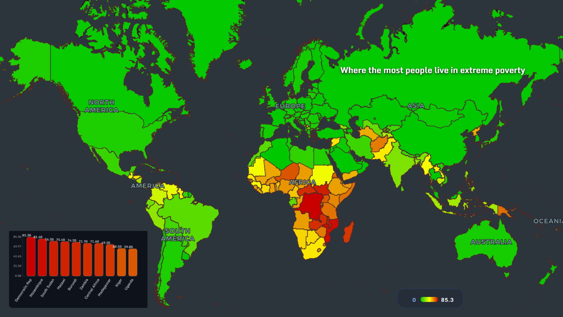
The extreme poverty map makes the pattern painfully clear. The highest values cluster across Sub-Saharan Africa, with the Democratic Republic of Congo and Mozambique both shown at about 85.3. South Sudan follows at 81.4, while Malawi, Burundi, Zambia, Central Africa, Madagascar, Niger, and Uganda also rank high.
The map is not saying that hardship only exists in one region. It is showing where the concentration becomes structural. Poverty here is not a temporary dip in income. It often overlaps with fragile infrastructure, limited access to services, food insecurity, conflict exposure, and weak labor markets.
This is why a global poverty map 2025 is more than a ranking. It is a reminder that poverty has geography, memory, and momentum.
When poverty touches every part of life
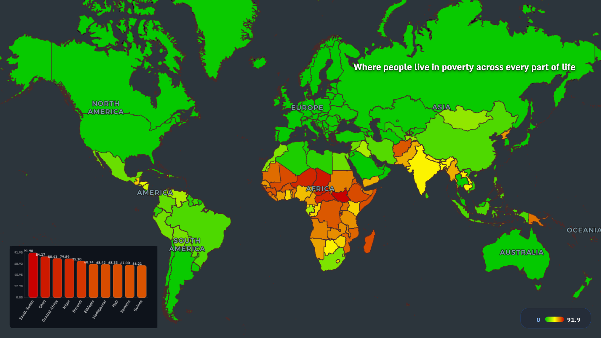
This map looks at poverty across multiple dimensions of life. South Sudan reaches 91.9, the highest value in the ranking. Chad follows at 84.17, Central Africa at 80.41, Niger at 79.89, and Burundi at 75.10. Ethiopia, Madagascar, Mali, Somalia, and Guinea also appear among the highest countries.
The important insight is that poverty is not one variable. A household may face low income, poor housing, low school access, weak healthcare, unsafe water, or unstable work at the same time. When these pressures overlap, poverty becomes harder to escape.
For analysts and journalists, this map is a good example of why single-indicator storytelling can be misleading. Income matters, but the lived experience of poverty often comes from stacked disadvantages.
Slums reveal the housing side of poverty
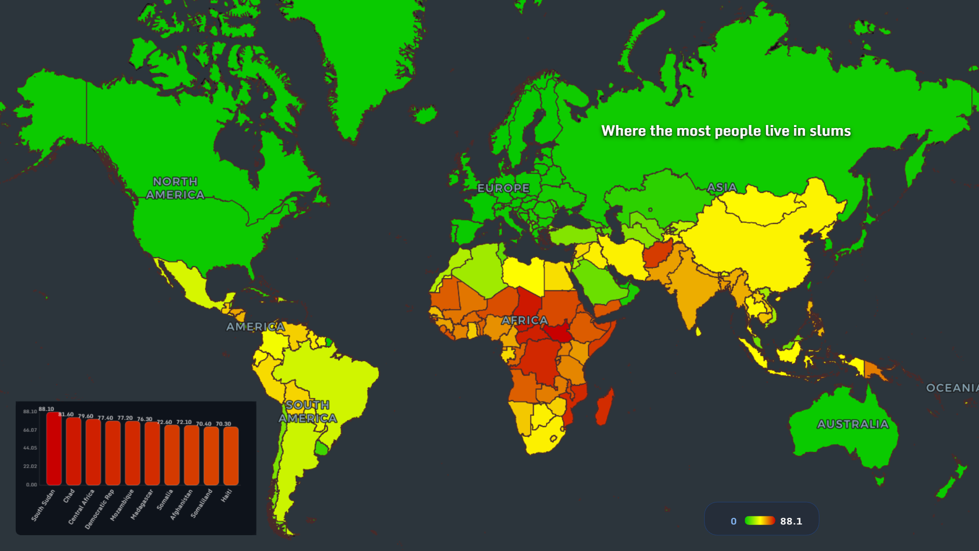
The slum population map shows South Sudan at 88.1, Chad at 81.6, Central Africa at 79.6, the Democratic Republic of Congo at 77.4, and Mozambique at 77.2. Madagascar, Somalia, Afghanistan, Somaliland, and Haiti also appear high.
This map shifts the focus from income to shelter. A person may live in a city, participate in an economy, and still lack secure housing, clean infrastructure, or stable access to basic services.
The map also complicates the usual urbanization story. Cities are often described as engines of opportunity, but rapid urban growth without housing capacity can reproduce poverty vertically - dense, visible, and hard to ignore.
Young people and the geography of blocked starts
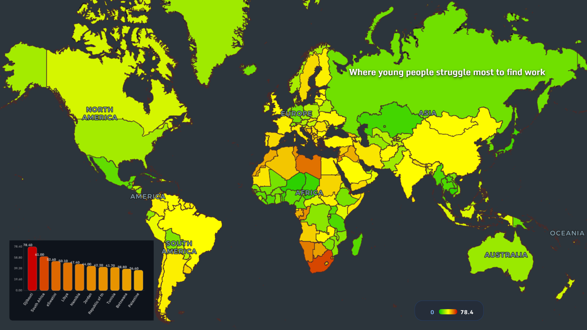
Youth employment is one of the clearest stress tests for an economy. In this map, Djibouti stands out at 78.4, followed by South Africa at 61.0, Eswatini at 52.6, Libya at 50.1, and Namibia at 47.4. Jordan, the Republic of Congo, Tunisia, Botswana, and Palestine also rank high.
This is not only a labor market problem. It is a future problem. When young people cannot find work, entire societies lose time, confidence, skills, and trust.
The youth unemployment map also shows that poverty and inequality are not limited to low-income countries. Middle-income economies can also fail to turn education, cities, and growth into stable work for a new generation.
Where family background matters most
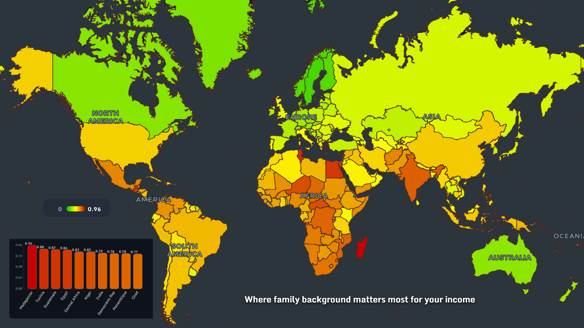
This social mobility map shows where family background has the strongest influence on income. Madagascar is at 0.96, Tunisia at 0.88, Guatemala at 0.87, Egypt at 0.86, and Central Africa and Niger both around 0.82. India, the Democratic Republic of Congo, Mozambique, and Chad also rank high.
The map tells a different kind of inequality story. It is not only about who is poor today. It is about how strongly yesterday predicts tomorrow.
When family background matters too much, talent has less room to move. Birthplace, parents, neighborhood, and inherited networks become more important than effort or ability. That is one of the quietest forms of inequality because it can look normal from the outside.
The rich-poor gap remains largest in specific regions
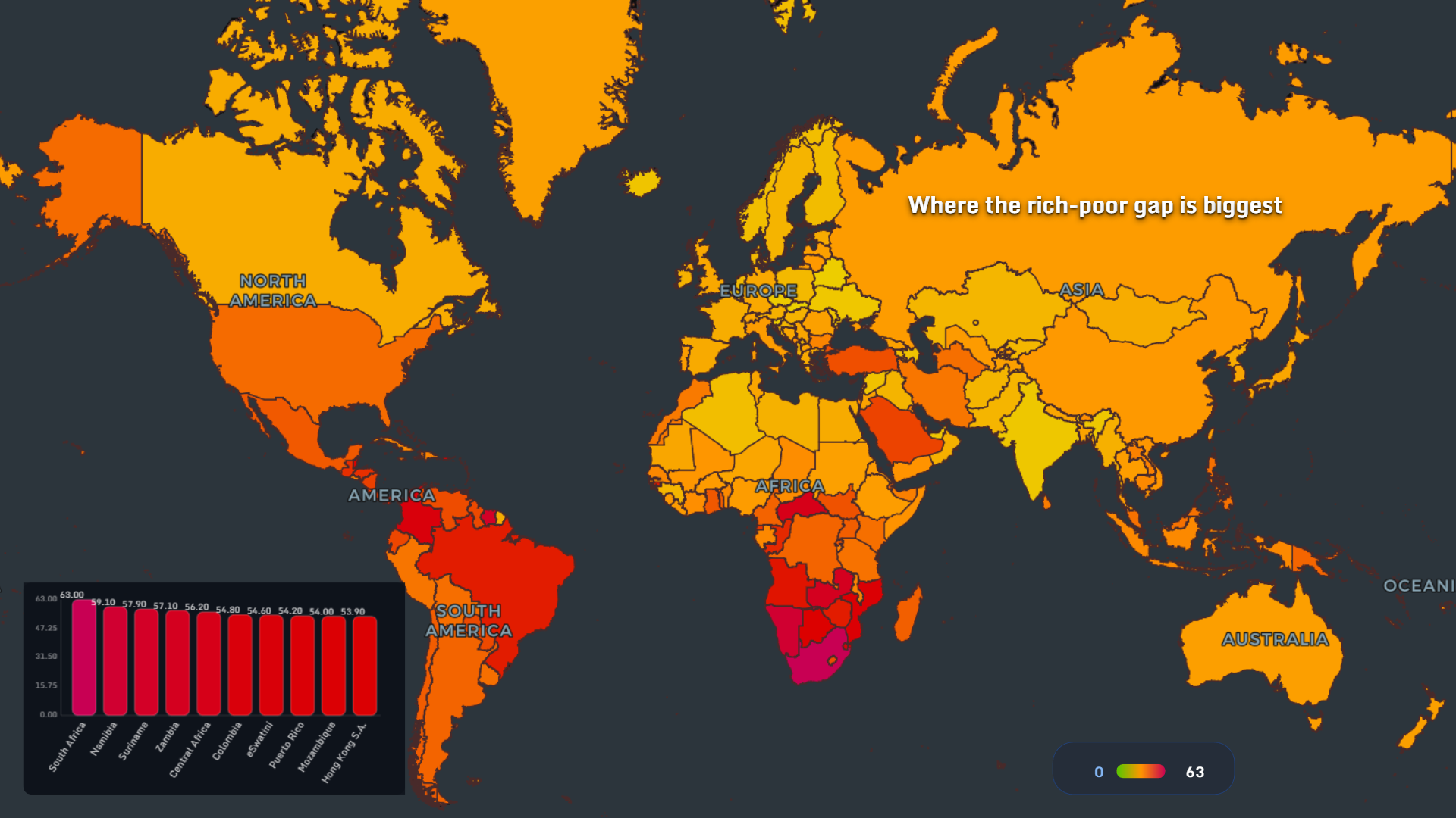
The Gini index map shows South Africa at 63.0, Namibia at 59.1, Suriname at 57.9, Zambia at 57.1, and Central Africa at 56.2. Colombia, Eswatini, Puerto Rico, Mozambique, and Hong Kong S.A.R. also appear in the top group.
This income inequality map is one of the clearest views of distribution. It does not ask whether a country is rich or poor overall. It asks how unevenly income is shared inside the country.
That distinction matters. Two countries can have similar income levels but very different social realities depending on who receives the gains. The Gini map helps reveal that hidden internal structure.
When the richest take the biggest income share
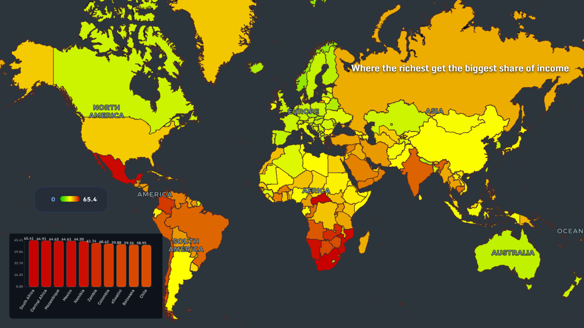
This map focuses on where the richest groups receive the largest share of income. South Africa again appears at the top with 65.41, followed closely by Central Africa at 64.91, Mozambique at 64.63, Mexico at 64.61, and Namibia at 64.20. Zambia, Colombia, Eswatini, Botswana, and Chile also appear among the highest values.
The pattern overlaps with the Gini index, but the emotional reading is different. The Gini index describes inequality as a statistical shape. This map makes it more direct: how much income flows upward?
For a data visualization of global trends, the contrast is useful. It shows that inequality is not only about poverty at the bottom. It is also about extraction and accumulation at the top.
Where ordinary people receive the smallest share
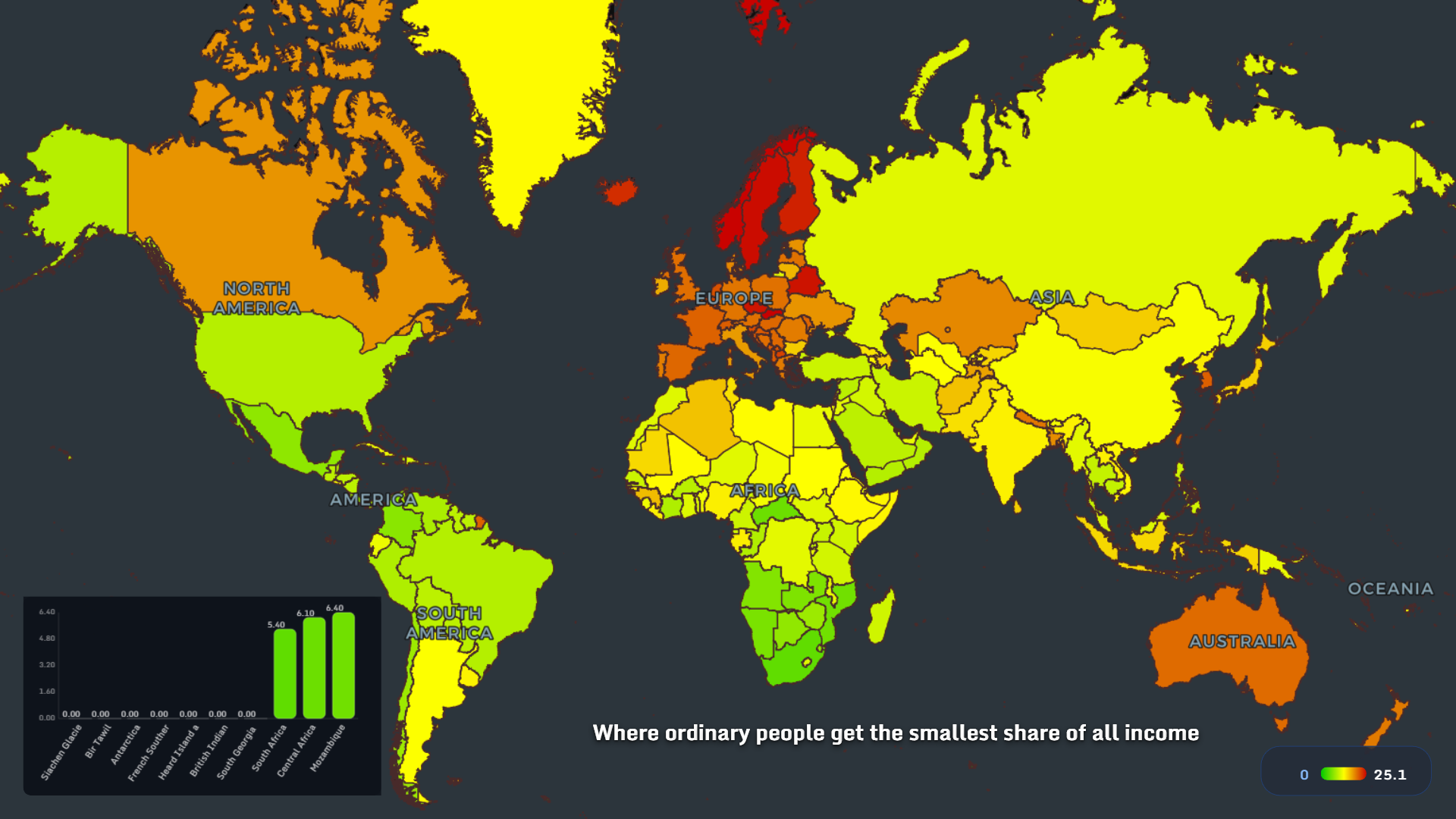
This map turns the previous question around. Instead of asking how much the richest receive, it asks where ordinary people get the smallest share of all income.
Among the visible country rankings, South Africa appears at 5.4, Central Africa at 6.1, and Mozambique at 6.4. Several territories in the chart are shown at 0.0, which makes the lower end especially stark.
The important insight is simple: inequality is not only visible in luxury. It is visible in the missing share - the wages not earned, the savings not built, the homes not owned, the years spent working without security.
When GDP rises but poverty does not fall
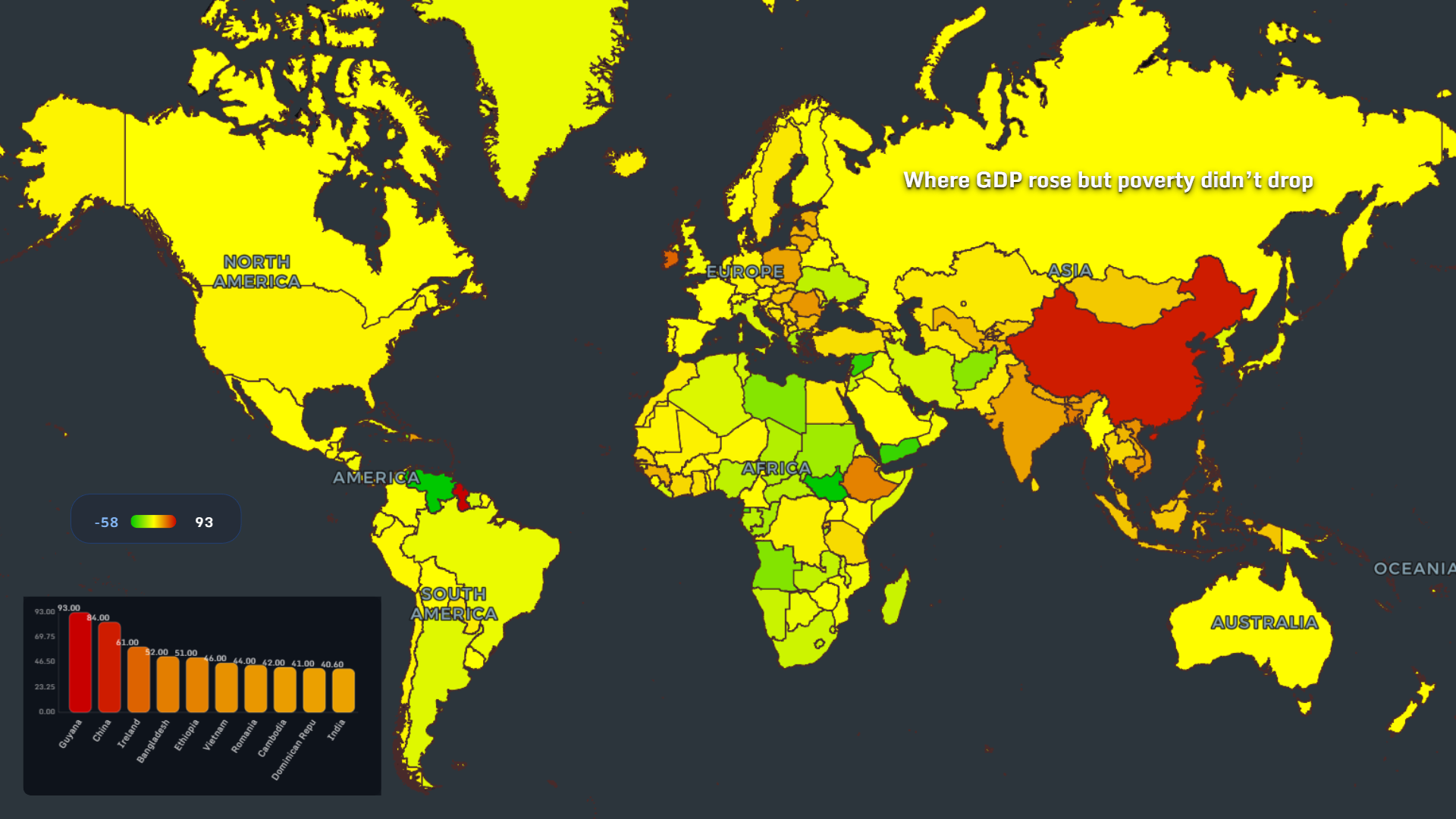
This map is one of the most interesting in the set because it challenges the simplest development story. Guyana is shown at 93.0, China at 84.0, Ireland at 61.0, Bangladesh at 52.0, and Ethiopia at 51.0. Vietnam, Romania, Cambodia, the Dominican Republic, and India also appear in the ranking.
The map asks a hard question: what happens when GDP improves but poverty does not fall in the same way?
Growth is important, but it is not automatically inclusive. If new wealth concentrates in specific sectors, cities, asset classes, or ownership structures, national numbers can rise while many households remain exposed.
This is where MAPTHOS becomes useful for analysis. By placing economic indicators on a map, we can see when “growth” and “life improvement” are not moving at the same speed.
Reading the maps together
One map can mislead. A group of maps can triangulate.
Extreme poverty points strongly toward parts of Sub-Saharan Africa. Slum exposure adds an urban housing layer. Youth unemployment shows where the next generation is blocked. Family background reveals where mobility is constrained. The Gini index and top-income maps show how unequal distribution can become even when economies function.
Together, these poverty and inequality maps by country show that poverty is not one crisis. It is a system of connected pressures.
The strongest lesson is not only where poverty exists, but where escape routes are narrow.
Why visualizing poverty still matters in 2025
A spreadsheet can list values. A map shows proximity, regional clusters, and uncomfortable repetition. When the same countries appear again and again across extreme poverty, slums, youth unemployment, social immobility, and income concentration, the pattern becomes harder to dismiss.
That is the real value of geographic data visualization. It turns scattered indicators into a story people can see.
And once a story can be seen, it can be questioned, compared, shared, and improved.
👉 Explore more at app.mapthos.org
See the world. Map better. Dream big. 🌍✨